- Power BI forums
- Updates
- News & Announcements
- Get Help with Power BI
- Desktop
- Service
- Report Server
- Power Query
- Mobile Apps
- Developer
- DAX Commands and Tips
- Custom Visuals Development Discussion
- Health and Life Sciences
- Power BI Spanish forums
- Translated Spanish Desktop
- Power Platform Integration - Better Together!
- Power Platform Integrations (Read-only)
- Power Platform and Dynamics 365 Integrations (Read-only)
- Training and Consulting
- Instructor Led Training
- Dashboard in a Day for Women, by Women
- Galleries
- Community Connections & How-To Videos
- COVID-19 Data Stories Gallery
- Themes Gallery
- Data Stories Gallery
- R Script Showcase
- Webinars and Video Gallery
- Quick Measures Gallery
- 2021 MSBizAppsSummit Gallery
- 2020 MSBizAppsSummit Gallery
- 2019 MSBizAppsSummit Gallery
- Events
- Ideas
- Custom Visuals Ideas
- Issues
- Issues
- Events
- Upcoming Events
- Community Blog
- Power BI Community Blog
- Custom Visuals Community Blog
- Community Support
- Community Accounts & Registration
- Using the Community
- Community Feedback
Register now to learn Fabric in free live sessions led by the best Microsoft experts. From Apr 16 to May 9, in English and Spanish.
- Power BI forums
- Forums
- Get Help with Power BI
- Desktop
- Re: Sync Y Axis of 2 Bar graphs by Default
- Subscribe to RSS Feed
- Mark Topic as New
- Mark Topic as Read
- Float this Topic for Current User
- Bookmark
- Subscribe
- Printer Friendly Page
- Mark as New
- Bookmark
- Subscribe
- Mute
- Subscribe to RSS Feed
- Permalink
- Report Inappropriate Content
Sync Y Axis of 2 Bar graphs by Default
Hi,
I have 2 Stacked column charts
1. OP Amount (OP/CP =OP) ,
2.CP Amount (OP/CP =CP)
both are derived from field OP/CP and the measure is value.
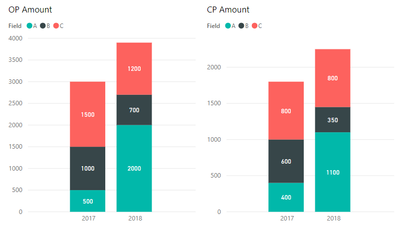
I want to sync my OP Amount chart with CP Amount chart, ideally both values in axis are different, OP is higher than CP. but my user is expecting CP graph should be in sync with OP graph to compare OP & CP.
in this case OP has Y axis 0 to 4k but CP has Y Axis 0 to 2k.
is there a way that we can sync CP chart Y Axis with OP Chart Y Axis (CP y Axis should be 4k but show actual CP Value). I think we can do it maually enterig 4k in Y axis in CP chart but i am looking for dynamic solution and other possiblities.
here I am attaching visuals,
current Visual look:
Expected should be as below, (implemented by changing Y axis for CP manually to 4000)
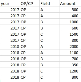
find the test data screenshot as below used for both the views,
Kindly respond to this and let me know the available options to implement.
Regards
Harsha
Solved! Go to Solution.
- Mark as New
- Bookmark
- Subscribe
- Mute
- Subscribe to RSS Feed
- Permalink
- Report Inappropriate Content
Hi @Anonymous ,
You cannot make two axys of different visual to syncronized, however you can do the following work around:
- Select the Line and Stacked Column chart
- Create the following measure:
AXIS  SYNC =
MAXX (
    SUMMARIZE (
        ALL ( 'OP/CP'[Year]; 'OP/CP'[OP/CP] );
        'OP/CP'[OP/CP];
        "Sync"; SUM ( 'OP/CP'[Amount] )
    );
    MAX ( [Sync] )
)
- Setup your chart as previously, and place the AXYS sinc on the line values
- Setting of Y-Axis turn off show secondary
- Shapes and put the stroke width to 0
- Labels turn of label of the measure
If you don't want the name of the Axi sync to show replace it by a dot or a similar thing on the chart itself and make the colour white.
Another option is to hide the legend of the chart and make a new one with a table visual or with some cards.
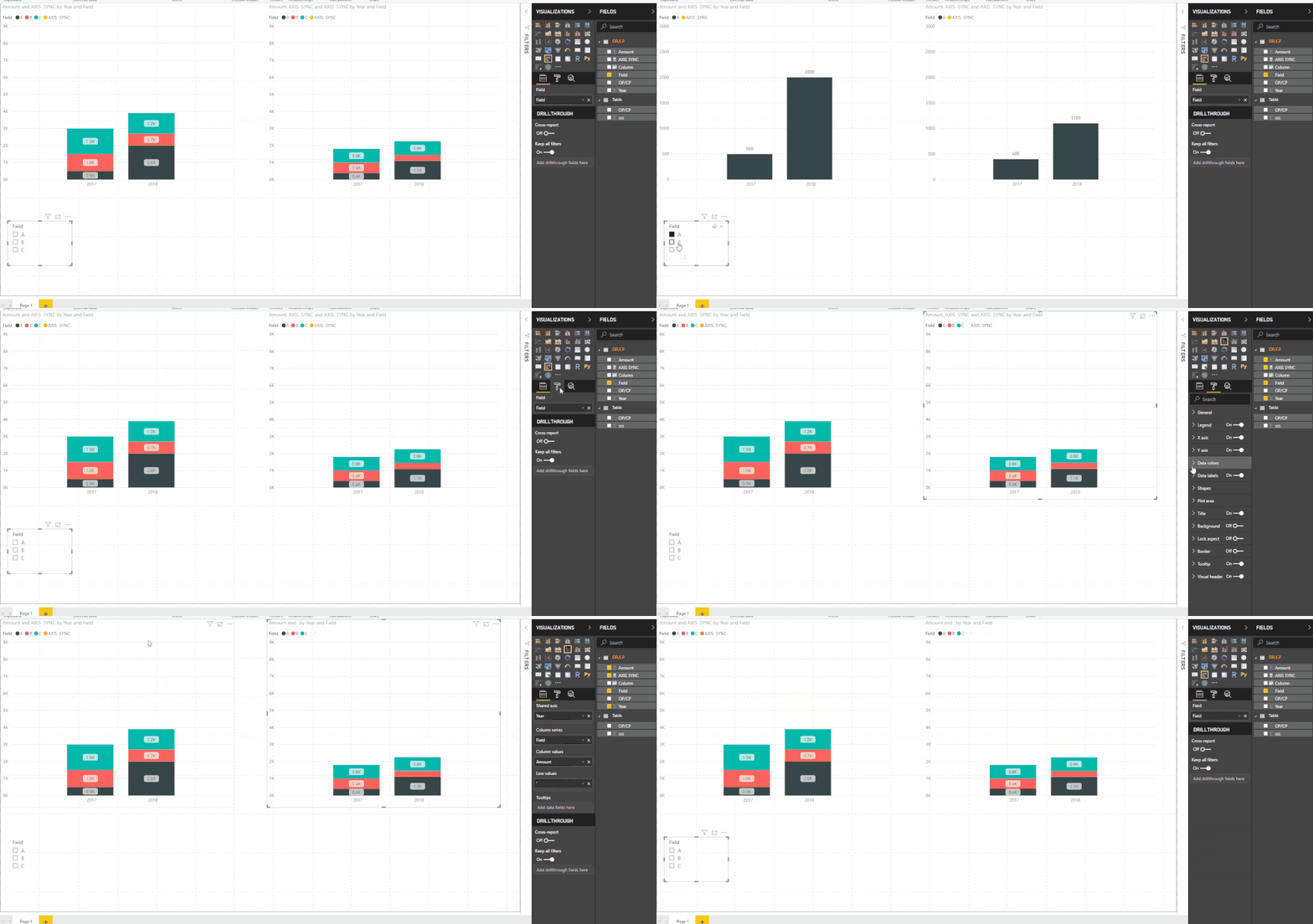
Result is attach.
Regards,
MFelix
Regards
Miguel Félix
Did I answer your question? Mark my post as a solution!
Proud to be a Super User!
Check out my blog: Power BI em Português- Mark as New
- Bookmark
- Subscribe
- Mute
- Subscribe to RSS Feed
- Permalink
- Report Inappropriate Content
Hi,
the Sync calculation didn't work well for my requirement with realtime data. The axis in both the sheets went 9k
My requirement is to set CP Amount Axis to OP Amount which is 4k in both places.
but your thought process helped me to think through line & Stacked column chart. Thanks for that.
what I have followed is I ahve derived 2 measure
1. CP Amount = calculate(sum(amount),op/cp = "CP")
2.OP Amount = calculate(sum(amount),op/cp = "OP")
then in CP Amount chart used CP Amount in Line & Stacked Chart with no line value.
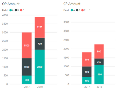
then in OP Amount chart used OP amount in Column value & CP Amount in Line value both are in sync with axis because I have used CP Amount in line value in OP Sheet.
overall your thought process helped me to achieve the requirement. see the below output visuals,
Thank you
Regards
Harsha
Helpful resources

Microsoft Fabric Learn Together
Covering the world! 9:00-10:30 AM Sydney, 4:00-5:30 PM CET (Paris/Berlin), 7:00-8:30 PM Mexico City

Power BI Monthly Update - April 2024
Check out the April 2024 Power BI update to learn about new features.

| User | Count |
|---|---|
| 110 | |
| 94 | |
| 80 | |
| 67 | |
| 59 |
| User | Count |
|---|---|
| 150 | |
| 119 | |
| 104 | |
| 87 | |
| 67 |


