- Power BI forums
- Updates
- News & Announcements
- Get Help with Power BI
- Desktop
- Service
- Report Server
- Power Query
- Mobile Apps
- Developer
- DAX Commands and Tips
- Custom Visuals Development Discussion
- Health and Life Sciences
- Power BI Spanish forums
- Translated Spanish Desktop
- Power Platform Integration - Better Together!
- Power Platform Integrations (Read-only)
- Power Platform and Dynamics 365 Integrations (Read-only)
- Training and Consulting
- Instructor Led Training
- Dashboard in a Day for Women, by Women
- Galleries
- Community Connections & How-To Videos
- COVID-19 Data Stories Gallery
- Themes Gallery
- Data Stories Gallery
- R Script Showcase
- Webinars and Video Gallery
- Quick Measures Gallery
- 2021 MSBizAppsSummit Gallery
- 2020 MSBizAppsSummit Gallery
- 2019 MSBizAppsSummit Gallery
- Events
- Ideas
- Custom Visuals Ideas
- Issues
- Issues
- Events
- Upcoming Events
- Community Blog
- Power BI Community Blog
- Custom Visuals Community Blog
- Community Support
- Community Accounts & Registration
- Using the Community
- Community Feedback
Register now to learn Fabric in free live sessions led by the best Microsoft experts. From Apr 16 to May 9, in English and Spanish.
- Power BI forums
- Forums
- Get Help with Power BI
- Desktop
- Summary Table Not filtering correctly
- Subscribe to RSS Feed
- Mark Topic as New
- Mark Topic as Read
- Float this Topic for Current User
- Bookmark
- Subscribe
- Printer Friendly Page
- Mark as New
- Bookmark
- Subscribe
- Mute
- Subscribe to RSS Feed
- Permalink
- Report Inappropriate Content
Summary Table Not filtering correctly
Hello all,
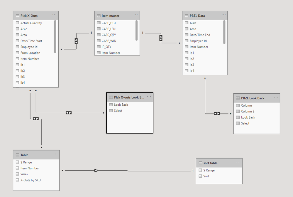
I have a summary table in a Power Bi report that is grouped by item number and fiscal week. I have created a many to many connection to it's source table using the item number, cross filter direction is set to both.
In the original table i have created a number of columns to allow me to use a slicer with buttons that say "Last week", "Last Month", "Last 3 Months", etc. Then end result of those columns is a column the combines all of the previous columns and is connected to a sperate table that the distinct, union and select columns, to allow the actual execution of the slicer look back buttons.
The final page has a pie chart from the summary table, a slicer for the look back button, a couple of other slicers having to do with different departmental areas, and a table from the source table with a comprehensive break down of the activity that has been summarized in the summary table.
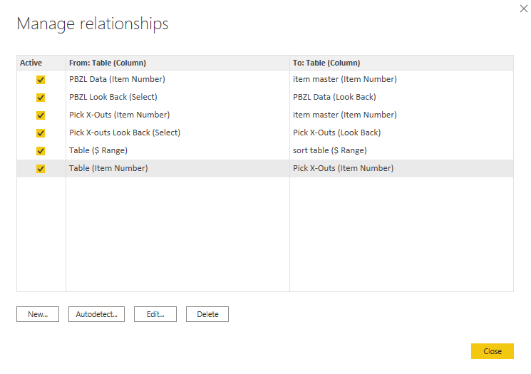
The issue is that the Pie Chart from the summary table is not responding appropriately to the various slicers when they are applied. It is getting eroneous numbers added in to it's calculation that should not be present in the designated time periods. I have tried a number of different relationships, with various other tables in my report, with similar or worse results than the current relationship. In addition to the below DAX expression, I have tried writing the DAX using the Groupby function, the summarize collumn function, and an antiquated method that was quite silly, but I was desperate... The only situation that I have ever been able to get this to work properly was by adding a filter argument to the summary table DAX where the Week number column had to equale the MAX of the week column from the source table, I then applied page level filters to the other objects on the report page to only display the most recent week.
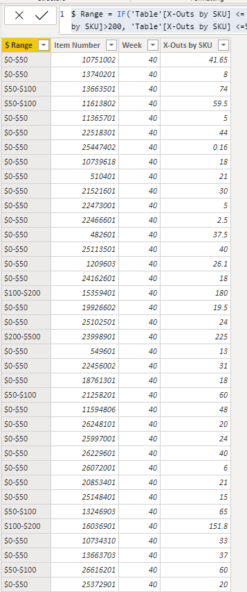
The DAX for the summary Table:
CALCULATETABLE (
SUMMARIZE (
'Pick X-Outs',
'Pick X-Outs'[Item Number],
'Pick X-Outs'[Week],
"X-Outs by SKU", SUM ( 'Pick X-Outs'[Total Dollar] )
),
FILTER ( 'Pick X-Outs', 'Pick X-Outs'[Week] = MAX ( 'Pick X-Outs'[Week] ) ) )
The DAX for the additional column in the summary table that is linked to a sort table and is one of the 2 components of the Pie chart in question.
$ Range =
IF (
'Table'[X-Outs by SKU] <= 50,
"$0-$50",
IF (
AND ( 'Table'[X-Outs by SKU] > 50, 'Table'[X-Outs by SKU] <= 100 ),
"$50-$100",
IF (
AND ( 'Table'[X-Outs by SKU] > 100, 'Table'[X-Outs by SKU] <= 200 ),
"$100-$200",
IF (
AND ( 'Table'[X-Outs by SKU] > 200, 'Table'[X-Outs by SKU] <= 500 ),
"$200-$500",
IF ( 'Table'[X-Outs by SKU] > 500, "over $500", BLANK () )
)
)
)
)
Current Relationships
Solved! Go to Solution.
- Mark as New
- Bookmark
- Subscribe
- Mute
- Subscribe to RSS Feed
- Permalink
- Report Inappropriate Content
@v-jingzhang Thank you for your reply! I think I definitely need to work on utilizng the Switch function more in my reports!
I had previously come up with a solution for the issue, that I forgot to post on here. The main problem that was occuring was that the total amount per item was aggregating over all existing weeks, not just the weeks that were selected with the time slicer.
The work around I came up with, was creating a key column in the summary table by combining the week number and the item number. I combined the same two colums in the table that the summary table pulled its data from, and set up a one to many relationship with the new "Key" column. This has proved very effective so far with the back testing I did on it, and required minimal additions to the report.
Thanks again for your help and response! I am excited to learn to better utilize Switch.
- Mark as New
- Bookmark
- Subscribe
- Mute
- Subscribe to RSS Feed
- Permalink
- Report Inappropriate Content
@Anonymous You are welcome. Your solution sounds great and also let me learn a lot. You will find sometimes there may be different solutions to the same problem and this is an interesting point in Power BI.
- Mark as New
- Bookmark
- Subscribe
- Mute
- Subscribe to RSS Feed
- Permalink
- Report Inappropriate Content
Hi @Anonymous
Sorry for the late reply.
The issue is that a calculated table is created and populated in advance of any slicer or filter applied in the report canvas. It means that your look back slicer is not able to change the data in a calculated table. That is why the pie chart is not responding appropriately to the various slicers.
What you can do is to create different measures for different look back periods and use SWITCH funtion to put all measures into one measure, and then put this measure into the pie chart. Then when you select different values in the look back slicer, the pie chart will change accordingly. Please see the example link: https://radacad.com/change-the-column-or-measure-value-in-a-power-bi-visual-by-selection-of-the-slicer-parameter-table-pattern
If you still have difficulty realizing it, feel free to let me know and share some sample data in table format or a sample PBIX file (remove sensitive information) so that I can help further.
Best Regards,
Community Support Team _ Jing Zhang
If this post helps, please consider Accept it as the solution to help other members find it.
- Mark as New
- Bookmark
- Subscribe
- Mute
- Subscribe to RSS Feed
- Permalink
- Report Inappropriate Content
@amitchandak Thank you for the speedy reply! Unfortunately changing all of the relationships to one direction did not alter the outcome 😞
- Mark as New
- Bookmark
- Subscribe
- Mute
- Subscribe to RSS Feed
- Permalink
- Report Inappropriate Content
@Anonymous , Summarize table should join with Week, Bucket, and Item. Try to avoid other bi-directional many to Many join. Then it will filter with those dimensions
Microsoft Power BI Learning Resources, 2023 !!
Learn Power BI - Full Course with Dec-2022, with Window, Index, Offset, 100+ Topics !!
Did I answer your question? Mark my post as a solution! Appreciate your Kudos !! Proud to be a Super User! !!
Helpful resources

Microsoft Fabric Learn Together
Covering the world! 9:00-10:30 AM Sydney, 4:00-5:30 PM CET (Paris/Berlin), 7:00-8:30 PM Mexico City

Power BI Monthly Update - April 2024
Check out the April 2024 Power BI update to learn about new features.

| User | Count |
|---|---|
| 107 | |
| 99 | |
| 76 | |
| 64 | |
| 58 |
| User | Count |
|---|---|
| 148 | |
| 113 | |
| 97 | |
| 84 | |
| 67 |


