- Power BI forums
- Updates
- News & Announcements
- Get Help with Power BI
- Desktop
- Service
- Report Server
- Power Query
- Mobile Apps
- Developer
- DAX Commands and Tips
- Custom Visuals Development Discussion
- Health and Life Sciences
- Power BI Spanish forums
- Translated Spanish Desktop
- Power Platform Integration - Better Together!
- Power Platform Integrations (Read-only)
- Power Platform and Dynamics 365 Integrations (Read-only)
- Training and Consulting
- Instructor Led Training
- Dashboard in a Day for Women, by Women
- Galleries
- Community Connections & How-To Videos
- COVID-19 Data Stories Gallery
- Themes Gallery
- Data Stories Gallery
- R Script Showcase
- Webinars and Video Gallery
- Quick Measures Gallery
- 2021 MSBizAppsSummit Gallery
- 2020 MSBizAppsSummit Gallery
- 2019 MSBizAppsSummit Gallery
- Events
- Ideas
- Custom Visuals Ideas
- Issues
- Issues
- Events
- Upcoming Events
- Community Blog
- Power BI Community Blog
- Custom Visuals Community Blog
- Community Support
- Community Accounts & Registration
- Using the Community
- Community Feedback
Register now to learn Fabric in free live sessions led by the best Microsoft experts. From Apr 16 to May 9, in English and Spanish.
- Power BI forums
- Forums
- Get Help with Power BI
- Desktop
- Stream Graph (custom visual) not working with date...
- Subscribe to RSS Feed
- Mark Topic as New
- Mark Topic as Read
- Float this Topic for Current User
- Bookmark
- Subscribe
- Printer Friendly Page
- Mark as New
- Bookmark
- Subscribe
- Mute
- Subscribe to RSS Feed
- Permalink
- Report Inappropriate Content
Stream Graph (custom visual) not working with dates
Hello,
I'm not sure if there is support for custom visuals here, but I thought I'd give it a try.
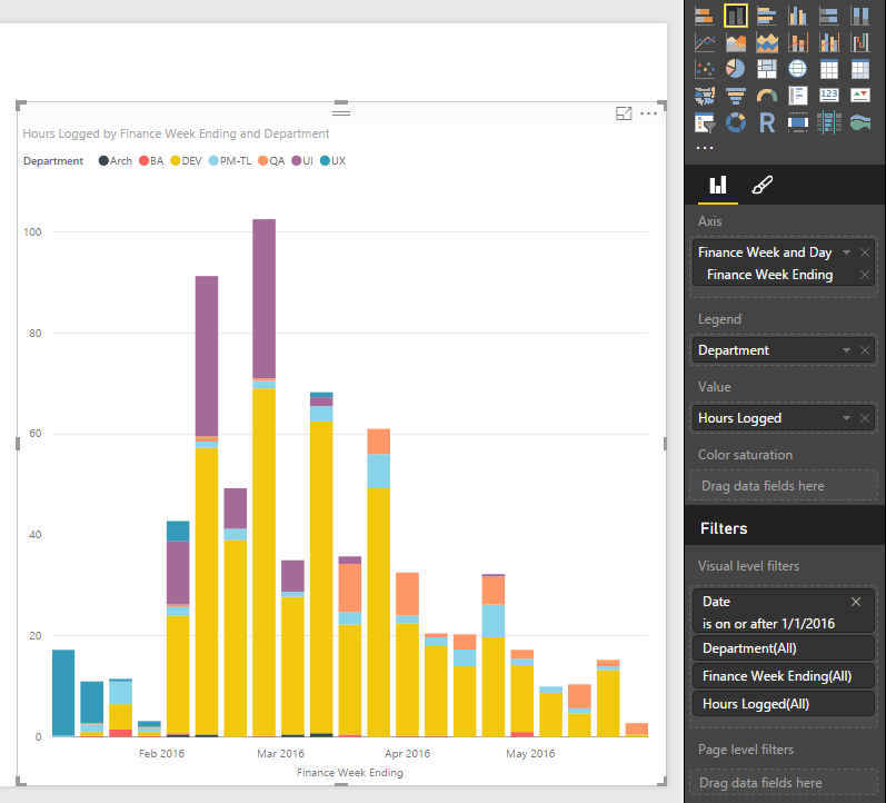
I'm trying to see the hours logged on a project each day, and how many of those were logged by each department. The Stream Graph seems like a perfect solution for this, but I can't get it to work right with the dates.
This bar chart shows the simple version of what I'd like:
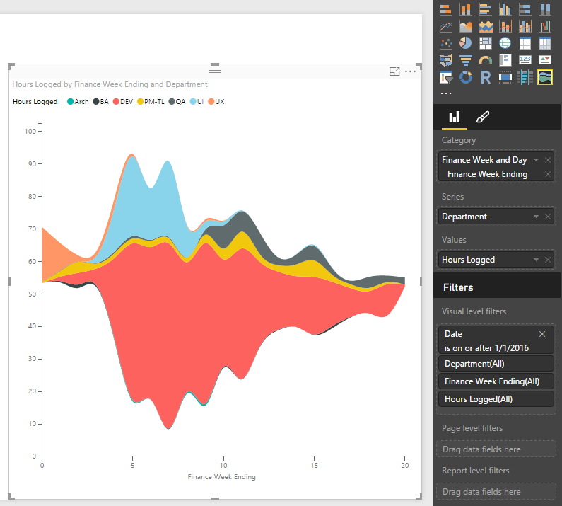
The point is, you see it started with UX, then mid-Feb went to UI and DEV, then by March was mostly DEV. Great, but not that pretty. So then I do the same thing as a Stream Graph:
This shows the same thing, but there are no dates on the bottom. It just shows a number, which I assume is just the count of days. Why? Does anyone get this or know how to change it? Maybe it's just quirky behavoir of custom visual, but I hope there's a solution.
Also, does anyone know if there is any meaning to where the "Wiggle" setting puts your data on the Y-axis? I understand that with Wiggle off it rests at zero. But with Wiggle on, is there any logic to why my first week data starts at 55ish and goes to 70? Is it purely aesthetic and/or random?
Thanks for any help.
Seth
Solved! Go to Solution.
- Mark as New
- Bookmark
- Subscribe
- Mute
- Subscribe to RSS Feed
- Permalink
- Report Inappropriate Content
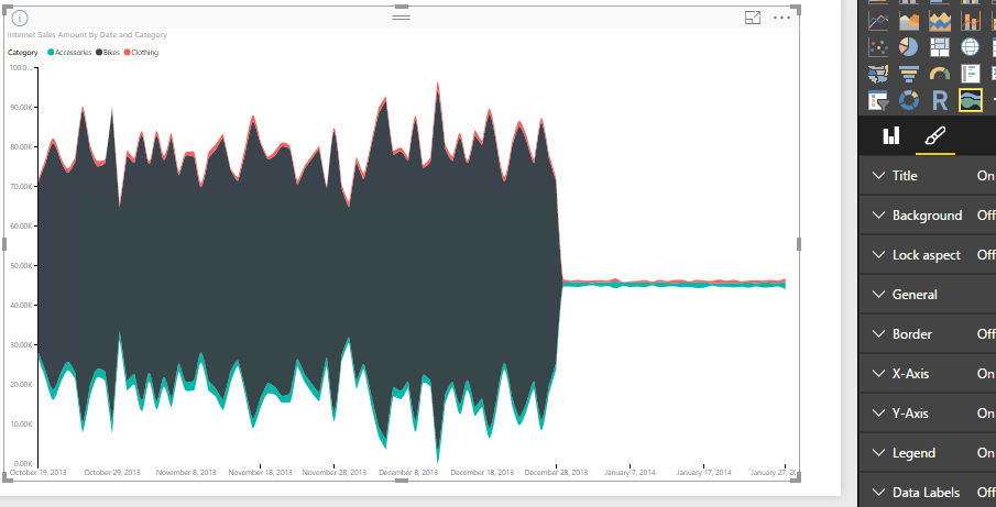
I haven't reproduced your issue. I'm working in Power BI Desktop May Update (2.35.4399.381).
This "wiggle" is resolved automatically. There's no setting for it. For how the "wiggle" generated internally, please contact Power BI Custom Visuals Support: pbicvsupport@microsoft.com
Regards,
- Mark as New
- Bookmark
- Subscribe
- Mute
- Subscribe to RSS Feed
- Permalink
- Report Inappropriate Content
Thanks. Maybe it's something weird with how my dates are formatted. I'll look into that. And thanks for the info on the "wiggle."
Helpful resources

Microsoft Fabric Learn Together
Covering the world! 9:00-10:30 AM Sydney, 4:00-5:30 PM CET (Paris/Berlin), 7:00-8:30 PM Mexico City

Power BI Monthly Update - April 2024
Check out the April 2024 Power BI update to learn about new features.

| User | Count |
|---|---|
| 110 | |
| 95 | |
| 76 | |
| 65 | |
| 51 |
| User | Count |
|---|---|
| 146 | |
| 109 | |
| 106 | |
| 88 | |
| 61 |


