- Power BI forums
- Updates
- News & Announcements
- Get Help with Power BI
- Desktop
- Service
- Report Server
- Power Query
- Mobile Apps
- Developer
- DAX Commands and Tips
- Custom Visuals Development Discussion
- Health and Life Sciences
- Power BI Spanish forums
- Translated Spanish Desktop
- Power Platform Integration - Better Together!
- Power Platform Integrations (Read-only)
- Power Platform and Dynamics 365 Integrations (Read-only)
- Training and Consulting
- Instructor Led Training
- Dashboard in a Day for Women, by Women
- Galleries
- Community Connections & How-To Videos
- COVID-19 Data Stories Gallery
- Themes Gallery
- Data Stories Gallery
- R Script Showcase
- Webinars and Video Gallery
- Quick Measures Gallery
- 2021 MSBizAppsSummit Gallery
- 2020 MSBizAppsSummit Gallery
- 2019 MSBizAppsSummit Gallery
- Events
- Ideas
- Custom Visuals Ideas
- Issues
- Issues
- Events
- Upcoming Events
- Community Blog
- Power BI Community Blog
- Custom Visuals Community Blog
- Community Support
- Community Accounts & Registration
- Using the Community
- Community Feedback
Register now to learn Fabric in free live sessions led by the best Microsoft experts. From Apr 16 to May 9, in English and Spanish.
- Power BI forums
- Forums
- Get Help with Power BI
- Desktop
- Strange Legend Error
- Subscribe to RSS Feed
- Mark Topic as New
- Mark Topic as Read
- Float this Topic for Current User
- Bookmark
- Subscribe
- Printer Friendly Page
- Mark as New
- Bookmark
- Subscribe
- Mute
- Subscribe to RSS Feed
- Permalink
- Report Inappropriate Content
Strange Legend Error
My stacked bar chart started acting strange after a refresh of my data. I don't even know how to explain it but it seems like my legend categories started breaking up for no reason.
Here's an example:
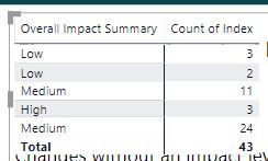
Count of index should be 35 for 'Medium' so 11 + 24 but for some reason in my visual these are not showing as one but rather as two separate bars - even the color is different and the one on the right doesn't even have data labels... and I have the same issue with all the other legend categories.
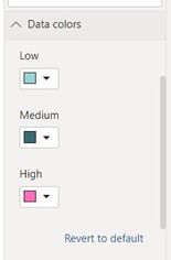
The weirdest thing is that when I go into format data color for this visual I only have the three options (Low, Medium, High - see screenshot) and there is no duplication of 'Medium' or 'Low' etc.
So my legend doesn't even sync up with what the visual shows.
I have no idea what might be causing this issue as literally nothing in the data has changed in the columns used in this visual.
Any ideas?
Solved! Go to Solution.
- Mark as New
- Bookmark
- Subscribe
- Mute
- Subscribe to RSS Feed
- Permalink
- Report Inappropriate Content
The strangest thing is that I have recreated the visual in a new report (copying and pasting all the query steps to make sure it is essentially the same data) and the visual works perfectly there! So it's definitely not the data but almost like something is broken in that specific Power BI report file itself.
- Mark as New
- Bookmark
- Subscribe
- Mute
- Subscribe to RSS Feed
- Permalink
- Report Inappropriate Content
Did anyone ever figure out the solution to this? I am having the exact same problem.
- Mark as New
- Bookmark
- Subscribe
- Mute
- Subscribe to RSS Feed
- Permalink
- Report Inappropriate Content
@mwimberger And I'm not even using measures in this visual:
But the strangest thing is that when I actually write a measure to calculate the number of 'Medium' ones for example then I get the correct 35.
- Mark as New
- Bookmark
- Subscribe
- Mute
- Subscribe to RSS Feed
- Permalink
- Report Inappropriate Content
Ahh right. @Anonymous
Have you checked that the difference between COUNT and COUNTA ? I think that is where the problem lies. Count ( in the visual with no measures ) will just count numbers, dates and strings and Counta in your measure will count numeric values as well as non blank values, including text, dates and logical values.
Let me know if that helps
Cheers
Manfred
- Mark as New
- Bookmark
- Subscribe
- Mute
- Subscribe to RSS Feed
- Permalink
- Report Inappropriate Content
hey @mwimberger
so not sure if I was clear enough on this but my measure is working perfectly. There is nothing wrong with the measure, it's when I DON'T use measures is when I start getting this issue. I'm just unsure why because it worked perfectly before but then started acting up after the latest refresh as mentioned in the OG post.
I don't actually want to use measures for this visual.
any ideas on how to make it work again?
- Mark as New
- Bookmark
- Subscribe
- Mute
- Subscribe to RSS Feed
- Permalink
- Report Inappropriate Content
@mwimberger Just to give you an idea what my data looks like it's something like this:
| Index | Overall Impact Summary |
| 1 | Low |
| 2 | Medium |
| 3 | Low |
| 4 | High |
| 5 | High |
- Mark as New
- Bookmark
- Subscribe
- Mute
- Subscribe to RSS Feed
- Permalink
- Report Inappropriate Content
The strangest thing is that I have recreated the visual in a new report (copying and pasting all the query steps to make sure it is essentially the same data) and the visual works perfectly there! So it's definitely not the data but almost like something is broken in that specific Power BI report file itself.
- Mark as New
- Bookmark
- Subscribe
- Mute
- Subscribe to RSS Feed
- Permalink
- Report Inappropriate Content
Hi @Anonymous
It may be that there is an "other" category with some data or calculated bands not being handled correctly. Might want to check the calculation by copying the legend to a matrix visual and seeing it there is a new category that is not Low , Medium or High. It may be that the <= , > logic has created a gap somewhere and didn't show up before with previous data.
I had this problem before and a check on the measures logic helped.
If you need help debgging the logic, maybe post that and I can give it a look over
Cheers
Manfred
- Mark as New
- Bookmark
- Subscribe
- Mute
- Subscribe to RSS Feed
- Permalink
- Report Inappropriate Content
- Mark as New
- Bookmark
- Subscribe
- Mute
- Subscribe to RSS Feed
- Permalink
- Report Inappropriate Content
Hi @Anonymous does your measure to assign bands have multiple "Low" and "Medium" Bands?
Here is something that I use to assign bandings.
Overall Impact Summary = switch(true(),

[IMPACT]>=0 && [IMPACT< 0.25  ,"Low"",
[IMPACT]>=0.25 && [IMPACT]< 0.5  ,"Medium"",
[IMPACT]>=0.5 && [IMPACT]< 1  ,"High"",
"Error")
If you need a table with upper and lower limits for bands I can give that example too.
Limit Band=
CALCULATE (
    VALUES ( tblBand[Band] ),
    FILTER (
        tblBand,
        [IMPACT] >tblBand[Lower Value]
            && [IMPACT]<= tblBand,[Upper Value]
    )
)
Where the tblBand may be something like this:
| Band | Lower Value | Upper Value |
| Low | 0 | 0.25 |
| Medium | 0.25 | 0.5 |
| High | 0.5 | 1 |
Helpful resources

Microsoft Fabric Learn Together
Covering the world! 9:00-10:30 AM Sydney, 4:00-5:30 PM CET (Paris/Berlin), 7:00-8:30 PM Mexico City

Power BI Monthly Update - April 2024
Check out the April 2024 Power BI update to learn about new features.

| User | Count |
|---|---|
| 114 | |
| 97 | |
| 85 | |
| 70 | |
| 61 |
| User | Count |
|---|---|
| 151 | |
| 120 | |
| 103 | |
| 87 | |
| 68 |


