- Power BI forums
- Updates
- News & Announcements
- Get Help with Power BI
- Desktop
- Service
- Report Server
- Power Query
- Mobile Apps
- Developer
- DAX Commands and Tips
- Custom Visuals Development Discussion
- Health and Life Sciences
- Power BI Spanish forums
- Translated Spanish Desktop
- Power Platform Integration - Better Together!
- Power Platform Integrations (Read-only)
- Power Platform and Dynamics 365 Integrations (Read-only)
- Training and Consulting
- Instructor Led Training
- Dashboard in a Day for Women, by Women
- Galleries
- Community Connections & How-To Videos
- COVID-19 Data Stories Gallery
- Themes Gallery
- Data Stories Gallery
- R Script Showcase
- Webinars and Video Gallery
- Quick Measures Gallery
- 2021 MSBizAppsSummit Gallery
- 2020 MSBizAppsSummit Gallery
- 2019 MSBizAppsSummit Gallery
- Events
- Ideas
- Custom Visuals Ideas
- Issues
- Issues
- Events
- Upcoming Events
- Community Blog
- Power BI Community Blog
- Custom Visuals Community Blog
- Community Support
- Community Accounts & Registration
- Using the Community
- Community Feedback
Register now to learn Fabric in free live sessions led by the best Microsoft experts. From Apr 16 to May 9, in English and Spanish.
- Power BI forums
- Forums
- Get Help with Power BI
- Desktop
- Stop Summarising Data in visualisation
- Subscribe to RSS Feed
- Mark Topic as New
- Mark Topic as Read
- Float this Topic for Current User
- Bookmark
- Subscribe
- Printer Friendly Page
- Mark as New
- Bookmark
- Subscribe
- Mute
- Subscribe to RSS Feed
- Permalink
- Report Inappropriate Content
Stop Summarising Data in visualisation
Hi All,
New user here - this is my first post on here...
I'm really struggling to show price data in a visualisation.
I have a range of products sold in a number of stores, each with a specific price, however, this price can change every week for any product in any store.
My data table has a row for every product, year, week, with a price specified in each row.
Example:
Store_ID Product_ID YEAR WEEK PRICE
Store_ID_1 Product_1 2017 1 150.00
Store_ID_1 Product_1 2017 2 150.00
Store_ID_1 Product_1 2017 3 152.00
Store_ID_1 Product_2 2017 1 90.00
Store_ID_1 Product_2 2017 2 91.00
Store_ID_1 Product_2 2017 3 91.00
Store_ID_2 Product_1 2017 1 135.00
Store_ID_2 Product_1 2017 2 137.00
Store_ID_2 Product_1 2017 3 144.00
Store_ID_2 Product_2 2017 1 89.00
Store_ID_2 Product_2 2017 2 90.00
Store_ID_2 Product_2 2017 3 90.00
...and so on....
I'm trying to create a visualisation that shows, on one line chart, each products' price varying over the weeks for each store, but I can't get PowerBI to show the actual price for each week.... it just always wants to show an average.
I have set the price column to not summarise in the data modelling, but this hasn't helped.
I have been able to create a matrix of the data which looks perfect, but I need this as a visual so that i can show trends.... is this possible please?
Many thanks.
- Mark as New
- Bookmark
- Subscribe
- Mute
- Subscribe to RSS Feed
- Permalink
- Report Inappropriate Content
Hi @Nickodemus,
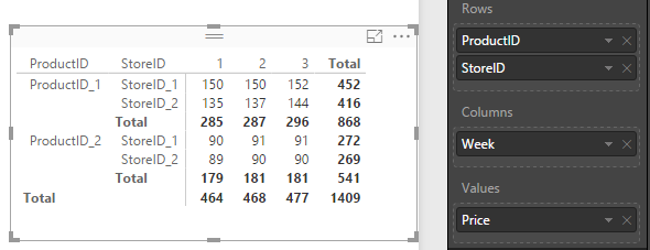
We are able to use a Matrix visual to show the trend of each products' price varying over the weeks for each storeID, because we can add multiple row groups or column groups in a matrix, as is shown from below image.
However, if you want to convert this matrix to a line chart, ideally, there should display four lines to show the trend on one chart. It is not available to do that now, because we are not allowed to add both [StoreID] and [ProductID] into legend. So, I'm afraid, your requirement cannot be achieved now.
By the way, in a chart, values will be aggregated by default, but if we desgin the chart correctly, the aggregated result is the same as its actual value.
Best regards,
Yuliana Gu
If this post helps, then please consider Accept it as the solution to help the other members find it more quickly.
- Mark as New
- Bookmark
- Subscribe
- Mute
- Subscribe to RSS Feed
- Permalink
- Report Inappropriate Content
Without seeing your data model or PBIX file it is hard to answer, but my guess is that if you are using weeks as the axis, there are multiple prices per week for a given product, and thus you will get some aggregation (i.e. average). You need to have exactly one data point per product per store for every X axis increment to avoid aggregating.
Try creating a new column:
[Year]*100+[Week]
This will give you an index, i.e. 201701, 201702 etc. Use this as your axis and see if it works better.
Feel free to share the PBIX if you want a more precise answer (or give us your data, anonomyzed is okay).
- Mark as New
- Bookmark
- Subscribe
- Mute
- Subscribe to RSS Feed
- Permalink
- Report Inappropriate Content
@dkay84_PowerBI - thanks for the reply. I've tried that, i think i'm getting somewhere.
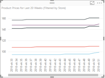
But I have had to adjust my expectations, and have applied a filter for each store to see individual product level data. At the aggregated level it shows average product price per store, which is probably still quite interesting.The next problem I have is that, because the price changes are so small and relatively infrequent, the chart looks pretty flat. Is there a good way to amplify the appearance of the line, to exaggerate the changes?
@v-yulgu-msft- thanks for you reply too. That matrix looks exactly like the one I've managed to create... I think I'm finally getting there.
Helpful resources

Microsoft Fabric Learn Together
Covering the world! 9:00-10:30 AM Sydney, 4:00-5:30 PM CET (Paris/Berlin), 7:00-8:30 PM Mexico City

Power BI Monthly Update - April 2024
Check out the April 2024 Power BI update to learn about new features.

| User | Count |
|---|---|
| 111 | |
| 95 | |
| 80 | |
| 68 | |
| 59 |
| User | Count |
|---|---|
| 150 | |
| 119 | |
| 104 | |
| 87 | |
| 67 |


