- Power BI forums
- Updates
- News & Announcements
- Get Help with Power BI
- Desktop
- Service
- Report Server
- Power Query
- Mobile Apps
- Developer
- DAX Commands and Tips
- Custom Visuals Development Discussion
- Health and Life Sciences
- Power BI Spanish forums
- Translated Spanish Desktop
- Power Platform Integration - Better Together!
- Power Platform Integrations (Read-only)
- Power Platform and Dynamics 365 Integrations (Read-only)
- Training and Consulting
- Instructor Led Training
- Dashboard in a Day for Women, by Women
- Galleries
- Community Connections & How-To Videos
- COVID-19 Data Stories Gallery
- Themes Gallery
- Data Stories Gallery
- R Script Showcase
- Webinars and Video Gallery
- Quick Measures Gallery
- 2021 MSBizAppsSummit Gallery
- 2020 MSBizAppsSummit Gallery
- 2019 MSBizAppsSummit Gallery
- Events
- Ideas
- Custom Visuals Ideas
- Issues
- Issues
- Events
- Upcoming Events
- Community Blog
- Power BI Community Blog
- Custom Visuals Community Blog
- Community Support
- Community Accounts & Registration
- Using the Community
- Community Feedback
Register now to learn Fabric in free live sessions led by the best Microsoft experts. From Apr 16 to May 9, in English and Spanish.
- Power BI forums
- Forums
- Get Help with Power BI
- Desktop
- Stacking Accumulated Values, Legend Split by Year ...
- Subscribe to RSS Feed
- Mark Topic as New
- Mark Topic as Read
- Float this Topic for Current User
- Bookmark
- Subscribe
- Printer Friendly Page
- Mark as New
- Bookmark
- Subscribe
- Mute
- Subscribe to RSS Feed
- Permalink
- Report Inappropriate Content
Stacking Accumulated Values, Legend Split by Year in a Line Graph
Hi - slightly tearing myself apart over this one - feels like i'm so close.
Basically, I have the following table:
| id | value | year | AsOfDate |
| 1 | 45.34 | 2020 | 31 December 2020 |
| 2 | 44.10 | 2021 | 15 March 2021 |
| 3 | 10.12 | 2021 | 18 April 2021 |
| 4 | 9.12 | 2020 | 10 December 2020 |
| 5 | 8.15 | 2019 | 06 June 2019 |
For my line chart:
Axes
AsOfDate
Legend
Year
Value
PnL
PnL is the following measure:
PnL = calculate(sum(DailyPnl[Value]), DATESYTD(DailyPnl[AsOfDate],"31/12"))
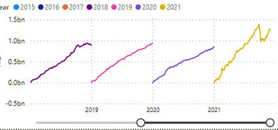
The graph comes out like the following
However, no matter how many combinations I've tried, I cannot get these bound together rather than a rolling timeline - I just want a year window with each year legend spanned across it and sort of overlapping.
What am I missing?
- Mark as New
- Bookmark
- Subscribe
- Mute
- Subscribe to RSS Feed
- Permalink
- Report Inappropriate Content
Hi,
I am not sure of what sort of a graph do you want but this is the approach you should follow:
- Create a Calendar Table with Year as a calculated column
- Build a relationship from the AsofDate column of the DailyPnL Table to the Date column of the Calendar Table
- To your visual, drag Year from the Calendar Table
- Write these measures
- Total = SUM(DailyPnL[Value])
- Total YTD = calculate([Total],datesytd(calendar[Date],"31/12"))
Hope this helps.
Regards,
Ashish Mathur
http://www.ashishmathur.com
https://www.linkedin.com/in/excelenthusiasts/
- Mark as New
- Bookmark
- Subscribe
- Mute
- Subscribe to RSS Feed
- Permalink
- Report Inappropriate Content
Thanks Ashish. Unfortunately it didn't work. I get the same chart as above. I put the Date from my date table into the Axis as you said, the Year from the date table conditional column I had into the Legend and the PnL measure into the Values.
Just to clarify, each year should span across a year window period of time in the chart. So they should all be clumped together, and being accumulative, all be rising upwards together agains each month
- Mark as New
- Bookmark
- Subscribe
- Mute
- Subscribe to RSS Feed
- Permalink
- Report Inappropriate Content
Share the link from where i can download your PBI file.
Regards,
Ashish Mathur
http://www.ashishmathur.com
https://www.linkedin.com/in/excelenthusiasts/
- Mark as New
- Bookmark
- Subscribe
- Mute
- Subscribe to RSS Feed
- Permalink
- Report Inappropriate Content
@Anonymous , based on what I got, If need overlapping you need measures not legend and you will not get year wise label. Also Always use date table for time intelligence
PnL = calculate(sum(DailyPnl[Value]), DATESYTD(Date[Date],"31/12"))

PnL LY= calculate(sum(DailyPnl[Value]), DATESYTD(dateadd(Date[Date],-1,year),"31/12"))

PnL LLY= calculate(sum(DailyPnl[Value]), DATESYTD(dateadd(Date[Date],-2,year),"31/12"))

PnL L2LY= calculate(sum(DailyPnl[Value]), DATESYTD(dateadd(Date[Date],-3,year),"31/12"))
Can you share sample data and sample output in table format? Or a sample pbix after removing sensitive data.
Microsoft Power BI Learning Resources, 2023 !!
Learn Power BI - Full Course with Dec-2022, with Window, Index, Offset, 100+ Topics !!
Did I answer your question? Mark my post as a solution! Appreciate your Kudos !! Proud to be a Super User! !!
Helpful resources

Microsoft Fabric Learn Together
Covering the world! 9:00-10:30 AM Sydney, 4:00-5:30 PM CET (Paris/Berlin), 7:00-8:30 PM Mexico City

Power BI Monthly Update - April 2024
Check out the April 2024 Power BI update to learn about new features.

| User | Count |
|---|---|
| 116 | |
| 105 | |
| 69 | |
| 67 | |
| 43 |
| User | Count |
|---|---|
| 148 | |
| 103 | |
| 103 | |
| 88 | |
| 66 |

