- Power BI forums
- Updates
- News & Announcements
- Get Help with Power BI
- Desktop
- Service
- Report Server
- Power Query
- Mobile Apps
- Developer
- DAX Commands and Tips
- Custom Visuals Development Discussion
- Health and Life Sciences
- Power BI Spanish forums
- Translated Spanish Desktop
- Power Platform Integration - Better Together!
- Power Platform Integrations (Read-only)
- Power Platform and Dynamics 365 Integrations (Read-only)
- Training and Consulting
- Instructor Led Training
- Dashboard in a Day for Women, by Women
- Galleries
- Community Connections & How-To Videos
- COVID-19 Data Stories Gallery
- Themes Gallery
- Data Stories Gallery
- R Script Showcase
- Webinars and Video Gallery
- Quick Measures Gallery
- 2021 MSBizAppsSummit Gallery
- 2020 MSBizAppsSummit Gallery
- 2019 MSBizAppsSummit Gallery
- Events
- Ideas
- Custom Visuals Ideas
- Issues
- Issues
- Events
- Upcoming Events
- Community Blog
- Power BI Community Blog
- Custom Visuals Community Blog
- Community Support
- Community Accounts & Registration
- Using the Community
- Community Feedback
Register now to learn Fabric in free live sessions led by the best Microsoft experts. From Apr 16 to May 9, in English and Spanish.
- Power BI forums
- Forums
- Get Help with Power BI
- Desktop
- Re: Stacked chart and date drilldown
- Subscribe to RSS Feed
- Mark Topic as New
- Mark Topic as Read
- Float this Topic for Current User
- Bookmark
- Subscribe
- Printer Friendly Page
- Mark as New
- Bookmark
- Subscribe
- Mute
- Subscribe to RSS Feed
- Permalink
- Report Inappropriate Content
Stacked chart and date drilldown
Hello
I have a two tables with date/time and several columns worth of data in each. I have for each created a Date column without the time, and created a separate table with just a Date in it as well. All Date tables are set up with a hieracy Year, Qtr, Month, Date and the two tables with date have a Many-One relationsship with the Date table.
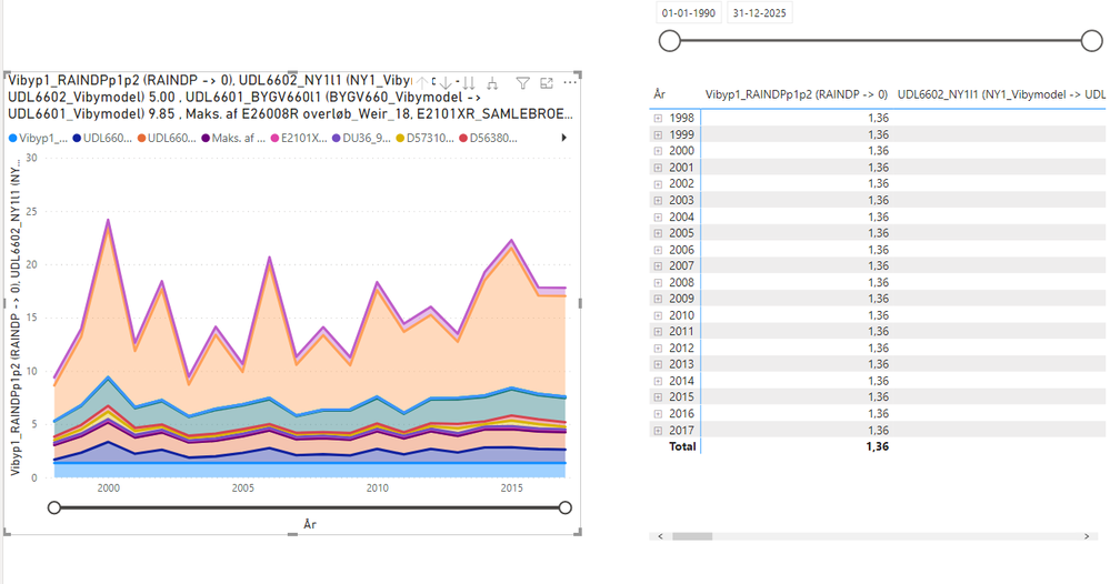
I currently have a stacked chart with axis as date and values set to max. My problem is when I would like to click 2012 for example, and then the Stacked bar chart should zoom in and show values spread out over 2012 from january-december. Instead it just shows the values for that year as dot.
How do I go about getting it to "zoom" correctly to that area? Or for instance can I use a Slicer with dates and then get it too zoom after that?
Solved! Go to Solution.
- Mark as New
- Bookmark
- Subscribe
- Mute
- Subscribe to RSS Feed
- Permalink
- Report Inappropriate Content
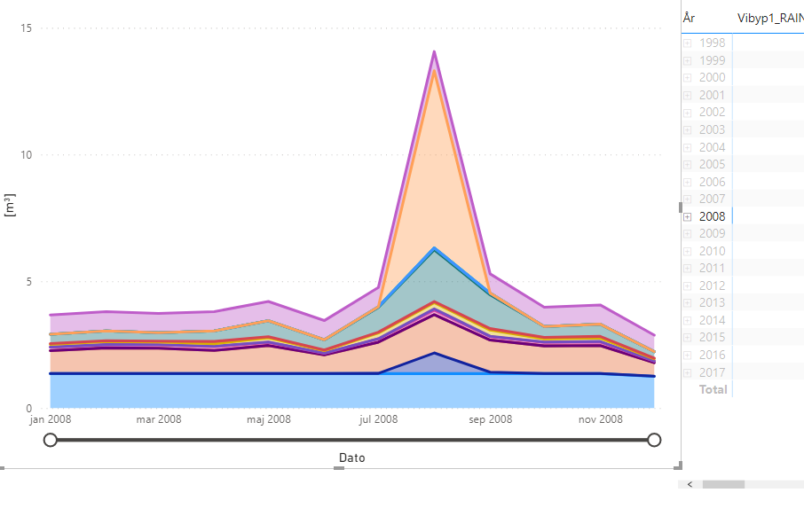
It seems I can get around it if i Click on a year in my Matrix, and afterwards right-click my Stacked Chart and use Expand to next level (paraphrasing, my language is danish).
Then I can get it too show values like I would have them. But is possible to this as default and dynamicly with the matrix?
- Mark as New
- Bookmark
- Subscribe
- Mute
- Subscribe to RSS Feed
- Permalink
- Report Inappropriate Content
Hi ,
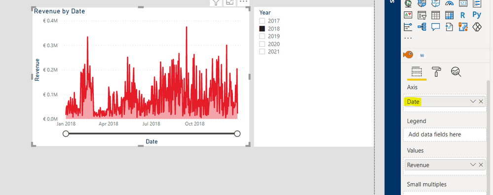
Could you verify whether you are using the date or the year in the axis? If you have the date selected, it should still show all dates within the year interval you filter. If you used year in the axis it will indeed only return a dot since it will aggregate the values by year. Below you'll find an example:
Best regards,
Tim
Did I answer your question? Mark my post as a solution!
Proud to be a Super User!
- Mark as New
- Bookmark
- Subscribe
- Mute
- Subscribe to RSS Feed
- Permalink
- Report Inappropriate Content
I have the hierachy added.
- Mark as New
- Bookmark
- Subscribe
- Mute
- Subscribe to RSS Feed
- Permalink
- Report Inappropriate Content
It seems I can get around it if i Click on a year in my Matrix, and afterwards right-click my Stacked Chart and use Expand to next level (paraphrasing, my language is danish).
Then I can get it too show values like I would have them. But is possible to this as default and dynamicly with the matrix?
- Mark as New
- Bookmark
- Subscribe
- Mute
- Subscribe to RSS Feed
- Permalink
- Report Inappropriate Content
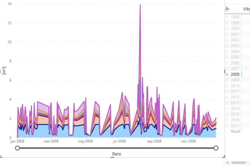
A yes I see, yeah you can have the visual automatically change the axis size/labels by placing only the date column in the axis (not the hierarchy). the hierarchy will fix the visual on the level you have drilled down to. When just using the date column it will automatically change the labels based on how large your selection is.
Did I answer your question? Mark my post as a solution!
Proud to be a Super User!
Helpful resources

Microsoft Fabric Learn Together
Covering the world! 9:00-10:30 AM Sydney, 4:00-5:30 PM CET (Paris/Berlin), 7:00-8:30 PM Mexico City

Power BI Monthly Update - April 2024
Check out the April 2024 Power BI update to learn about new features.

| User | Count |
|---|---|
| 110 | |
| 98 | |
| 78 | |
| 64 | |
| 55 |
| User | Count |
|---|---|
| 143 | |
| 109 | |
| 89 | |
| 84 | |
| 66 |


