- Power BI forums
- Updates
- News & Announcements
- Get Help with Power BI
- Desktop
- Service
- Report Server
- Power Query
- Mobile Apps
- Developer
- DAX Commands and Tips
- Custom Visuals Development Discussion
- Health and Life Sciences
- Power BI Spanish forums
- Translated Spanish Desktop
- Power Platform Integration - Better Together!
- Power Platform Integrations (Read-only)
- Power Platform and Dynamics 365 Integrations (Read-only)
- Training and Consulting
- Instructor Led Training
- Dashboard in a Day for Women, by Women
- Galleries
- Community Connections & How-To Videos
- COVID-19 Data Stories Gallery
- Themes Gallery
- Data Stories Gallery
- R Script Showcase
- Webinars and Video Gallery
- Quick Measures Gallery
- 2021 MSBizAppsSummit Gallery
- 2020 MSBizAppsSummit Gallery
- 2019 MSBizAppsSummit Gallery
- Events
- Ideas
- Custom Visuals Ideas
- Issues
- Issues
- Events
- Upcoming Events
- Community Blog
- Power BI Community Blog
- Custom Visuals Community Blog
- Community Support
- Community Accounts & Registration
- Using the Community
- Community Feedback
Register now to learn Fabric in free live sessions led by the best Microsoft experts. From Apr 16 to May 9, in English and Spanish.
- Power BI forums
- Forums
- Get Help with Power BI
- Desktop
- Stacked bar chart with Y axis values and data labe...
- Subscribe to RSS Feed
- Mark Topic as New
- Mark Topic as Read
- Float this Topic for Current User
- Bookmark
- Subscribe
- Printer Friendly Page
- Mark as New
- Bookmark
- Subscribe
- Mute
- Subscribe to RSS Feed
- Permalink
- Report Inappropriate Content
Stacked bar chart with Y axis values and data labels as %
Hi
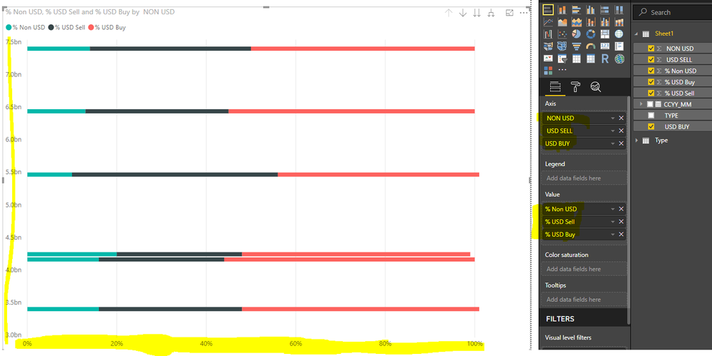
I want to plot the following in a stacked bar chart (USD BUY, Sell and Non USD) but want the Y axis to be $ and the data labels to be the percentages of the total. Is this possible?
TYPE | CCYY_MM | USD BUY | USD SELL | NON USD | % USD Buy | % USD Sell | % Non USD | |
Type 1 | 2018-07 | 25,433,171,832 | 26,007,534,928 | 5,465,037,778 | 45% | 46% | 10% | |
2018-08 | 25,490,106,878 | 18,339,329,069 | 7,397,680,867 | 50% | 36% | 14% | ||
2018-09 | 26,357,963,060 | 15,342,844,028 | 6,436,374,013 | 55% | 32% | 13% | ||
Type 2 | 2018-07 | 11,438,590,452 | 6,942,432,706 | 3,400,535,273 | 53% | 32% | 16% | |
2018-08 | 10,657,977,063 | 5,922,456,964 | 4,242,688,476 | 51% | 28% | 20% | ||
2018-09 | 14,324,124,841 | 7,289,472,789 | 4,162,251,854 | 56% | 28% | 16% | ||
- Mark as New
- Bookmark
- Subscribe
- Mute
- Subscribe to RSS Feed
- Permalink
- Report Inappropriate Content
Hi @nsaray,
I'm a little confused about your requirement.
Do you want the stacked bar chart like below?
Best Regards,
Cherry
If this post helps, then please consider Accept it as the solution to help the other members find it more quickly.
- Mark as New
- Bookmark
- Subscribe
- Mute
- Subscribe to RSS Feed
- Permalink
- Report Inappropriate Content
Hi
I want to plot the following in a stacked bar chart (USD BUY, Sell and Non USD) but want the Y axis to be $ and the data labels to be the percentages of the total. Is this possible?
TYPE | CCYY_MM | USD BUY | USD SELL | NON USD | % USD Buy | % USD Sell | % Non USD | |
Type 1 | 2018-07 | 25,433,171,832 | 26,007,534,928 | 5,465,037,778 | 45% | 46% | 10% | |
2018-08 | 25,490,106,878 | 18,339,329,069 | 7,397,680,867 | 50% | 36% | 14% | ||
2018-09 | 26,357,963,060 | 15,342,844,028 | 6,436,374,013 | 55% | 32% | 13% | ||
Type 2 | 2018-07 | 11,438,590,452 | 6,942,432,706 | 3,400,535,273 | 53% | 32% | 16% | |
2018-08 | 10,657,977,063 | 5,922,456,964 | 4,242,688,476 | 51% | 28% | 20% | ||
2018-09 | 14,324,124,841 | 7,289,472,789 | 4,162,251,854 | 56% | 28% | 16% | ||
- Mark as New
- Bookmark
- Subscribe
- Mute
- Subscribe to RSS Feed
- Permalink
- Report Inappropriate Content
Hi @nsaray,
It is better to show %Value in your tooltip. Because directly we can not achieve directly but in tricky way we can show this to user. We have to use two chart.
For 1 chart just disable title and legend and keep both axis and in 2nd chart just off both axis then enable data level on 2nd chart as %Value.
Here i have created sample from your file. Please find the link.
Helpful resources

Microsoft Fabric Learn Together
Covering the world! 9:00-10:30 AM Sydney, 4:00-5:30 PM CET (Paris/Berlin), 7:00-8:30 PM Mexico City

Power BI Monthly Update - April 2024
Check out the April 2024 Power BI update to learn about new features.

| User | Count |
|---|---|
| 114 | |
| 99 | |
| 83 | |
| 70 | |
| 60 |
| User | Count |
|---|---|
| 150 | |
| 115 | |
| 104 | |
| 89 | |
| 65 |

