- Power BI forums
- Updates
- News & Announcements
- Get Help with Power BI
- Desktop
- Service
- Report Server
- Power Query
- Mobile Apps
- Developer
- DAX Commands and Tips
- Custom Visuals Development Discussion
- Health and Life Sciences
- Power BI Spanish forums
- Translated Spanish Desktop
- Power Platform Integration - Better Together!
- Power Platform Integrations (Read-only)
- Power Platform and Dynamics 365 Integrations (Read-only)
- Training and Consulting
- Instructor Led Training
- Dashboard in a Day for Women, by Women
- Galleries
- Community Connections & How-To Videos
- COVID-19 Data Stories Gallery
- Themes Gallery
- Data Stories Gallery
- R Script Showcase
- Webinars and Video Gallery
- Quick Measures Gallery
- 2021 MSBizAppsSummit Gallery
- 2020 MSBizAppsSummit Gallery
- 2019 MSBizAppsSummit Gallery
- Events
- Ideas
- Custom Visuals Ideas
- Issues
- Issues
- Events
- Upcoming Events
- Community Blog
- Power BI Community Blog
- Custom Visuals Community Blog
- Community Support
- Community Accounts & Registration
- Using the Community
- Community Feedback
Register now to learn Fabric in free live sessions led by the best Microsoft experts. From Apr 16 to May 9, in English and Spanish.
- Power BI forums
- Forums
- Get Help with Power BI
- Desktop
- Stacked bar chart presenting starts/stops of day
- Subscribe to RSS Feed
- Mark Topic as New
- Mark Topic as Read
- Float this Topic for Current User
- Bookmark
- Subscribe
- Printer Friendly Page
- Mark as New
- Bookmark
- Subscribe
- Mute
- Subscribe to RSS Feed
- Permalink
- Report Inappropriate Content
Stacked bar chart presenting starts/stops of day
I want to visualize the events (1=run/0=stop) of the current day by showing a stacked bar as presented in the picutre below where the width auto adjusts to the value. This is somewhat familiar to what I have seen with having both X/Y-axis categories i guess but maybe there is a work around or a different way of doing this?
I get this result in a normal stacked bar chart.
The waterfall chart is not far from what I need even if it builds in X/Y-axis but the x-axis should be continuos as above, not categorical. Also the events 1/0 should have to indicate instead of a breakdown.
Solved! Go to Solution.
- Mark as New
- Bookmark
- Subscribe
- Mute
- Subscribe to RSS Feed
- Permalink
- Report Inappropriate Content
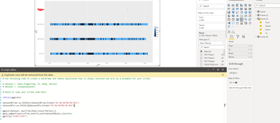
Was able to find a solution with R-script.
library(ggplot2)

dataset$From<-as.POSIXct(dataset$From,format="%Y-%m-%dT%H:%M:%OS")
dataset$To<-as.POSIXct(dataset$To,format="%Y-%m-%dT%H:%M:%OS")

ggplot(dataset, aes(From,Room,colour=Person))+
geom_segment(aes(x=From,xend=To,yend=dataset$Room),size=10)+
ggtitle("START/STOP")
- Mark as New
- Bookmark
- Subscribe
- Mute
- Subscribe to RSS Feed
- Permalink
- Report Inappropriate Content
HI @lukasjar ,
What I did was the following:
- Added a colum with the end time (power query):
[TimeStampStart] + #duration(0,0,[Hours]*60,0)- Assume you have a calendar table and a hour table
- Created the following measure:
OnOFF =
IF (
    MAX ( Hours[Half hour] )
        <= MAXX ( ALLSELECTED ( 'Table'[ENDTIME] ), 'Table'[ENDTIME] ),
    MAXX (
        TOPN (
            1,
            FILTER ( 'Table', 'Table'[TimeStampStart] <= MIN ( Hours[Half hour] ) ),
            'Table'[TimeStampStart]
        ),
        'Table'[Event]
    )
)
- Created a matrix with condittional formatting based on the value:
Check PBIX file attach.
Regards
Miguel Félix
Did I answer your question? Mark my post as a solution!
Proud to be a Super User!
Check out my blog: Power BI em Português- Mark as New
- Bookmark
- Subscribe
- Mute
- Subscribe to RSS Feed
- Permalink
- Report Inappropriate Content
Was able to find a solution with R-script.
library(ggplot2)

dataset$From<-as.POSIXct(dataset$From,format="%Y-%m-%dT%H:%M:%OS")
dataset$To<-as.POSIXct(dataset$To,format="%Y-%m-%dT%H:%M:%OS")

ggplot(dataset, aes(From,Room,colour=Person))+
geom_segment(aes(x=From,xend=To,yend=dataset$Room),size=10)+
ggtitle("START/STOP")
- Mark as New
- Bookmark
- Subscribe
- Mute
- Subscribe to RSS Feed
- Permalink
- Report Inappropriate Content
Hello!
Sorry but the matrix is static and the column width does not adjust to the value.
- Mark as New
- Bookmark
- Subscribe
- Mute
- Subscribe to RSS Feed
- Permalink
- Report Inappropriate Content
Hi @lukasjar ,
No problem, I made the matrix to have 30 minutes intervals so the bars would correspond to the half hour periods and when you add adjacent periods it would be a bigger bar. and the making some more adjustements with conditional formatting you could show and hide other values.
But understand that your requirements may change with a full dataset glad you were abble to figure it out.
By the way I have no knowledge of R 😁.
Regards
Miguel Félix
Did I answer your question? Mark my post as a solution!
Proud to be a Super User!
Check out my blog: Power BI em Português- Mark as New
- Bookmark
- Subscribe
- Mute
- Subscribe to RSS Feed
- Permalink
- Report Inappropriate Content
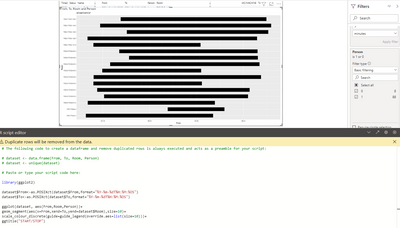
Using R-script I have been able to plot the events as shown in the picture below. The issue I have now is to have different colours depending on the value of category "Person".
Any suggestions on what to change to get different colors?
library(ggplot2)

dataset$From<-as.POSIXct(dataset$From,format="%Y-%m-%dT%H:%M:%OS")
dataset$To<-as.POSIXct(dataset$To,format="%Y-%m-%dT%H:%M:%OS")

ggplot(dataset, aes(From,Room,Person))+
geom_segment(aes(x=From,xend=To,yend=dataset$Room),size=10)+
scale_colour_discrete(guide=guide_legend(override.aes=list(size=10)))+
ggtitle("START/STOP")
Timestamps (from/to) are formated as datetime and room/person is formated as text.
Helpful resources

Microsoft Fabric Learn Together
Covering the world! 9:00-10:30 AM Sydney, 4:00-5:30 PM CET (Paris/Berlin), 7:00-8:30 PM Mexico City

Power BI Monthly Update - April 2024
Check out the April 2024 Power BI update to learn about new features.

| User | Count |
|---|---|
| 110 | |
| 95 | |
| 76 | |
| 65 | |
| 51 |
| User | Count |
|---|---|
| 146 | |
| 109 | |
| 106 | |
| 88 | |
| 61 |


