- Power BI forums
- Updates
- News & Announcements
- Get Help with Power BI
- Desktop
- Service
- Report Server
- Power Query
- Mobile Apps
- Developer
- DAX Commands and Tips
- Custom Visuals Development Discussion
- Health and Life Sciences
- Power BI Spanish forums
- Translated Spanish Desktop
- Power Platform Integration - Better Together!
- Power Platform Integrations (Read-only)
- Power Platform and Dynamics 365 Integrations (Read-only)
- Training and Consulting
- Instructor Led Training
- Dashboard in a Day for Women, by Women
- Galleries
- Community Connections & How-To Videos
- COVID-19 Data Stories Gallery
- Themes Gallery
- Data Stories Gallery
- R Script Showcase
- Webinars and Video Gallery
- Quick Measures Gallery
- 2021 MSBizAppsSummit Gallery
- 2020 MSBizAppsSummit Gallery
- 2019 MSBizAppsSummit Gallery
- Events
- Ideas
- Custom Visuals Ideas
- Issues
- Issues
- Events
- Upcoming Events
- Community Blog
- Power BI Community Blog
- Custom Visuals Community Blog
- Community Support
- Community Accounts & Registration
- Using the Community
- Community Feedback
Register now to learn Fabric in free live sessions led by the best Microsoft experts. From Apr 16 to May 9, in English and Spanish.
- Power BI forums
- Forums
- Get Help with Power BI
- Desktop
- Stacked Line Charts Across Date
- Subscribe to RSS Feed
- Mark Topic as New
- Mark Topic as Read
- Float this Topic for Current User
- Bookmark
- Subscribe
- Printer Friendly Page
- Mark as New
- Bookmark
- Subscribe
- Mute
- Subscribe to RSS Feed
- Permalink
- Report Inappropriate Content
Stacked Line Charts Across Date
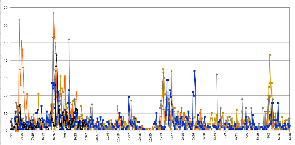
So we are working in Power BI and I am having some difficulty with displaying a specific need in a line chart. In short we track certain types of issues in our CRM. We need to display the data based not on calendar year but rather by year starting from 7/1-6/30. Since each entry has a creation time in it's own year, if I use that to display my line chart I cant overlap the data. What I need to do is be able to break the data down by month/day and display overlapping lines to see peaks in given years. When I do this by customising a column it displays it the way I want except it has a long chart that you have to scroll through. I need the ability to display the chart in a Continuous Type so it will simply only take up the space of the width of the chart itself. The first image is what I have in Power BI currently and the second image is what we need it to do, as it currently does in Excel.
- Mark as New
- Bookmark
- Subscribe
- Mute
- Subscribe to RSS Feed
- Permalink
- Report Inappropriate Content
Hi @dhouchin,
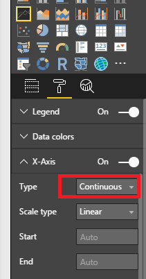
In a line chart, we are able to change the X-Axis type as Continuous via below property:
But it requires the A-axis field to be Date type or Number type. In your scenario, it seems you are using text data type in A-axis, please change it to Date field like "2016-07-01".
Best Regards,
Qiuyun Yu
If this post helps, then please consider Accept it as the solution to help the other members find it more quickly.
- Mark as New
- Bookmark
- Subscribe
- Mute
- Subscribe to RSS Feed
- Permalink
- Report Inappropriate Content
I appreciate your reply to this message, however as I noted in my original post, I need to see the data outlined in a method where the different years are their own line and the X axis only shows the Month/Day. I have tried the formating options you listed below, and they do not work as they show each year throughout the chart and not one on top of the other. Is there any other option out there?
- Mark as New
- Bookmark
- Subscribe
- Mute
- Subscribe to RSS Feed
- Permalink
- Report Inappropriate Content
I think you want to display daily data on a Monthly axis?
In Excel when you change the width of the chart to make it smaller the X-Axis will adjust from days to months and then even start skipping months etc..
So even if you are displaying daily data it will start showing you the Months as you make the chart smaller!
I believe this is what you are asking for - unfortunately PBI will not act the same way you'll get the scroll bar.
- Mark as New
- Bookmark
- Subscribe
- Mute
- Subscribe to RSS Feed
- Permalink
- Report Inappropriate Content
@Sean,You are right in regards to how Excel works and basically that is exactly what I need to replicate if possible.
- Mark as New
- Bookmark
- Subscribe
- Mute
- Subscribe to RSS Feed
- Permalink
- Report Inappropriate Content
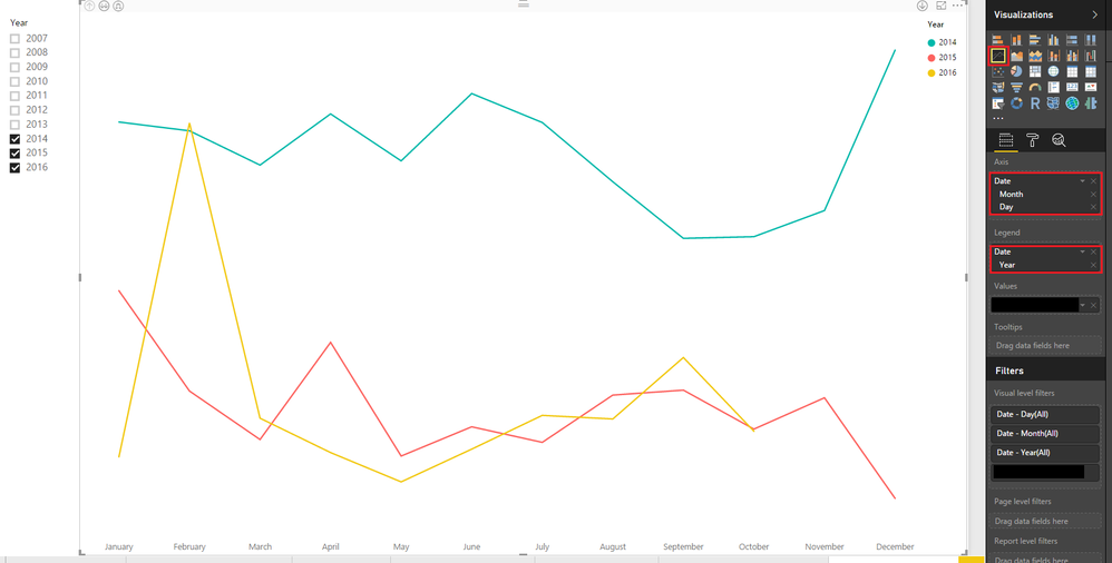
@dhouchin You can try something like this set up (although you'll have to adjust for your Fiscal Year)
- Mark as New
- Bookmark
- Subscribe
- Mute
- Subscribe to RSS Feed
- Permalink
- Report Inappropriate Content
@dhouchin I think the October Update may help you!
Read the Section for "Improved Date Axis Range Formatting" here
https://powerbi.microsoft.com/en-us/blog/power-bi-desktop-october-feature-summary/
It seems we got excatly the bahavior I mentioned - make the chart smaller and the Axis Labels adjust automatically!
However the X-Axis has to be continous for this to work!
Helpful resources

Microsoft Fabric Learn Together
Covering the world! 9:00-10:30 AM Sydney, 4:00-5:30 PM CET (Paris/Berlin), 7:00-8:30 PM Mexico City

Power BI Monthly Update - April 2024
Check out the April 2024 Power BI update to learn about new features.

| User | Count |
|---|---|
| 111 | |
| 97 | |
| 80 | |
| 69 | |
| 59 |
| User | Count |
|---|---|
| 150 | |
| 119 | |
| 104 | |
| 87 | |
| 67 |


