- Power BI forums
- Updates
- News & Announcements
- Get Help with Power BI
- Desktop
- Service
- Report Server
- Power Query
- Mobile Apps
- Developer
- DAX Commands and Tips
- Custom Visuals Development Discussion
- Health and Life Sciences
- Power BI Spanish forums
- Translated Spanish Desktop
- Power Platform Integration - Better Together!
- Power Platform Integrations (Read-only)
- Power Platform and Dynamics 365 Integrations (Read-only)
- Training and Consulting
- Instructor Led Training
- Dashboard in a Day for Women, by Women
- Galleries
- Community Connections & How-To Videos
- COVID-19 Data Stories Gallery
- Themes Gallery
- Data Stories Gallery
- R Script Showcase
- Webinars and Video Gallery
- Quick Measures Gallery
- 2021 MSBizAppsSummit Gallery
- 2020 MSBizAppsSummit Gallery
- 2019 MSBizAppsSummit Gallery
- Events
- Ideas
- Custom Visuals Ideas
- Issues
- Issues
- Events
- Upcoming Events
- Community Blog
- Power BI Community Blog
- Custom Visuals Community Blog
- Community Support
- Community Accounts & Registration
- Using the Community
- Community Feedback
Register now to learn Fabric in free live sessions led by the best Microsoft experts. From Apr 16 to May 9, in English and Spanish.
- Power BI forums
- Forums
- Get Help with Power BI
- Desktop
- Stacked Column chart - Totals
- Subscribe to RSS Feed
- Mark Topic as New
- Mark Topic as Read
- Float this Topic for Current User
- Bookmark
- Subscribe
- Printer Friendly Page
- Mark as New
- Bookmark
- Subscribe
- Mute
- Subscribe to RSS Feed
- Permalink
- Report Inappropriate Content
Stacked Column chart - Totals
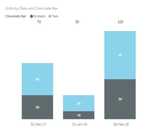
Hi, am struggling on creating a view using the Stacked Column visual, which represents two fields - IT cost and Total costs. I would like to have the IT costs as part of the Total Costs, however, the graph shows me a sum of both, which is not correct. How can I change this?
I thought by creating another column, called Other costs ( Total costs - IT costs) and simply have a sum of both then, however, would be brilliant if on top, I could see a data label showing me the sum. If this is the solution, how do I get this label?
Thanks , Atanas
- Mark as New
- Bookmark
- Subscribe
- Mute
- Subscribe to RSS Feed
- Permalink
- Report Inappropriate Content
Frustrated that PBI does not have a simple Total to a stacked column/bar graph I am now using matrix tables on my graphs. I have multi periods and therefore the card method is not ideal.
Steps: Create a Matrix Table >> Change Column Header Font Color & Background to White >> Turn off the Auto-Size for Column Headers >> Outline to None >> Do the same for Row Headers>> Change Grid Outline color to white >> Send the Matrix Table to back.
Hope this helps. It is not perfect but at least takes care of multi-period bar graphs provided the number of periods is constant.
- Mark as New
- Bookmark
- Subscribe
- Mute
- Subscribe to RSS Feed
- Permalink
- Report Inappropriate Content
Create a card visualization and put Total Cost in it and then place it above your column.
Unfortunately, the stacked column visualization does not allow you to have a reference line tied to a column or measure, it only currently supports a Constant line.
@ me in replies or I'll lose your thread!!!
Instead of a Kudo, please vote for this idea
Become an expert!: Enterprise DNA
External Tools: MSHGQM
YouTube Channel!: Microsoft Hates Greg
Latest book!: The Definitive Guide to Power Query (M)
DAX is easy, CALCULATE makes DAX hard...
- Mark as New
- Bookmark
- Subscribe
- Mute
- Subscribe to RSS Feed
- Permalink
- Report Inappropriate Content
Hi @Greg_Deckler,
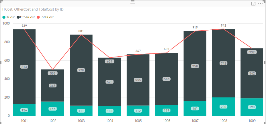
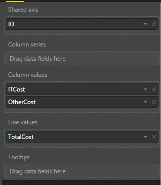
thanks for responding. I have seen some people including a Line Value as Totals, however, it seems to be possible to only show the Total on the Line and not have the split in labels in the columns. Do you happen to know how they do it?
/just like you showed in your example however without the labels in the columns and the line crossing the edge on the top and showing the Total/
Thank you.
Atanas
- Mark as New
- Bookmark
- Subscribe
- Mute
- Subscribe to RSS Feed
- Permalink
- Report Inappropriate Content
To get rid of the data labels, go into the format painter and turn off Data Labels. For the line, see @v-caliao-msft's post. However, if you turn off data labels, I believe you will have to use the Card visualization technique.
@ me in replies or I'll lose your thread!!!
Instead of a Kudo, please vote for this idea
Become an expert!: Enterprise DNA
External Tools: MSHGQM
YouTube Channel!: Microsoft Hates Greg
Latest book!: The Definitive Guide to Power Query (M)
DAX is easy, CALCULATE makes DAX hard...
- Mark as New
- Bookmark
- Subscribe
- Mute
- Subscribe to RSS Feed
- Permalink
- Report Inappropriate Content
Hi @Greg_Deckler, @v-caliao-msft,
thanks for responding. My question was more whether there is a possibility to apply data labels only on the line ,and not on the columns, or the other way around?
Regards,
Atanas
- Mark as New
- Bookmark
- Subscribe
- Mute
- Subscribe to RSS Feed
- Permalink
- Report Inappropriate Content
Hi @t-atgeor,
Could you provide a screenshot about it? I have tested it on my local environment, the chart looks like below.
Regards,
Charlie Liao
Helpful resources

Microsoft Fabric Learn Together
Covering the world! 9:00-10:30 AM Sydney, 4:00-5:30 PM CET (Paris/Berlin), 7:00-8:30 PM Mexico City

Power BI Monthly Update - April 2024
Check out the April 2024 Power BI update to learn about new features.

| User | Count |
|---|---|
| 117 | |
| 105 | |
| 69 | |
| 67 | |
| 43 |
| User | Count |
|---|---|
| 151 | |
| 103 | |
| 102 | |
| 87 | |
| 63 |


