- Power BI forums
- Updates
- News & Announcements
- Get Help with Power BI
- Desktop
- Service
- Report Server
- Power Query
- Mobile Apps
- Developer
- DAX Commands and Tips
- Custom Visuals Development Discussion
- Health and Life Sciences
- Power BI Spanish forums
- Translated Spanish Desktop
- Power Platform Integration - Better Together!
- Power Platform Integrations (Read-only)
- Power Platform and Dynamics 365 Integrations (Read-only)
- Training and Consulting
- Instructor Led Training
- Dashboard in a Day for Women, by Women
- Galleries
- Community Connections & How-To Videos
- COVID-19 Data Stories Gallery
- Themes Gallery
- Data Stories Gallery
- R Script Showcase
- Webinars and Video Gallery
- Quick Measures Gallery
- 2021 MSBizAppsSummit Gallery
- 2020 MSBizAppsSummit Gallery
- 2019 MSBizAppsSummit Gallery
- Events
- Ideas
- Custom Visuals Ideas
- Issues
- Issues
- Events
- Upcoming Events
- Community Blog
- Power BI Community Blog
- Custom Visuals Community Blog
- Community Support
- Community Accounts & Registration
- Using the Community
- Community Feedback
Register now to learn Fabric in free live sessions led by the best Microsoft experts. From Apr 16 to May 9, in English and Spanish.
- Power BI forums
- Forums
- Get Help with Power BI
- Desktop
- Re: Stacked Column Chart with 2-3 Values
- Subscribe to RSS Feed
- Mark Topic as New
- Mark Topic as Read
- Float this Topic for Current User
- Bookmark
- Subscribe
- Printer Friendly Page
- Mark as New
- Bookmark
- Subscribe
- Mute
- Subscribe to RSS Feed
- Permalink
- Report Inappropriate Content
Stacked Column Chart with 2-3 Values
Hello,
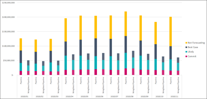
I created the following stacked column charts in Excel using Pivot Tables and need to find a way to build the same/similar charts using Power BI in a stacked format. Here are screenshots of the charts made in Excel that I need to replicate in Power BI...
Trended Pipeline Forecast by Deal Status showing Pipeline against Weighted Pipeline values (per month)
Trended 3-Month Pipeline Forecast by Deal Status showcasing Pipeline, Weighted Pipeline, and Budget values (per month)
Power BI will not allow me to add multiple value fields while trying to create the stacked chart view...
Does anyone know a way that it would be possible to generate these types of reports in Power BI? Thanks in advance!
-Alex
Solved! Go to Solution.
- Mark as New
- Bookmark
- Subscribe
- Mute
- Subscribe to RSS Feed
- Permalink
- Report Inappropriate Content
Hi @86010991 ,
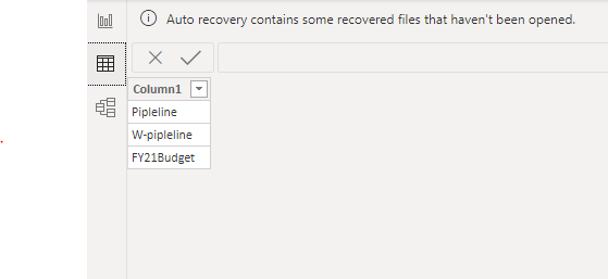
Yes, it is possible. you can create a disconnected table:
Then you can put date column and it in Axis and set concatenate labels off:
Create a new measure by SWITCH for values like:
Measure = SWITCH(SELECTEDVALUE('Table'[Column1]),"Pipleline",.......,"W-Pipleline",......,"FY21 Budget",.......)
For more details, please refer to the similar post: https://community.powerbi.com/t5/Desktop/Stacked-bar-chart-help-to-use-multiple-values/td-p/986028
If this post helps, then please consider Accept it as the solution to help the other members find it more quickly.
Best Regards,
Dedmon Dai
- Mark as New
- Bookmark
- Subscribe
- Mute
- Subscribe to RSS Feed
- Permalink
- Report Inappropriate Content
Hi Dedmon,
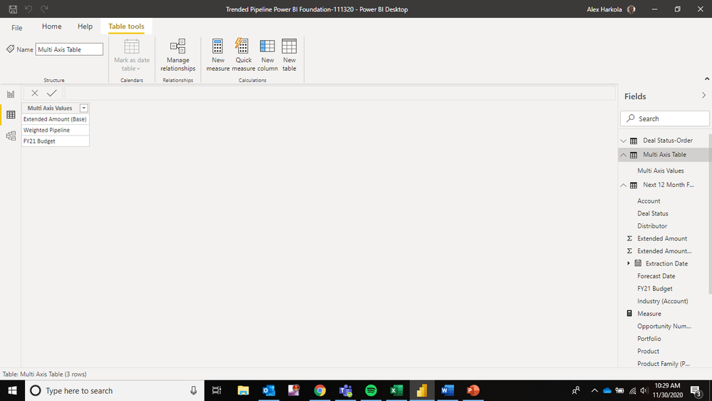
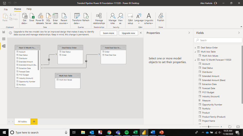
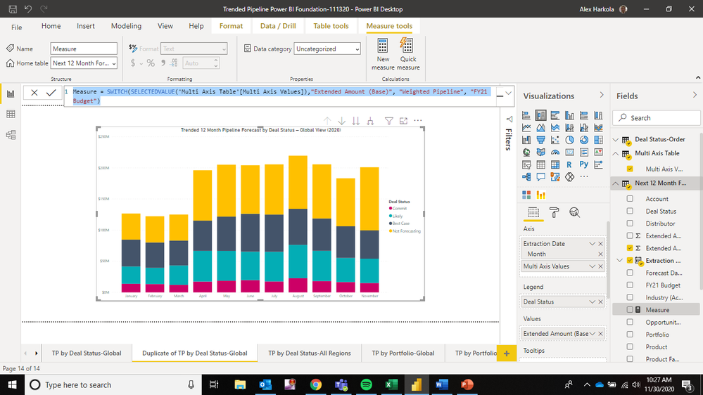
Thank you very much for your reply to this question. I was able to create a disconnected table and put date column and the disconnected table in X-Axis and set concatenate labels off. I am just starting to use Power BI this month, so I am unfamiliar with the Measures feature and how to create a new measure as you outlined (the one I created shown below doesn't seem to work)...
Here is what I created, but I am having trouble tying everything together:
*Extended Amount (Base) represents Pipeline, Weighted Pipeline is W-Pipeline, and FY21 Budget is the same.
Can you please share in detail how I can tie everything together?
Thanks again in advance,
Alex
- Mark as New
- Bookmark
- Subscribe
- Mute
- Subscribe to RSS Feed
- Permalink
- Report Inappropriate Content
Hi @86010991 ,
Yes, it is possible. you can create a disconnected table:
Then you can put date column and it in Axis and set concatenate labels off:
Create a new measure by SWITCH for values like:
Measure = SWITCH(SELECTEDVALUE('Table'[Column1]),"Pipleline",.......,"W-Pipleline",......,"FY21 Budget",.......)
For more details, please refer to the similar post: https://community.powerbi.com/t5/Desktop/Stacked-bar-chart-help-to-use-multiple-values/td-p/986028
If this post helps, then please consider Accept it as the solution to help the other members find it more quickly.
Best Regards,
Dedmon Dai
Helpful resources

Microsoft Fabric Learn Together
Covering the world! 9:00-10:30 AM Sydney, 4:00-5:30 PM CET (Paris/Berlin), 7:00-8:30 PM Mexico City

Power BI Monthly Update - April 2024
Check out the April 2024 Power BI update to learn about new features.

| User | Count |
|---|---|
| 113 | |
| 100 | |
| 78 | |
| 76 | |
| 52 |
| User | Count |
|---|---|
| 146 | |
| 109 | |
| 106 | |
| 88 | |
| 61 |
