- Power BI forums
- Updates
- News & Announcements
- Get Help with Power BI
- Desktop
- Service
- Report Server
- Power Query
- Mobile Apps
- Developer
- DAX Commands and Tips
- Custom Visuals Development Discussion
- Health and Life Sciences
- Power BI Spanish forums
- Translated Spanish Desktop
- Power Platform Integration - Better Together!
- Power Platform Integrations (Read-only)
- Power Platform and Dynamics 365 Integrations (Read-only)
- Training and Consulting
- Instructor Led Training
- Dashboard in a Day for Women, by Women
- Galleries
- Community Connections & How-To Videos
- COVID-19 Data Stories Gallery
- Themes Gallery
- Data Stories Gallery
- R Script Showcase
- Webinars and Video Gallery
- Quick Measures Gallery
- 2021 MSBizAppsSummit Gallery
- 2020 MSBizAppsSummit Gallery
- 2019 MSBizAppsSummit Gallery
- Events
- Ideas
- Custom Visuals Ideas
- Issues
- Issues
- Events
- Upcoming Events
- Community Blog
- Power BI Community Blog
- Custom Visuals Community Blog
- Community Support
- Community Accounts & Registration
- Using the Community
- Community Feedback
Register now to learn Fabric in free live sessions led by the best Microsoft experts. From Apr 16 to May 9, in English and Spanish.
- Power BI forums
- Forums
- Get Help with Power BI
- Desktop
- Stacked Bar/Line chart not displaying or summariz...
- Subscribe to RSS Feed
- Mark Topic as New
- Mark Topic as Read
- Float this Topic for Current User
- Bookmark
- Subscribe
- Printer Friendly Page
- Mark as New
- Bookmark
- Subscribe
- Mute
- Subscribe to RSS Feed
- Permalink
- Report Inappropriate Content
Stacked Bar/Line chart not displaying or summarizing properly
Relatively new Power BI user seeking assistance.
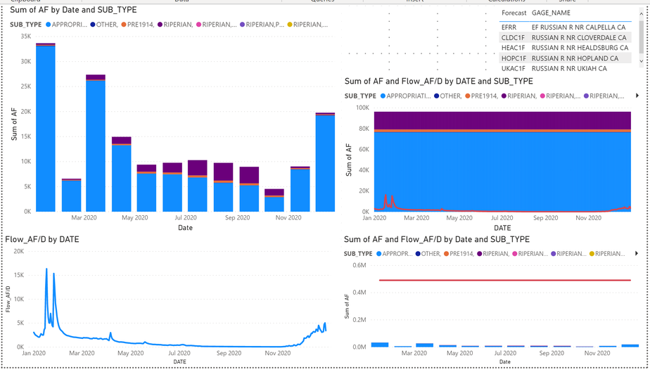
I am comparing water supply to demand at several locations in a watershed. I can properly filter supply and demand by location of interest, and properly display the supply or demand individually. However when i try to combine the two, the summarizing or display is not correct.
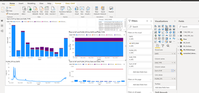
In the attached image, Location of Interest is in top right, Demand is top left, Supply is bottom left. The middle and lower right visuals are 2 attempts to combine the charts at left using the Stacked Bar/line visual. When i use the date from the Supply data (middle right), supply appears correctly, but demand seems to be averaging over the year. Conversely, in the lower right, when i use the date from the demand data, demands appear properly, but supply appears to be averaged over the year. I have tried all of the summarization options in the Visualization pane drop down.
Any suggestions on how to make the combo chart show the data as displayed in the idividual charts at left would be greatly appreciated!
- Mark as New
- Bookmark
- Subscribe
- Mute
- Subscribe to RSS Feed
- Permalink
- Report Inappropriate Content
Hi , @Anonymous
The attached picture is too small to be clearly recognized, can you choose a large size for display ?
Best Regards,
Community Support Team _ Eason
- Mark as New
- Bookmark
- Subscribe
- Mute
- Subscribe to RSS Feed
- Permalink
- Report Inappropriate Content
@v-easonf-msft , please let me know if i can provide other useful info- thanks for looking!
for clarity Flow=Supply, and AF=demand; the first image is unfiltered and the absolute values shown (Supply vs demand) will be somewhat different.
This image uses a Location of interest (Gage) to filter, and the values should be much closer/overlap each other.
- Mark as New
- Bookmark
- Subscribe
- Mute
- Subscribe to RSS Feed
- Permalink
- Report Inappropriate Content
Hi , @Anonymous
Can you share a sample pbix file which would help tremendously.
You are unlikely to reach a solution in community forum for this kind of unknown issue that we cannot test and reproduce without a sample file.
You also can create a support ticket or even ask for a phone call support in the ticket.
Best Regards,
Community Support Team _ Eason
- Mark as New
- Bookmark
- Subscribe
- Mute
- Subscribe to RSS Feed
- Permalink
- Report Inappropriate Content
Hi, @v-easonf-msft
I have uploaded the file at the link below. Thanks for looking.
https://drive.google.com/file/d/1DLfzHuNI3f3HTv6npaRpSYk4jilo-th1/view?usp=sharing
- Mark as New
- Bookmark
- Subscribe
- Mute
- Subscribe to RSS Feed
- Permalink
- Report Inappropriate Content
Hi @Anonymous -
On both graphs on the right, you can use a secondary y-axis to show line values separate from column values. On the formatting section, scroll to the bottom of "Y-axis"and you'll see "Show Secondary". Turn that on and you can have a completely independent axis for the line values.
Hope this helps,
David
- Mark as New
- Bookmark
- Subscribe
- Mute
- Subscribe to RSS Feed
- Permalink
- Report Inappropriate Content
Hi @dedelman_clng , Thank you for the suggestion.
I have tried the secondary axis, however it does not change the summarization which appears to be the problem. I turned the secondary axis on in the example posted previously, and while the data now overlaps, the straight line in the right visual should look like the line in the left visual.
- Mark as New
- Bookmark
- Subscribe
- Mute
- Subscribe to RSS Feed
- Permalink
- Report Inappropriate Content
It looks like you're trying to graph 2 sets of data (Flow, unstacked_demand) that don't have a relationship with each other. The data model in your example report is very confusing because it is many-to-many relationships all around.
What you should be aiming for is having a Date table, and then creating a relationship with those data tables with dates (Flow, unstacked_demand). You can then use the date column in your Date table as the axis, and you'll be able to associate Flow and unstacked_demand together. Right now, Flow doesn't know about unstacked_demand's date column, nor vice versa.
One other thing to note is that one set of data seems to be continuous (Flow; value every day) while the other is categorical (unstacked_demand; one value per month). Those may not play well together on one graph, as either the monthly data will appear as very tiny line, or the daily data will show as a the value on the same day as the monthly data. The latter behavior is shown below (once I removed some model relationships to allow unranked_demand to be linked to the date table):
Let us know some more information on what the data is and why the relationship are how they are and we may be able to point you further in the right direction.
Hope this helps
David
- Mark as New
- Bookmark
- Subscribe
- Mute
- Subscribe to RSS Feed
- Permalink
- Report Inappropriate Content
Thank you for the review and assessment. I will have to go back and build this one differntly i think. I had tried to link the dates, but some other relationship was preventing that. Perhaps having the maps and other data was making this more complicated than i am really ready for. I have daily demands and will see if that works better in a simpler model.
- Mark as New
- Bookmark
- Subscribe
- Mute
- Subscribe to RSS Feed
- Permalink
- Report Inappropriate Content
Good luck! Feel free to reach out for further assistance if needed.
Helpful resources

Microsoft Fabric Learn Together
Covering the world! 9:00-10:30 AM Sydney, 4:00-5:30 PM CET (Paris/Berlin), 7:00-8:30 PM Mexico City

Power BI Monthly Update - April 2024
Check out the April 2024 Power BI update to learn about new features.

| User | Count |
|---|---|
| 111 | |
| 100 | |
| 80 | |
| 64 | |
| 57 |
| User | Count |
|---|---|
| 146 | |
| 110 | |
| 93 | |
| 84 | |
| 67 |


