- Power BI forums
- Updates
- News & Announcements
- Get Help with Power BI
- Desktop
- Service
- Report Server
- Power Query
- Mobile Apps
- Developer
- DAX Commands and Tips
- Custom Visuals Development Discussion
- Health and Life Sciences
- Power BI Spanish forums
- Translated Spanish Desktop
- Power Platform Integration - Better Together!
- Power Platform Integrations (Read-only)
- Power Platform and Dynamics 365 Integrations (Read-only)
- Training and Consulting
- Instructor Led Training
- Dashboard in a Day for Women, by Women
- Galleries
- Community Connections & How-To Videos
- COVID-19 Data Stories Gallery
- Themes Gallery
- Data Stories Gallery
- R Script Showcase
- Webinars and Video Gallery
- Quick Measures Gallery
- 2021 MSBizAppsSummit Gallery
- 2020 MSBizAppsSummit Gallery
- 2019 MSBizAppsSummit Gallery
- Events
- Ideas
- Custom Visuals Ideas
- Issues
- Issues
- Events
- Upcoming Events
- Community Blog
- Power BI Community Blog
- Custom Visuals Community Blog
- Community Support
- Community Accounts & Registration
- Using the Community
- Community Feedback
Register now to learn Fabric in free live sessions led by the best Microsoft experts. From Apr 16 to May 9, in English and Spanish.
- Power BI forums
- Forums
- Get Help with Power BI
- Desktop
- Stacked Bar Chart with Groupings
- Subscribe to RSS Feed
- Mark Topic as New
- Mark Topic as Read
- Float this Topic for Current User
- Bookmark
- Subscribe
- Printer Friendly Page
- Mark as New
- Bookmark
- Subscribe
- Mute
- Subscribe to RSS Feed
- Permalink
- Report Inappropriate Content
Stacked Bar Chart with Groupings
Hi! I'm hoping this is a really easy question that comes down to operator error due to relative unfamiliarity with PowerBI. Any help would certainly be appreciated. I have a bar chart that's showing the customer count by region.
I have some performance guardrails that are included as measures...for example a customer was less than minimum, less than target or over target. I want to have each of these three shown as groups on this chart.
What I've done: I've created measures to calculate the customer's performance metric and then a second measure for grouping based on the first metric. I try to add that grouping measure to the Legend and nothing happens. Could anyone please help?
Solved! Go to Solution.
- Mark as New
- Bookmark
- Subscribe
- Mute
- Subscribe to RSS Feed
- Permalink
- Report Inappropriate Content
Good morning!
So if the thing creating the problem was using Direct Query mode I changed the data connection to Import instead. There was no reason it had to be Direct Query other than I'm a novice. After changing the data connection I went back to creating a column for the grouping. And it worked!

Thank you for your help!
- Mark as New
- Bookmark
- Subscribe
- Mute
- Subscribe to RSS Feed
- Permalink
- Report Inappropriate Content
One thing I want to add...if I add a field defined in the data (not a calculated measure) such as sales person or area, it works. It doesn't seem to like the calculated measure being what it's supposed to group by.
- Mark as New
- Bookmark
- Subscribe
- Mute
- Subscribe to RSS Feed
- Permalink
- Report Inappropriate Content
Hi @littlemojopuppy,
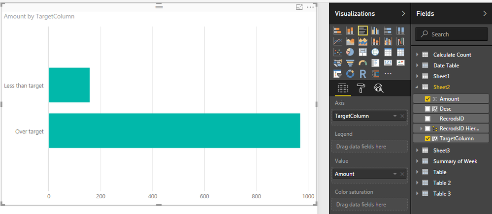
For your requirement, you can use calculate column to calculate the target, then drag it to axis field.
For example:
TargetColumn =
var target= AVERAGEX(ALL(Sheet2),[Amount])*0.75
Return
if([Amount]>target,"Over target","Less than target")
In addition, you can drag your original axis column to legend field to show the detail info.
Regards,
Xiaoxin Sheng
If this post helps, please consider accept as solution to help other members find it more quickly.
- Mark as New
- Bookmark
- Subscribe
- Mute
- Subscribe to RSS Feed
- Permalink
- Report Inappropriate Content
Apologies if this reply is duplicated...my original response doesn't seem to be here.
I set up two measures for the minimum and target (but I like how you're calculating the 75% of average interactively!) The formula to determine which grouping a record should be in is as follows: Net TGP Per Case Grouping = IF([Net TGP Per Case]<[Net TGP Per Case Minimum],"Below Minimum",IF(AND([Net TGP Per Case]>=[Net TGP Per Case Minimum],[Net TGP Per Case]<[Net TGP Per Case Target]),"Below Target","Above Target")).
The requirement is to have geography shown on the axis since the rest of the dashboard will be based on geography. What I'm looking for is what's shown as a solid green bar to be broken into three segments, one for each of the groupings below min, below target and above target. Here's an Excel mock-up of what I'm trying to get to.

Thank you for any help you might be able to provide!
- Mark as New
- Bookmark
- Subscribe
- Mute
- Subscribe to RSS Feed
- Permalink
- Report Inappropriate Content
Hello again! I noticed that you suggested a column as opposed to a measure. I tried creating a column in place of the measure...I got an error saying that "Function 'SUM' is not allowed as part of calculated column DAX expressions on DirectQuery models". I'd bet that this is due to using the measure (which is based on an aggregation of underlying data) in defining the column.
So I can't change the measure used in the comparison to determine grouping because it's used elsewhere. But if I were to create a column with the same formula as the measure and then a second column with the grouping that should work? Maybe?
- Mark as New
- Bookmark
- Subscribe
- Mute
- Subscribe to RSS Feed
- Permalink
- Report Inappropriate Content
Hi @littlemojopuppy,
Since you have used the direct query mode to connect the database, it is hard to achieve your requirement by dax function because of there are some limitations which you use measure or calculate column on direct mode.
You can use query editor to work through the issue:
Open the "Query editor" and click on "Advanced Editor", then add a custom step.
avg=List.Average(Table.SelectRows(Table.SelectColumns(PerviousStep,"ColumnName"),each _<> null)[ColumnName])
Add a custom column and use above variable to calculate the result.
#"Added Custom" = Table.AddColumn(PerviousStep, "State", each if [ColumnName]>avg then "Over" else if [ColumnName]=avg then "Equal" else "Less")
Screenshots:
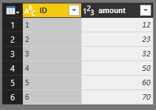
Base Table.
Target variable.
Add custom column to check the state.
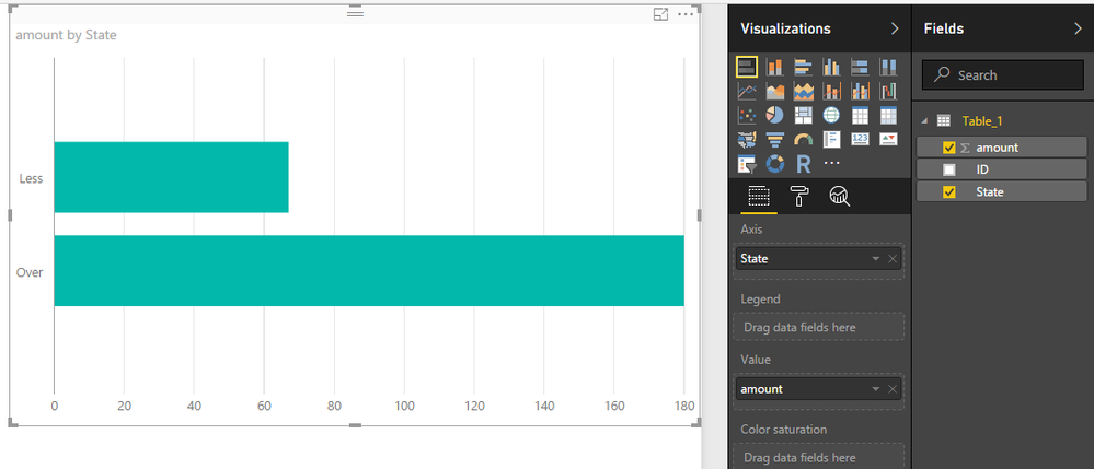
Save and return to report view, create a visual with the new column as the axis field.
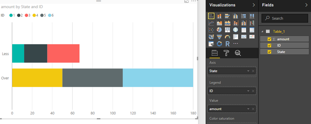
In addition, you can drag the original column to legend field to show the detail information.
Full query:
let
    Source = Sql.Databases("xxxxxx"),
    qiuyun = Source{[Name="xxxxx"]}[Data],
    dbo_Table_1 = qiuyun{[Schema="dbo",Item="Table_1"]}[Data],
    avg=List.Average(Table.SelectRows(Table.SelectColumns(dbo_Table_1,"amount"),each _<> null)[amount]),//get the average
    #"Added Custom" = Table.AddColumn(dbo_Table_1, "State", each if [amount]>avg then "Over" else if [amount]=avg then "Equal" else "Less")
in
    #"Added Custom"
Regards,
Xiaoxin Sheng
If this post helps, please consider accept as solution to help other members find it more quickly.
- Mark as New
- Bookmark
- Subscribe
- Mute
- Subscribe to RSS Feed
- Permalink
- Report Inappropriate Content
Good morning!
So if the thing creating the problem was using Direct Query mode I changed the data connection to Import instead. There was no reason it had to be Direct Query other than I'm a novice. After changing the data connection I went back to creating a column for the grouping. And it worked!

Thank you for your help!
Helpful resources

Microsoft Fabric Learn Together
Covering the world! 9:00-10:30 AM Sydney, 4:00-5:30 PM CET (Paris/Berlin), 7:00-8:30 PM Mexico City

Power BI Monthly Update - April 2024
Check out the April 2024 Power BI update to learn about new features.

| User | Count |
|---|---|
| 110 | |
| 97 | |
| 78 | |
| 63 | |
| 55 |
| User | Count |
|---|---|
| 143 | |
| 109 | |
| 89 | |
| 84 | |
| 66 |


