- Power BI forums
- Updates
- News & Announcements
- Get Help with Power BI
- Desktop
- Service
- Report Server
- Power Query
- Mobile Apps
- Developer
- DAX Commands and Tips
- Custom Visuals Development Discussion
- Health and Life Sciences
- Power BI Spanish forums
- Translated Spanish Desktop
- Power Platform Integration - Better Together!
- Power Platform Integrations (Read-only)
- Power Platform and Dynamics 365 Integrations (Read-only)
- Training and Consulting
- Instructor Led Training
- Dashboard in a Day for Women, by Women
- Galleries
- Community Connections & How-To Videos
- COVID-19 Data Stories Gallery
- Themes Gallery
- Data Stories Gallery
- R Script Showcase
- Webinars and Video Gallery
- Quick Measures Gallery
- 2021 MSBizAppsSummit Gallery
- 2020 MSBizAppsSummit Gallery
- 2019 MSBizAppsSummit Gallery
- Events
- Ideas
- Custom Visuals Ideas
- Issues
- Issues
- Events
- Upcoming Events
- Community Blog
- Power BI Community Blog
- Custom Visuals Community Blog
- Community Support
- Community Accounts & Registration
- Using the Community
- Community Feedback
Register now to learn Fabric in free live sessions led by the best Microsoft experts. From Apr 16 to May 9, in English and Spanish.
- Power BI forums
- Forums
- Get Help with Power BI
- Desktop
- Split merged bars in bar chart
- Subscribe to RSS Feed
- Mark Topic as New
- Mark Topic as Read
- Float this Topic for Current User
- Bookmark
- Subscribe
- Printer Friendly Page
- Mark as New
- Bookmark
- Subscribe
- Mute
- Subscribe to RSS Feed
- Permalink
- Report Inappropriate Content
Split merged bars in bar chart
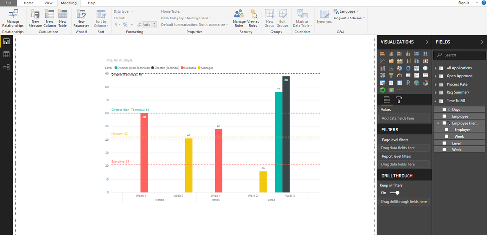
Hi, does anyone know how to split these bars up into individual bars?
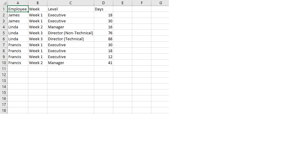
It seems like Power BI will sum the values of Days (see Excel file, under the column Days) based on the Level. I actually would like to see individual bars, i.e. Francis should have 3 bars of Executive instead of just 1.
Let me know if I'm unclear, and thank you very much in advance!
Solved! Go to Solution.
- Mark as New
- Bookmark
- Subscribe
- Mute
- Subscribe to RSS Feed
- Permalink
- Report Inappropriate Content
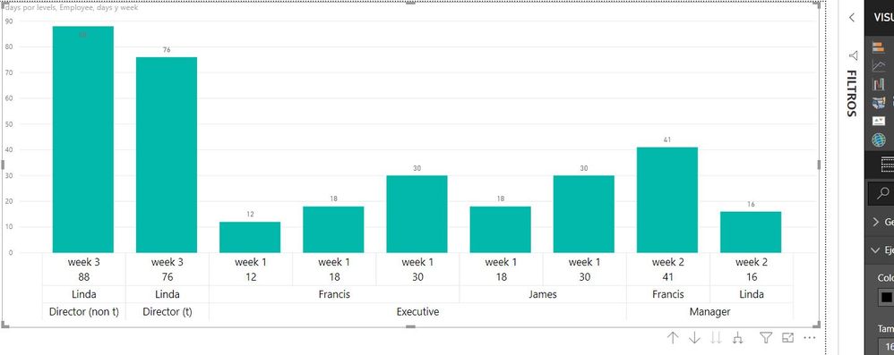
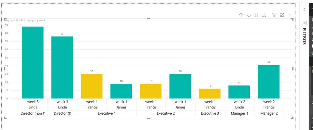
Hi, I dont understand what you are trying to do...there must be other better way... you are trying to say that francis has other dimension that is not declare in your table to say that Power bi has to split in 3... the question is why Francis in the same week under the same level (executive) has 3 differents ammounts of days?... if you dont differenciate that you will always have 1 bar....thats the logic.
1st// solution is to use the days column as x axis as well (categorical x axis not lineal)
2nd// solution is to differentiate the level column like Executive 1; executive 2 and so on.
- Mark as New
- Bookmark
- Subscribe
- Mute
- Subscribe to RSS Feed
- Permalink
- Report Inappropriate Content
Thank you both for your replies! Much appreciated for taking your time to help solve my case.
Actually the reason why each Employee seems to have multiple rows is because they are different instances. That is, in Week 1, Francis has recruited 3 Executive roles, and for each role he has taken different number of days to recruit them, hence I have placed them in different rows as different instances.
I tried to use "Don't Summarize", but nothing seems to change. I think this case is somewhat similar to this one I found in the Community Forum (https://community.powerbi.com/t5/Desktop/Make-a-column-not-sum-count/td-p/24672). I suppose I could manually divide them up by adding a column to differentiate each row as a unique one, except that I would have a graph that has a very long legend, with the bars very far apart from each other. But the solution as provided by christianfcbmx seems to be quite viable - and I will work on trying that out. 🙂
Thank you very much again to the both of you!
- Mark as New
- Bookmark
- Subscribe
- Mute
- Subscribe to RSS Feed
- Permalink
- Report Inappropriate Content
Hi @Anonymous
Is this problem sloved?
If not, please let me know.
Best Regards
Maggie
Community Support Team _ Maggie Li
If this post helps, then please consider Accept it as the solution to help the other members find it more quickly.
- Mark as New
- Bookmark
- Subscribe
- Mute
- Subscribe to RSS Feed
- Permalink
- Report Inappropriate Content
Hi, I dont understand what you are trying to do...there must be other better way... you are trying to say that francis has other dimension that is not declare in your table to say that Power bi has to split in 3... the question is why Francis in the same week under the same level (executive) has 3 differents ammounts of days?... if you dont differenciate that you will always have 1 bar....thats the logic.
1st// solution is to use the days column as x axis as well (categorical x axis not lineal)
2nd// solution is to differentiate the level column like Executive 1; executive 2 and so on.
- Mark as New
- Bookmark
- Subscribe
- Mute
- Subscribe to RSS Feed
- Permalink
- Report Inappropriate Content
It looks like this graph is automatically summarizing your like data. So all of James' time is executive time, so he gets 1 bar of sum'd executive time. Linda gets 3 different bars because all of her time is different somehow. Francis has 1 bar for all his week 1 executive time because it's all like data.
On some visuals there's an option for how to treat your data called "Do not summarize", which would stop it from doing this. However, it doesn't seem to be available on this graph.
The explanation I found for that was, more or less, it did not make sense not to summarize data in this kind of visual, and that in this case your best bet may be to transform your data somehow (and I'm looking into how you might do that).
EDIT: I didn't have much luck transforming it meaningfully, but maybe a more experienced user will have a solution.
Helpful resources

Microsoft Fabric Learn Together
Covering the world! 9:00-10:30 AM Sydney, 4:00-5:30 PM CET (Paris/Berlin), 7:00-8:30 PM Mexico City

Power BI Monthly Update - April 2024
Check out the April 2024 Power BI update to learn about new features.

| User | Count |
|---|---|
| 112 | |
| 100 | |
| 80 | |
| 64 | |
| 57 |
| User | Count |
|---|---|
| 145 | |
| 111 | |
| 92 | |
| 84 | |
| 66 |


