- Power BI forums
- Updates
- News & Announcements
- Get Help with Power BI
- Desktop
- Service
- Report Server
- Power Query
- Mobile Apps
- Developer
- DAX Commands and Tips
- Custom Visuals Development Discussion
- Health and Life Sciences
- Power BI Spanish forums
- Translated Spanish Desktop
- Power Platform Integration - Better Together!
- Power Platform Integrations (Read-only)
- Power Platform and Dynamics 365 Integrations (Read-only)
- Training and Consulting
- Instructor Led Training
- Dashboard in a Day for Women, by Women
- Galleries
- Community Connections & How-To Videos
- COVID-19 Data Stories Gallery
- Themes Gallery
- Data Stories Gallery
- R Script Showcase
- Webinars and Video Gallery
- Quick Measures Gallery
- 2021 MSBizAppsSummit Gallery
- 2020 MSBizAppsSummit Gallery
- 2019 MSBizAppsSummit Gallery
- Events
- Ideas
- Custom Visuals Ideas
- Issues
- Issues
- Events
- Upcoming Events
- Community Blog
- Power BI Community Blog
- Custom Visuals Community Blog
- Community Support
- Community Accounts & Registration
- Using the Community
- Community Feedback
Register now to learn Fabric in free live sessions led by the best Microsoft experts. From Apr 16 to May 9, in English and Spanish.
- Power BI forums
- Forums
- Get Help with Power BI
- Desktop
- Specifying measures as a setting value for visuals...
- Subscribe to RSS Feed
- Mark Topic as New
- Mark Topic as Read
- Float this Topic for Current User
- Bookmark
- Subscribe
- Printer Friendly Page
- Mark as New
- Bookmark
- Subscribe
- Mute
- Subscribe to RSS Feed
- Permalink
- Report Inappropriate Content
Specifying measures as a setting value for visuals - A serious limitation that PowerBI must overcome
For several visuals in Power BI, we have the ability to specify some sort of fixed value as a setting/parameter to improve analysis. A few examples:
- Values of constant lines, min/max lines, average, median and percentile lines.
- Gauxe axis: Min, Max Target
- Conditional formatting of table cells: minimum, center, maximum values
The problem is that for those parameters we can only specify a fixed, constant value. For example. I reckon that all visual settings should allow us to specify a measure as an option where the option to specify a constant value is possible. For those familiar with SSRS, this would be anlalogous to the fx button.
I see this as a serious limitation of Power BI, and I already had to use a competitor product in one of our implementations because of it.
You can vote for this suggestion here.
Remember: Since MSFT only seems to evaluate suggestions on a quantitative approach, unless people vote for this -- it might not ever happen.
Regards,
P.
- Mark as New
- Bookmark
- Subscribe
- Mute
- Subscribe to RSS Feed
- Permalink
- Report Inappropriate Content
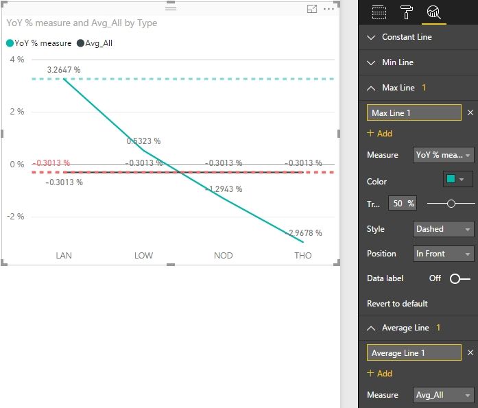
In the August Update, PBI has already added the ability to create multiple data bound reference lines on clustered column and bar charts, line charts, and scatter charts. These new reference lines are calculated based on the max, min, median, average, or different percentiles of a selected measure.
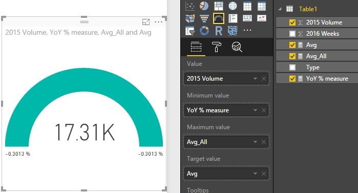
We can also use a measure for Min, Max and Target for Gauge.
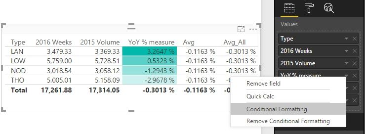
We can also use Conditional Formatting for measure as below.
Best Regards,
Herbert
- Mark as New
- Bookmark
- Subscribe
- Mute
- Subscribe to RSS Feed
- Permalink
- Report Inappropriate Content
Microsoft has already started providing these options on various visuals and they are adding this to remaining ones.
In recent release, they have proivded option to add trend lines on line chart based on Mean/Median/Avg etc.
Still work needed on conditional formatting.
Helpful resources

Microsoft Fabric Learn Together
Covering the world! 9:00-10:30 AM Sydney, 4:00-5:30 PM CET (Paris/Berlin), 7:00-8:30 PM Mexico City

Power BI Monthly Update - April 2024
Check out the April 2024 Power BI update to learn about new features.

| User | Count |
|---|---|
| 106 | |
| 93 | |
| 75 | |
| 62 | |
| 50 |
| User | Count |
|---|---|
| 147 | |
| 107 | |
| 105 | |
| 87 | |
| 61 |


