- Power BI forums
- Updates
- News & Announcements
- Get Help with Power BI
- Desktop
- Service
- Report Server
- Power Query
- Mobile Apps
- Developer
- DAX Commands and Tips
- Custom Visuals Development Discussion
- Health and Life Sciences
- Power BI Spanish forums
- Translated Spanish Desktop
- Power Platform Integration - Better Together!
- Power Platform Integrations (Read-only)
- Power Platform and Dynamics 365 Integrations (Read-only)
- Training and Consulting
- Instructor Led Training
- Dashboard in a Day for Women, by Women
- Galleries
- Community Connections & How-To Videos
- COVID-19 Data Stories Gallery
- Themes Gallery
- Data Stories Gallery
- R Script Showcase
- Webinars and Video Gallery
- Quick Measures Gallery
- 2021 MSBizAppsSummit Gallery
- 2020 MSBizAppsSummit Gallery
- 2019 MSBizAppsSummit Gallery
- Events
- Ideas
- Custom Visuals Ideas
- Issues
- Issues
- Events
- Upcoming Events
- Community Blog
- Power BI Community Blog
- Custom Visuals Community Blog
- Community Support
- Community Accounts & Registration
- Using the Community
- Community Feedback
Register now to learn Fabric in free live sessions led by the best Microsoft experts. From Apr 16 to May 9, in English and Spanish.
- Power BI forums
- Forums
- Get Help with Power BI
- Desktop
- Re: Sort by most recent 12 months
- Subscribe to RSS Feed
- Mark Topic as New
- Mark Topic as Read
- Float this Topic for Current User
- Bookmark
- Subscribe
- Printer Friendly Page
- Mark as New
- Bookmark
- Subscribe
- Mute
- Subscribe to RSS Feed
- Permalink
- Report Inappropriate Content
Sort by most recent 12 months
Hi all,
Hoping someone can help...
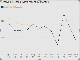
I've got a line chart with x axis showing most recent 12 months, created using a month as text column in the Date Table and sorting that by month number. The visual is then filtered for the most recent 12 calendar months.
I'd quite like to be able to add a trend line to one of the values but can't because the x axis is categorical and not continuous.
Is there any way to get both the continuous months and a trend line?
Thanks in advance.
JB
Solved! Go to Solution.
- Mark as New
- Bookmark
- Subscribe
- Mute
- Subscribe to RSS Feed
- Permalink
- Report Inappropriate Content
Hi, @j_b_pbi
Based on your description, I created data to reproduce your scenario.
Table:
Calendar(a calculated table):
Calendar = CALENDARAUTO()
There is a one-to-one relationship between two tables.
You may create a calculated column and a measure as below.
Calculated column:
Monthnum = MONTH('Calendar'[Date])

Measure:
IsDisplay =
var _year = SELECTEDVALUE('Calendar'[Date].[Year])
var _month = SELECTEDVALUE('Calendar'[Monthnum])
return
IF(
    OR(
        _year = YEAR(TODAY())&&_month<MONTH(TODAY()),
        _year = YEAR(TODAY())-1&&_month>=MONTH(TODAY())
    ),
    1,
    0
)
Then you need to put the measure in the visual level filter to display the corresponding result.
Best Regards
Allan
If this post helps, then please consider Accept it as the solution to help the other members find it more quickly.
- Mark as New
- Bookmark
- Subscribe
- Mute
- Subscribe to RSS Feed
- Permalink
- Report Inappropriate Content
Hi, @j_b_pbi
If you take the answer of someone, please mark it as the solution to help the other members who have same problems find it more quickly. If not, let me know and I'll try to help you further. Thanks.
Best Regards
Allan
- Mark as New
- Bookmark
- Subscribe
- Mute
- Subscribe to RSS Feed
- Permalink
- Report Inappropriate Content
Hi, @j_b_pbi
Based on your description, I created data to reproduce your scenario.
Table:
Calendar(a calculated table):
Calendar = CALENDARAUTO()
There is a one-to-one relationship between two tables.
You may create a calculated column and a measure as below.
Calculated column:
Monthnum = MONTH('Calendar'[Date])

Measure:
IsDisplay =
var _year = SELECTEDVALUE('Calendar'[Date].[Year])
var _month = SELECTEDVALUE('Calendar'[Monthnum])
return
IF(
    OR(
        _year = YEAR(TODAY())&&_month<MONTH(TODAY()),
        _year = YEAR(TODAY())-1&&_month>=MONTH(TODAY())
    ),
    1,
    0
)
Then you need to put the measure in the visual level filter to display the corresponding result.
Best Regards
Allan
If this post helps, then please consider Accept it as the solution to help the other members find it more quickly.
- Mark as New
- Bookmark
- Subscribe
- Mute
- Subscribe to RSS Feed
- Permalink
- Report Inappropriate Content
Hi Allan @v-alq-msft ,
Thanks for your help.
I can't quite get the breakdown over months. Am I missing something in the hierachy?
Thanks
- Mark as New
- Bookmark
- Subscribe
- Mute
- Subscribe to RSS Feed
- Permalink
- Report Inappropriate Content
- Mark as New
- Bookmark
- Subscribe
- Mute
- Subscribe to RSS Feed
- Permalink
- Report Inappropriate Content
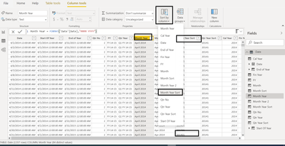
@j_b_pbi , Not sure I got. But if you have created a month year in text format
You have to create a month year sort column and mark it as the sort column
month year sort = format([Date],"YYYYMM")
https://docs.microsoft.com/en-us/power-bi/desktop-sort-by-column
Microsoft Power BI Learning Resources, 2023 !!
Learn Power BI - Full Course with Dec-2022, with Window, Index, Offset, 100+ Topics !!
Did I answer your question? Mark my post as a solution! Appreciate your Kudos !! Proud to be a Super User! !!
Helpful resources

Microsoft Fabric Learn Together
Covering the world! 9:00-10:30 AM Sydney, 4:00-5:30 PM CET (Paris/Berlin), 7:00-8:30 PM Mexico City

Power BI Monthly Update - April 2024
Check out the April 2024 Power BI update to learn about new features.

| User | Count |
|---|---|
| 114 | |
| 100 | |
| 78 | |
| 75 | |
| 52 |
| User | Count |
|---|---|
| 144 | |
| 109 | |
| 108 | |
| 88 | |
| 61 |


