- Power BI forums
- Updates
- News & Announcements
- Get Help with Power BI
- Desktop
- Service
- Report Server
- Power Query
- Mobile Apps
- Developer
- DAX Commands and Tips
- Custom Visuals Development Discussion
- Health and Life Sciences
- Power BI Spanish forums
- Translated Spanish Desktop
- Power Platform Integration - Better Together!
- Power Platform Integrations (Read-only)
- Power Platform and Dynamics 365 Integrations (Read-only)
- Training and Consulting
- Instructor Led Training
- Dashboard in a Day for Women, by Women
- Galleries
- Community Connections & How-To Videos
- COVID-19 Data Stories Gallery
- Themes Gallery
- Data Stories Gallery
- R Script Showcase
- Webinars and Video Gallery
- Quick Measures Gallery
- 2021 MSBizAppsSummit Gallery
- 2020 MSBizAppsSummit Gallery
- 2019 MSBizAppsSummit Gallery
- Events
- Ideas
- Custom Visuals Ideas
- Issues
- Issues
- Events
- Upcoming Events
- Community Blog
- Power BI Community Blog
- Custom Visuals Community Blog
- Community Support
- Community Accounts & Registration
- Using the Community
- Community Feedback
Register now to learn Fabric in free live sessions led by the best Microsoft experts. From Apr 16 to May 9, in English and Spanish.
- Power BI forums
- Forums
- Get Help with Power BI
- Desktop
- Sort Stacked area chart
- Subscribe to RSS Feed
- Mark Topic as New
- Mark Topic as Read
- Float this Topic for Current User
- Bookmark
- Subscribe
- Printer Friendly Page
- Mark as New
- Bookmark
- Subscribe
- Mute
- Subscribe to RSS Feed
- Permalink
- Report Inappropriate Content
Sort Stacked area chart
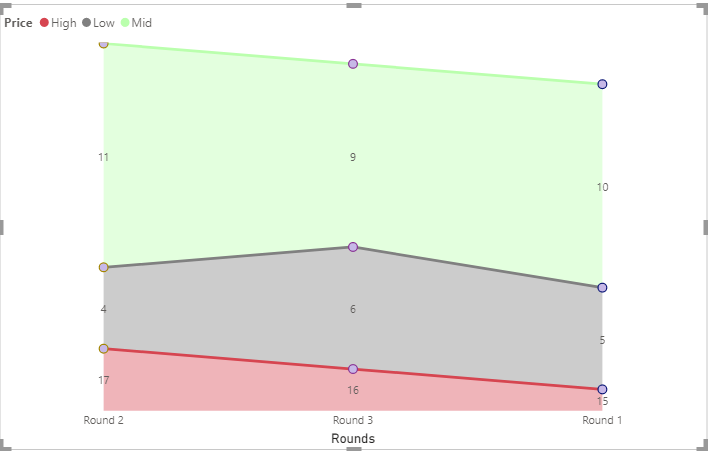
Hi, I have a data for price monitoring done by 3 rounds, in each round we took the low, mid, and high price for an item, like this:
and I want to use the Stacked area chart:
How can I sort the Axis(rounds: round 1, round 2, round 3) and the Legends (Prices: low at the bottom then mid then high)?
Solved! Go to Solution.
- Mark as New
- Bookmark
- Subscribe
- Mute
- Subscribe to RSS Feed
- Permalink
- Report Inappropriate Content
Hi @DiaaDag ,
On your area chart, on the top right, click on the 3 dots and you can see options to sort your axis as below:
Use this to sort your x-axis with values - Round1, Round2, Round3.
To sort your Legend, refer following article:
https://www.seerinteractive.com/blog/reorder-powerbi-legend/
Thanks,
Pragati
- Mark as New
- Bookmark
- Subscribe
- Mute
- Subscribe to RSS Feed
- Permalink
- Report Inappropriate Content
Hello @DiaaDag ,
Also, if you want to put the Bass to the bottom,you can create three measures and sort them under Values.
High = CALCULATE(SUM('Table'[Amount]),FILTER('Table','Table'[Price] = "High"))Mid = CALCULATE(SUM('Table'[Amount]),FILTER('Table','Table'[Price] = "Mid"))Low = CALCULATE(SUM('Table'[Amount]),FILTER('Table','Table'[Price] = "Low"))
If you don't meet your requirements, could you show the exact expected result based on the table you shared?
Best regards
Community Support Team _ zhenbw
If this post helps,then consider Accepting it as the solution to help other members find it more quickly.
BTW, pbix as attached.
- Mark as New
- Bookmark
- Subscribe
- Mute
- Subscribe to RSS Feed
- Permalink
- Report Inappropriate Content
Hi @DiaaDag ,
On your area chart, on the top right, click on the 3 dots and you can see options to sort your axis as below:
Use this to sort your x-axis with values - Round1, Round2, Round3.
To sort your Legend, refer following article:
https://www.seerinteractive.com/blog/reorder-powerbi-legend/
Thanks,
Pragati
- Mark as New
- Bookmark
- Subscribe
- Mute
- Subscribe to RSS Feed
- Permalink
- Report Inappropriate Content
Thank you very much
Helpful resources

Microsoft Fabric Learn Together
Covering the world! 9:00-10:30 AM Sydney, 4:00-5:30 PM CET (Paris/Berlin), 7:00-8:30 PM Mexico City

Power BI Monthly Update - April 2024
Check out the April 2024 Power BI update to learn about new features.

| User | Count |
|---|---|
| 114 | |
| 100 | |
| 74 | |
| 73 | |
| 49 |
| User | Count |
|---|---|
| 145 | |
| 109 | |
| 109 | |
| 90 | |
| 64 |


