- Power BI forums
- Updates
- News & Announcements
- Get Help with Power BI
- Desktop
- Service
- Report Server
- Power Query
- Mobile Apps
- Developer
- DAX Commands and Tips
- Custom Visuals Development Discussion
- Health and Life Sciences
- Power BI Spanish forums
- Translated Spanish Desktop
- Power Platform Integration - Better Together!
- Power Platform Integrations (Read-only)
- Power Platform and Dynamics 365 Integrations (Read-only)
- Training and Consulting
- Instructor Led Training
- Dashboard in a Day for Women, by Women
- Galleries
- Community Connections & How-To Videos
- COVID-19 Data Stories Gallery
- Themes Gallery
- Data Stories Gallery
- R Script Showcase
- Webinars and Video Gallery
- Quick Measures Gallery
- 2021 MSBizAppsSummit Gallery
- 2020 MSBizAppsSummit Gallery
- 2019 MSBizAppsSummit Gallery
- Events
- Ideas
- Custom Visuals Ideas
- Issues
- Issues
- Events
- Upcoming Events
- Community Blog
- Power BI Community Blog
- Custom Visuals Community Blog
- Community Support
- Community Accounts & Registration
- Using the Community
- Community Feedback
Register now to learn Fabric in free live sessions led by the best Microsoft experts. From Apr 16 to May 9, in English and Spanish.
- Power BI forums
- Forums
- Get Help with Power BI
- Desktop
- Sort Fields columns
- Subscribe to RSS Feed
- Mark Topic as New
- Mark Topic as Read
- Float this Topic for Current User
- Bookmark
- Subscribe
- Printer Friendly Page
- Mark as New
- Bookmark
- Subscribe
- Mute
- Subscribe to RSS Feed
- Permalink
- Report Inappropriate Content
Sort Fields columns
Hello, I am a novice user of POWER BI Desktop version with the intention of analysing data held in multiple Excel files and within multiple sheets and each sheet has about 300 x 300 rows and columns. a lot of data. classic for Power BI.
when i link the excel sheets to Power BI, i get the FIELDS section populated, however i am unable to sort them on the basis of how the data appears in the Excel. i.e. it always sorts it in alphabetical order and not in any other way.
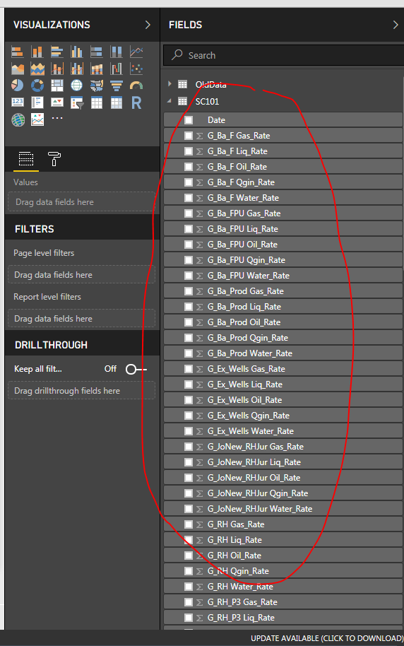
Second query:
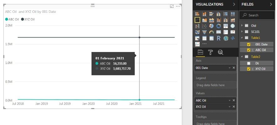
I have plotted two variables from different excel files with date as the common reference. the numbers in the different excel sheets are against date. when i use the line chart it does not provide the second variable in its true format i.e. it just provides a flat number. sure i would not have used the line chart if i was doing this in excel - i would have used the scatter line chart as it ahs two different date columns to plot against. what am i missing. I have used the scatter and line chart visualisations from default Power BI.
Thanks.
Ankeet
Solved! Go to Solution.
- Mark as New
- Bookmark
- Subscribe
- Mute
- Subscribe to RSS Feed
- Permalink
- Report Inappropriate Content
Hi Maggie,
apologies for the delayed response, but i figured out an easier way to get the data plotted.
a) clean up the data set to have the date range consistent between the different tables.
b) Mark the data in excel as a 'table' with a specific name.
c) from Power BI, import those tables rather than the entire sheet, this i think is a key step.
d) put a relationship between the date range in Power BI
and then it is possible to plot the graph on the same line chart.
i have not had the chance to experiment without doing step (a) or (d) but my suspicion is step (c) is critical.
Nonetheless, many thanks for your help and responding to the query. appreciate it. this was my first time on a forum board and it has been a good experiance.
Regards,
Ankeet
- Mark as New
- Bookmark
- Subscribe
- Mute
- Subscribe to RSS Feed
- Permalink
- Report Inappropriate Content
Hi @ankeetvora
For the first question, as i known, the column names are listed in default order on the right pane, but it would display in the data model as the order in your excel.
For the second question, please let me know more about your situation.
Do you create any relationship between these two tables(different excel files with date)?
Could you add the columns in the line chart to a table visual to let me see your data for example?
Could you show me the whole screenshot of your line chart including the "Axis", "Legend" ,"Value" field?
Best Regards
Maggie
- Mark as New
- Bookmark
- Subscribe
- Mute
- Subscribe to RSS Feed
- Permalink
- Report Inappropriate Content
Hello Maggie, Power users of Power BI,
My Data set is in the form of multiple sheets - all time series data. I paste the sample data set below for testing purposes. Of course I have other data referenced to the date i.e. I have XYZ Water, ABC Water, XYZ Copper, ABC Copper, XYZ Diesel, ABC Diesel etc…
Dt | XYZ Oil | 001 Date | ABC Oil | |
01/07/2018 | 52538.14 | 01/07/2018 | 27169 | |
01/08/2018 | 52075.26 | 01/08/2018 | 26339 | |
01/09/2018 | 50377.19 | 01/09/2018 | 25606 | |
01/10/2018 | 50747.39 | 01/10/2018 | 24959 | |
01/11/2018 | 49555.96 | 01/11/2018 | 24353 | |
01/12/2018 | 48841.49 | 01/12/2018 | 23804 | |
01/01/2019 | 45908.1 | 01/01/2019 | 23280 | |
01/02/2019 | 45624.91 | 01/02/2019 | 22785 | |
01/03/2019 | 44774.71 | 01/03/2019 | 22368 | |
01/04/2019 | 44024.55 | 01/04/2019 | 21908 | |
01/05/2019 | 43523.06 | 01/05/2019 | 21515 | |
01/06/2019 | 42938.65 | 01/06/2019 | 21273 | |
01/07/2019 | 42353.98 | 01/07/2019 | 20767 | |
01/08/2019 | 41711.36 | 01/08/2019 | 20430 | |
01/09/2019 | 41183.69 | 01/09/2019 | 20075 | |
01/10/2019 | 38381.67 | 01/10/2019 | 19770 | |
01/11/2019 | 40084.28 | 01/11/2019 | 19495 | |
01/12/2019 | 39561.75 | 01/12/2019 | 19221 | |
01/01/2020 | 39108.44 | 01/01/2020 | 18911 | |
01/02/2020 | 38634.2 | 01/02/2020 | 18338 | |
01/03/2020 | 38213 | 01/03/2020 | 18470 | |
01/04/2020 | 37630.62 | 01/04/2020 | 18058 | |
01/05/2020 | 37217.02 | 01/05/2020 | 18035 | |
01/06/2020 | 40998.24 | 01/06/2020 | 17902 | |
01/07/2020 | 40549.83 | 01/07/2020 | 17608 | |
01/08/2020 | 40002.58 | 01/08/2020 | 17342 | |
01/09/2020 | 39554.05 | 01/09/2020 | 17206 | |
01/10/2020 | 39161.19 | 01/10/2020 | 16327 | |
01/11/2020 | 38776.25 | 01/11/2020 | 16358 | |
01/12/2020 | 38279.8 | 01/12/2020 | 16560 | |
01/01/2021 | 37979.33 | 01/01/2021 | 16401 | |
01/02/2021 | 37684.17 | 01/02/2021 | 16233 | |
01/03/2021 | 37420.64 | 01/03/2021 | 16094 | |
01/04/2021 | 37132.97 | 01/04/2021 | 15946 | |
01/05/2021 | 36811.58 | 01/05/2021 | 15801 | |
01/06/2021 | 36535.32 | 01/06/2021 | 15214 | |
01/07/2021 | 36268.91 | 01/07/2021 | 15586 | |
01/08/2021 | 35957.85 | 01/08/2021 | 15426 | |
01/09/2021 | 34920.71 | 01/09/2021 | 14852 | |
01/10/2021 | 35463.45 | 01/10/2021 | 14858 | |
01/11/2021 | 35211.42 | 01/11/2021 | 15847 |
My objective is to plot a chart with the oil rate from the two cases on the same graph. I would use the Scatter plot in excel to do this but because I will be comparing 10’s of scenarios (XYZ, ABC, LMN, IJK…..) for 10’s of parameters (oil, water, diesel, copper….) excel is tedious. Hence I would like to use Power BI to do the analytics and visualization of the data. For the purposes of this lets say I want to recreate this below graph in Power BI.
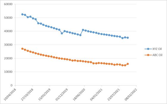
Note the data is residing in different sheets, and sometimes even different excel files so when importing to Power BI they will appear in different queries .
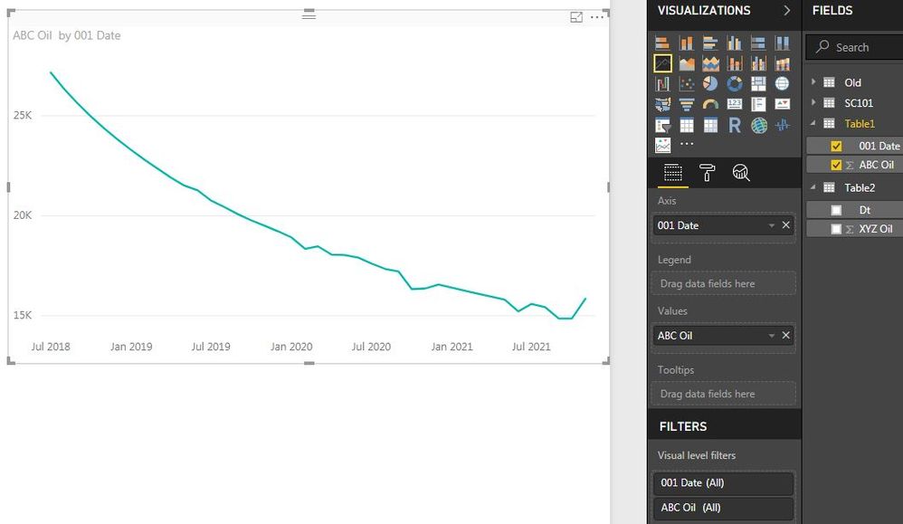
When I do the Line Chart option, It plots the data just fine for the first parameter!
As soon as I get the second data set in the line chart it just gives a flat line with the cumulative total of that column rather than the actual number itself.
I have used the Power BI Visuals from the market place (such as Power KPI, Pulse Chart) but I am essentially lost for ideas on what I am doing wrong. I think it’s a simple fix and your help is much appreciated in getting this across.
I have not made any relationships between the data set as I don’t think the data needs to be related, however I am ready to do it if that helps!
If I attempt a scatter Plot, then it does not like the Date to be on the X Axis.
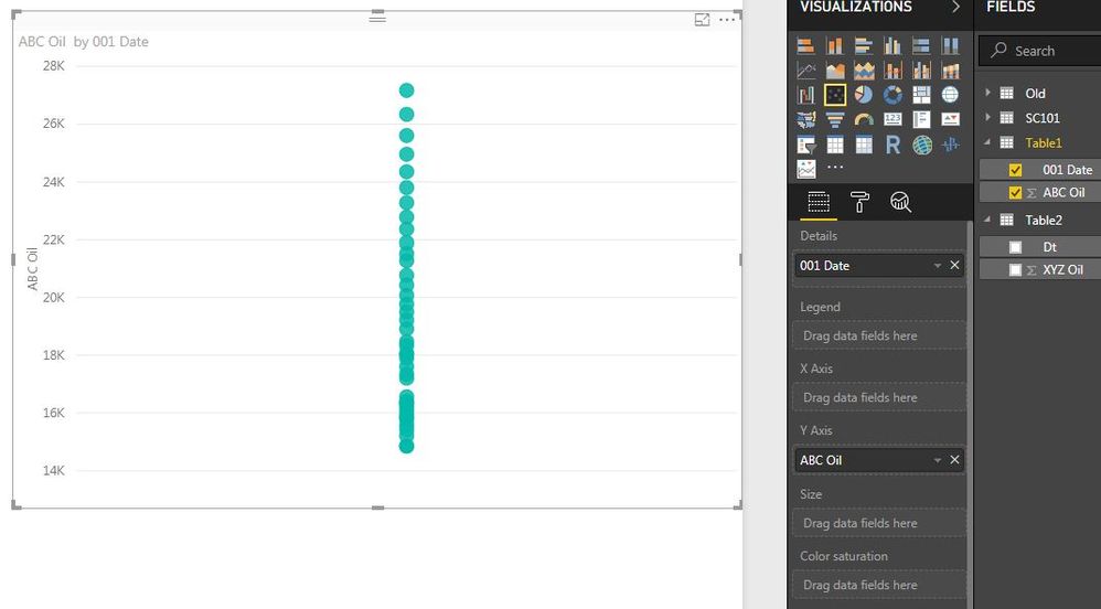
Many thanks.
Ankeet Vora
- Mark as New
- Bookmark
- Subscribe
- Mute
- Subscribe to RSS Feed
- Permalink
- Report Inappropriate Content
Hi @ankeetvora
From your example data, the "date" columns are the same for all tables which contains "date" column and XYZ Water, ABC Water, XYZ Copper, ect column.
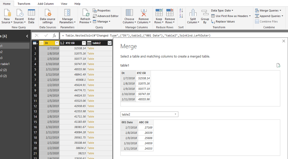
You could go to Edit Queries->Merge queries, merge all tables together based on the "date" column.
Then select columns to expand by clicking on the "arrow" on the column header. only select the useful column to expand instead of all)
The same steps to merge other tables to this table.
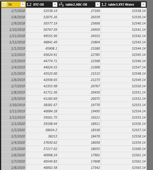
after merging, you will see a table like this (i only test with three tables)
Rename the columns's name as table2.ABC Oil->ABC Oil, table3.XYZ Water->XYZ Water
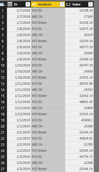
Ctrl+click on the columns "XYZ Oil", "ABC Oil" and "XYZ Water", select Transform->Unpivot columns
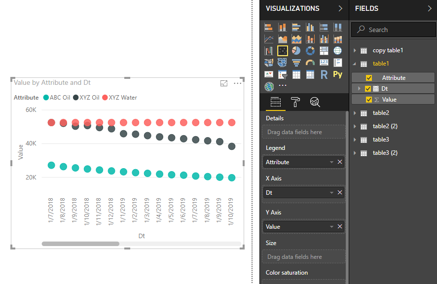
Final colse &&apply, go to Report view, create a visual like this
Best Regards
Maggie
- Mark as New
- Bookmark
- Subscribe
- Mute
- Subscribe to RSS Feed
- Permalink
- Report Inappropriate Content
Hi Maggie,
apologies for the delayed response, but i figured out an easier way to get the data plotted.
a) clean up the data set to have the date range consistent between the different tables.
b) Mark the data in excel as a 'table' with a specific name.
c) from Power BI, import those tables rather than the entire sheet, this i think is a key step.
d) put a relationship between the date range in Power BI
and then it is possible to plot the graph on the same line chart.
i have not had the chance to experiment without doing step (a) or (d) but my suspicion is step (c) is critical.
Nonetheless, many thanks for your help and responding to the query. appreciate it. this was my first time on a forum board and it has been a good experiance.
Regards,
Ankeet
- Mark as New
- Bookmark
- Subscribe
- Mute
- Subscribe to RSS Feed
- Permalink
- Report Inappropriate Content
On the first one, I am not aware of a way to sort those differently. You would have to add a number or something to your columns in Excel.
On the second one, would need to understand the data better. Please see this post regarding How to Get Your Question Answered Quickly: https://community.powerbi.com/t5/Community-Blog/How-to-Get-Your-Question-Answered-Quickly/ba-p/38490
@ me in replies or I'll lose your thread!!!
Instead of a Kudo, please vote for this idea
Become an expert!: Enterprise DNA
External Tools: MSHGQM
YouTube Channel!: Microsoft Hates Greg
Latest book!: The Definitive Guide to Power Query (M)
DAX is easy, CALCULATE makes DAX hard...
Helpful resources

Microsoft Fabric Learn Together
Covering the world! 9:00-10:30 AM Sydney, 4:00-5:30 PM CET (Paris/Berlin), 7:00-8:30 PM Mexico City

Power BI Monthly Update - April 2024
Check out the April 2024 Power BI update to learn about new features.

| User | Count |
|---|---|
| 109 | |
| 99 | |
| 77 | |
| 66 | |
| 54 |
| User | Count |
|---|---|
| 144 | |
| 104 | |
| 102 | |
| 87 | |
| 64 |

