- Power BI forums
- Updates
- News & Announcements
- Get Help with Power BI
- Desktop
- Service
- Report Server
- Power Query
- Mobile Apps
- Developer
- DAX Commands and Tips
- Custom Visuals Development Discussion
- Health and Life Sciences
- Power BI Spanish forums
- Translated Spanish Desktop
- Power Platform Integration - Better Together!
- Power Platform Integrations (Read-only)
- Power Platform and Dynamics 365 Integrations (Read-only)
- Training and Consulting
- Instructor Led Training
- Dashboard in a Day for Women, by Women
- Galleries
- Community Connections & How-To Videos
- COVID-19 Data Stories Gallery
- Themes Gallery
- Data Stories Gallery
- R Script Showcase
- Webinars and Video Gallery
- Quick Measures Gallery
- 2021 MSBizAppsSummit Gallery
- 2020 MSBizAppsSummit Gallery
- 2019 MSBizAppsSummit Gallery
- Events
- Ideas
- Custom Visuals Ideas
- Issues
- Issues
- Events
- Upcoming Events
- Community Blog
- Power BI Community Blog
- Custom Visuals Community Blog
- Community Support
- Community Accounts & Registration
- Using the Community
- Community Feedback
Register now to learn Fabric in free live sessions led by the best Microsoft experts. From Apr 16 to May 9, in English and Spanish.
- Power BI forums
- Forums
- Get Help with Power BI
- Desktop
- Re: Small multiples: any way to format x/y axis sc...
- Subscribe to RSS Feed
- Mark Topic as New
- Mark Topic as Read
- Float this Topic for Current User
- Bookmark
- Subscribe
- Printer Friendly Page
- Mark as New
- Bookmark
- Subscribe
- Mute
- Subscribe to RSS Feed
- Permalink
- Report Inappropriate Content
Small multiples: any way to format x/y axis scale individually?
Using SWITCH() and a table of measures, I'm able to use the small multiples feature to display multiple measures for long lists of items/customers/categories in a graph that scrolls together. This feature is a big problem solver for some of the reporting I'm typically asked to build.
One limitation I've found is that if I want to display an actual $ measure and a % measure together, the x/y axis will auto format to accomodate the $ figure, typically meaning the percent figure is not visible. I'm not finding an option to change scale by measure/category in the usual places.
I believe the fix may be listed in the Small Multiples Milestone list:
Preview Milestone 2
- ...
- Formatting: Y axis ranges can be synchronized or unsynchronized (to allow comparison of trends across multiples whose ranges vary wildly)
Beyond this eventual fix, has anyone found a workaround that allows us to set the axis scale of the individual "multiples"? Or does anyone have any insight on how far off Milestone 2 might be? I'm a relatively new user and not sure how long features like this stay in preview.
- Mark as New
- Bookmark
- Subscribe
- Mute
- Subscribe to RSS Feed
- Permalink
- Report Inappropriate Content
Hey guys, you could refer to this page. It has worked for me.
https://powerbidocs.com/2022/12/03/unshared-y-axis-for-small-multiple-charts/
- Mark as New
- Bookmark
- Subscribe
- Mute
- Subscribe to RSS Feed
- Permalink
- Report Inappropriate Content
Very helpful!!! Thanks!
- Mark as New
- Bookmark
- Subscribe
- Mute
- Subscribe to RSS Feed
- Permalink
- Report Inappropriate Content
Thanks a lot. This feature is exactly what I needed. I was worried for a minute when I could not find this feature. Without your comment, I may have given up.
- Mark as New
- Bookmark
- Subscribe
- Mute
- Subscribe to RSS Feed
- Permalink
- Report Inappropriate Content
Glad it helped 🤙
- Mark as New
- Bookmark
- Subscribe
- Mute
- Subscribe to RSS Feed
- Permalink
- Report Inappropriate Content
As far as I know, this feature still isn't available, although it would be very helpful. I voted for this idea: Small Multiple Line Chart with Auto-Adjusting Y-Axis
- Mark as New
- Bookmark
- Subscribe
- Mute
- Subscribe to RSS Feed
- Permalink
- Report Inappropriate Content
Has there been any workaround for this feature?
- Formatting: Y axis ranges can be synchronized or unsynchronized (to allow comparison of trends across multiples whose ranges vary wildly)
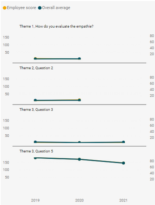
I am still unable to synchronize the Y axis in small multiples, I would like to have for each small multiple a Y-axis range that matches the range of data provided.
In the below example: Quality score example, scores can be 0-5 scale or a percentage score 0-100%, depending on the question asked. It is not possible for me to customize each Y-axis of the small multiple. I don't want to build a new visual per question.
What is the solution/work around?
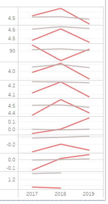
Tableau is able to customize the Y-axis range for each small multiple:
- Mark as New
- Bookmark
- Subscribe
- Mute
- Subscribe to RSS Feed
- Permalink
- Report Inappropriate Content
Any updates on this? This is a really critical option to make small multiples useful in many more situations.
- Mark as New
- Bookmark
- Subscribe
- Mute
- Subscribe to RSS Feed
- Permalink
- Report Inappropriate Content
I am also following up on progress/due date with the preview milestone 2 on option for a synchronized or unsynchronized Y axis on small multiples. Has this been completed yet, if not, does the functionaly have a due date for delivery? Thanks.
- Mark as New
- Bookmark
- Subscribe
- Mute
- Subscribe to RSS Feed
- Permalink
- Report Inappropriate Content
Is there any news on that "Milestone 2"? I couldn't find a solution and I'm really surprised this feature wasn't added. To me this is a solid "must have" as almost in every scenario when I "play" with absolute values in small multiples chart I see big variation of data. At this point this tool is useful basically only for some relative KPI's like sales per units, % returns etc.
- Mark as New
- Bookmark
- Subscribe
- Mute
- Subscribe to RSS Feed
- Permalink
- Report Inappropriate Content
Can't agree more with you @pirdim
Seems we aren't getting a straight answer yet as "WHEN" exactly this would be implemented.
- Mark as New
- Bookmark
- Subscribe
- Mute
- Subscribe to RSS Feed
- Permalink
- Report Inappropriate Content
@Trcose , for new and planned feature you can also refer this page
https://docs.microsoft.com/en-us/power-platform-release-plan/2020wave2/power-bi/planned-features
for any limitations, you can suggest an idea or vote for an existing one - https://ideas.powerbi.com/ideas/
Microsoft Power BI Learning Resources, 2023 !!
Learn Power BI - Full Course with Dec-2022, with Window, Index, Offset, 100+ Topics !!
Did I answer your question? Mark my post as a solution! Appreciate your Kudos !! Proud to be a Super User! !!
Helpful resources

Microsoft Fabric Learn Together
Covering the world! 9:00-10:30 AM Sydney, 4:00-5:30 PM CET (Paris/Berlin), 7:00-8:30 PM Mexico City

Power BI Monthly Update - April 2024
Check out the April 2024 Power BI update to learn about new features.

| User | Count |
|---|---|
| 112 | |
| 100 | |
| 80 | |
| 64 | |
| 57 |
| User | Count |
|---|---|
| 146 | |
| 110 | |
| 93 | |
| 84 | |
| 67 |


