- Power BI forums
- Updates
- News & Announcements
- Get Help with Power BI
- Desktop
- Service
- Report Server
- Power Query
- Mobile Apps
- Developer
- DAX Commands and Tips
- Custom Visuals Development Discussion
- Health and Life Sciences
- Power BI Spanish forums
- Translated Spanish Desktop
- Power Platform Integration - Better Together!
- Power Platform Integrations (Read-only)
- Power Platform and Dynamics 365 Integrations (Read-only)
- Training and Consulting
- Instructor Led Training
- Dashboard in a Day for Women, by Women
- Galleries
- Community Connections & How-To Videos
- COVID-19 Data Stories Gallery
- Themes Gallery
- Data Stories Gallery
- R Script Showcase
- Webinars and Video Gallery
- Quick Measures Gallery
- 2021 MSBizAppsSummit Gallery
- 2020 MSBizAppsSummit Gallery
- 2019 MSBizAppsSummit Gallery
- Events
- Ideas
- Custom Visuals Ideas
- Issues
- Issues
- Events
- Upcoming Events
- Community Blog
- Power BI Community Blog
- Custom Visuals Community Blog
- Community Support
- Community Accounts & Registration
- Using the Community
- Community Feedback
Register now to learn Fabric in free live sessions led by the best Microsoft experts. From Apr 16 to May 9, in English and Spanish.
- Power BI forums
- Forums
- Get Help with Power BI
- Desktop
- Slope and graph plot
- Subscribe to RSS Feed
- Mark Topic as New
- Mark Topic as Read
- Float this Topic for Current User
- Bookmark
- Subscribe
- Printer Friendly Page
- Mark as New
- Bookmark
- Subscribe
- Mute
- Subscribe to RSS Feed
- Permalink
- Report Inappropriate Content
Slope and graph plot
Hi community !
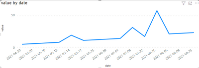
I have a big database with a lot of data in it. Typically, I would have a "Table" with column "Result" and "Date". But, not all date would be populated.
I try to create a measure that would display the slope of the Results (to see the trend) of the selected time from filter (that will select based on Date).
If I plot Result against Date, there are some gap when no measurement was performed. As I am not interested in the numerical value of the slope, but on the ratio "slope/target" value to see if the trend is critically going up or down.
So, in fact, what I would need is a way to plot "Result" against X Axis 1-2-3-4-5-6- ... and get the slope from that.
Any Idea??
Thanks
Julien
- Mark as New
- Bookmark
- Subscribe
- Mute
- Subscribe to RSS Feed
- Permalink
- Report Inappropriate Content
Hi @Courju
sorry for not very understand,
based on the file I created, could you add more details about the expected result?
Best Regards,
Community Support Team _Tang
If this post helps, please consider Accept it as the solution to help the other members find it more quickly.
- Mark as New
- Bookmark
- Subscribe
- Mute
- Subscribe to RSS Feed
- Permalink
- Report Inappropriate Content
Here an example of the file:
https://1drv.ms/u/s!AmQCAddskXi4g9pIhiLCRwGzshJzsw?e=gnqffr
There, you might see that I had to fill up
I have the feeling that there is something to do with Rankx ... I spent hours on it, and can't figure it out.
For the calculation of the slope, I found that:
- Mark as New
- Bookmark
- Subscribe
- Mute
- Subscribe to RSS Feed
- Permalink
- Report Inappropriate Content
Thanks for already starting to look at my request ... 😁
I wanted to make changes to your pbix, but somehow couldn't.
But, let me show it then, as you proposed:
Based on what you started:
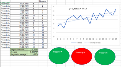
I have a huge database from production samples. After slicer filtering down to one single property, I end up with a similar table than the one you proposed.
No average necessary, no sum, and but a numerical 1.2.3.4. is given automatically (of course, as it needs to follow the slicer choice, so it can't be just added to the database). If I do add an ID to each row, it would not be continuous, due to the lack of data on certain days, and for certain properties.
The plot is done of the numerical vs. day (no double point will be found as my values are refered with day and time and for one property, there is no double value then) and the linear regression done provides me the 0,3281. This is divided by the average of all data to rationalize the result. There I get 3,69% "increase".
Purpose is to obtain a simple visualisation like this:
Based on, let say 5%.
For a quality control lab, it will be a visualization for the manager to look at every 2-3 days. No graph, no values, only lights red or green, showing that the property is stable or not, but always based on the same rational increase.
Of course, a property measuring at average 0.62 is not impacted the same from a +1 unit than a property measuring at average 10500 ... that is clear.
Ok, I hope this is easier to understand now.
Thanks again for your help ... already hours trying that ...
Julien
- Mark as New
- Bookmark
- Subscribe
- Mute
- Subscribe to RSS Feed
- Permalink
- Report Inappropriate Content
@Courju You may want to try the built-in analytics options for your chart. They include a trend line.
Helpful resources

Microsoft Fabric Learn Together
Covering the world! 9:00-10:30 AM Sydney, 4:00-5:30 PM CET (Paris/Berlin), 7:00-8:30 PM Mexico City

Power BI Monthly Update - April 2024
Check out the April 2024 Power BI update to learn about new features.

| User | Count |
|---|---|
| 111 | |
| 95 | |
| 80 | |
| 68 | |
| 59 |
| User | Count |
|---|---|
| 150 | |
| 119 | |
| 104 | |
| 87 | |
| 67 |


