- Power BI forums
- Updates
- News & Announcements
- Get Help with Power BI
- Desktop
- Service
- Report Server
- Power Query
- Mobile Apps
- Developer
- DAX Commands and Tips
- Custom Visuals Development Discussion
- Health and Life Sciences
- Power BI Spanish forums
- Translated Spanish Desktop
- Power Platform Integration - Better Together!
- Power Platform Integrations (Read-only)
- Power Platform and Dynamics 365 Integrations (Read-only)
- Training and Consulting
- Instructor Led Training
- Dashboard in a Day for Women, by Women
- Galleries
- Community Connections & How-To Videos
- COVID-19 Data Stories Gallery
- Themes Gallery
- Data Stories Gallery
- R Script Showcase
- Webinars and Video Gallery
- Quick Measures Gallery
- 2021 MSBizAppsSummit Gallery
- 2020 MSBizAppsSummit Gallery
- 2019 MSBizAppsSummit Gallery
- Events
- Ideas
- Custom Visuals Ideas
- Issues
- Issues
- Events
- Upcoming Events
- Community Blog
- Power BI Community Blog
- Custom Visuals Community Blog
- Community Support
- Community Accounts & Registration
- Using the Community
- Community Feedback
Register now to learn Fabric in free live sessions led by the best Microsoft experts. From Apr 16 to May 9, in English and Spanish.
- Power BI forums
- Forums
- Get Help with Power BI
- Desktop
- Re: Slicing by Measure
- Subscribe to RSS Feed
- Mark Topic as New
- Mark Topic as Read
- Float this Topic for Current User
- Bookmark
- Subscribe
- Printer Friendly Page
- Mark as New
- Bookmark
- Subscribe
- Mute
- Subscribe to RSS Feed
- Permalink
- Report Inappropriate Content
Slicing by Measure
I've created a measure that calculates exactly the way I need it to, but now I'm stuck on trying to figure out how I can turn it into a slicer.
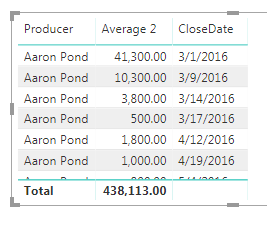
First, I have a field named Estimated Revenue. This field is simply a revenue number accompanied by dates:
So in trying to get the average of this number, I created a basic measure:

Realizing I cannot slice by a measure, I then created a column to return this number:
But all this ended up doing was returning the sum again which I already had:
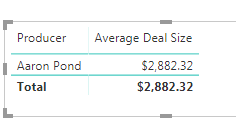
Lastly, I had to create ANOTHER measure to return the true average:
So this now gives me a correct value:
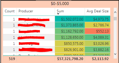
So regardless of date, I can see any persons average deal size, however since this is a measure I cannot put it into a slicer. So for instance, if on a graph I would like to see over time if people with an average deal size of $5,000 or less have been improving or not, I have no real way to see that. The best I'm able to do is put people in a table and put a filter on each table defining their ranges for average deal size:
Is there any way I can turn their average deal size into a slicer?
- Mark as New
- Bookmark
- Subscribe
- Mute
- Subscribe to RSS Feed
- Permalink
- Report Inappropriate Content
Hi @Anonymous
You may create a measure like below. Then drag it to visual level filter then set it is 1 to filter the Avg Deal Size <=5000.Here is article about it.
Measure =
IF ( [Avg Deal Size] < 5000, 1 )
Regards,
Cherie
If this post helps, then please consider Accept it as the solution to help the other members find it more quickly.
- Mark as New
- Bookmark
- Subscribe
- Mute
- Subscribe to RSS Feed
- Permalink
- Report Inappropriate Content
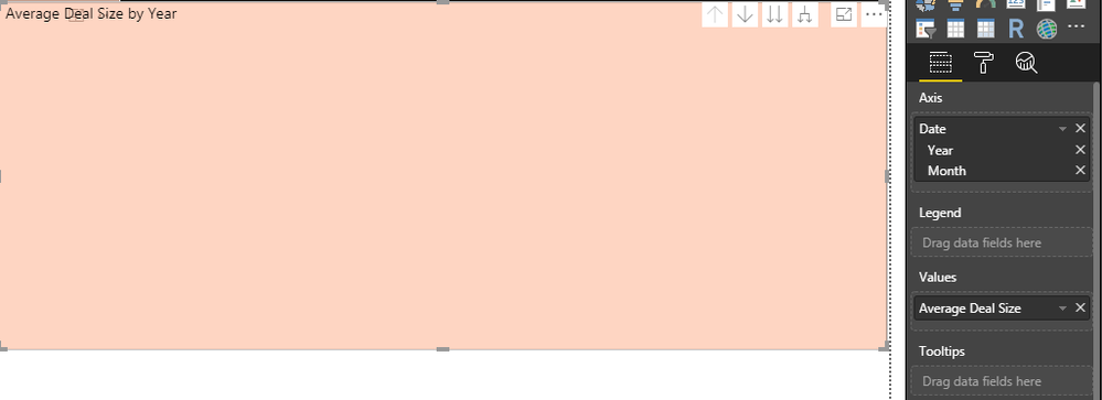
@v-cherch-msft Thank you. While this works, the issue that I now have is once I set the filter to 1, my visualizations disappear:
Before:
After:
But for some reason If I change my axis to a hierarchy of Month/Day instead of Year/Month it displays but I'm unsure of the numbers because if the average is supposed to be between 0-5000, I don't know how a month could be over 5000:
- Mark as New
- Bookmark
- Subscribe
- Mute
- Subscribe to RSS Feed
- Permalink
- Report Inappropriate Content
Hi @Anonymous
Sample data and expected output will be helpful to provide an accurate solution.Could you share some sample data which could reproduce your scenario for us to check?You can upload the .pbix file to OneDrive and post the link here. Do mask sensitive data before uploading.
Regards,
Cherie
If this post helps, then please consider Accept it as the solution to help the other members find it more quickly.
Helpful resources

Microsoft Fabric Learn Together
Covering the world! 9:00-10:30 AM Sydney, 4:00-5:30 PM CET (Paris/Berlin), 7:00-8:30 PM Mexico City

Power BI Monthly Update - April 2024
Check out the April 2024 Power BI update to learn about new features.

| User | Count |
|---|---|
| 115 | |
| 99 | |
| 86 | |
| 70 | |
| 62 |
| User | Count |
|---|---|
| 151 | |
| 120 | |
| 103 | |
| 87 | |
| 68 |


