- Power BI forums
- Updates
- News & Announcements
- Get Help with Power BI
- Desktop
- Service
- Report Server
- Power Query
- Mobile Apps
- Developer
- DAX Commands and Tips
- Custom Visuals Development Discussion
- Health and Life Sciences
- Power BI Spanish forums
- Translated Spanish Desktop
- Power Platform Integration - Better Together!
- Power Platform Integrations (Read-only)
- Power Platform and Dynamics 365 Integrations (Read-only)
- Training and Consulting
- Instructor Led Training
- Dashboard in a Day for Women, by Women
- Galleries
- Community Connections & How-To Videos
- COVID-19 Data Stories Gallery
- Themes Gallery
- Data Stories Gallery
- R Script Showcase
- Webinars and Video Gallery
- Quick Measures Gallery
- 2021 MSBizAppsSummit Gallery
- 2020 MSBizAppsSummit Gallery
- 2019 MSBizAppsSummit Gallery
- Events
- Ideas
- Custom Visuals Ideas
- Issues
- Issues
- Events
- Upcoming Events
- Community Blog
- Power BI Community Blog
- Custom Visuals Community Blog
- Community Support
- Community Accounts & Registration
- Using the Community
- Community Feedback
Register now to learn Fabric in free live sessions led by the best Microsoft experts. From Apr 16 to May 9, in English and Spanish.
- Power BI forums
- Forums
- Get Help with Power BI
- Desktop
- Re: Slicer to toggle color blind friendly theme
- Subscribe to RSS Feed
- Mark Topic as New
- Mark Topic as Read
- Float this Topic for Current User
- Bookmark
- Subscribe
- Printer Friendly Page
- Mark as New
- Bookmark
- Subscribe
- Mute
- Subscribe to RSS Feed
- Permalink
- Report Inappropriate Content
Slicer to toggle color blind friendly theme
Some of our users are color blind, so I want to implement a slicer that changes the color theme of a line chart. I have been able to do this in the past when the number of categories is a known quantity with a measure that sets the Hex color code for each category, and switches based on a slicer selection.
Colors_Speaker = SWITCH(
    TRUE(),
'Color Scheme'[Selected Color Style]=1,
SWITCH(TRUE(),
Speaker_Master[Speaker Rec Code]=1,"#66DF60",
Speaker_Master[Speaker Rec Code]=2,"#D64550",
Speaker_Master[Speaker Rec Code]=3,"#B3B3B3"
),
'Color Scheme'[Selected Color Style]=2,
SWITCH(TRUE(),
Speaker_Master[Speaker Rec Code]=1,"#1AFF1A",
Speaker_Master[Speaker Rec Code]=2,"#4B0092",
Speaker_Master[Speaker Rec Code]=3,"#B3B3B3"
))
But now I have a visual where the number of categories is dynamic, so ideally a user could switch to a color blind friendly theme using a slicer. If switching themes with a slicer is not possible, I'm open to other ideas for a work around.
- Mark as New
- Bookmark
- Subscribe
- Mute
- Subscribe to RSS Feed
- Permalink
- Report Inappropriate Content
Hey @rcheskin ,
maybe you might consider storing the color code inside the table, then you can create a measure like so:
vizAid Fill Color =
var __theme = SELECTEDVALUE( 'theme'[theme] , "theme1" )
var __speakercode = SELECTEDVALUE( 'speakercode'[speakercodeid] )
return
IF( __theme = "theme1"
    , CALCULATE( MAX( 'speakercode'[theme1] ) ,  'speakercode'[speakercodeid] = __speakercode )
    , CALCULATE( MAX( 'speakercode'[theme2] ) ,  'speakercode'[speakercodeid] = __speakercode )
)
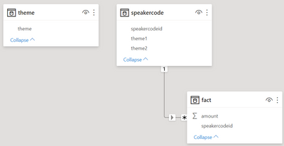
This is how my data model looks like:
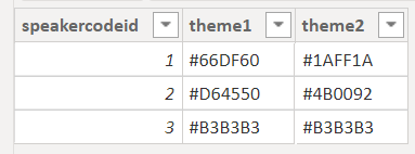
The content of the table speakcercode
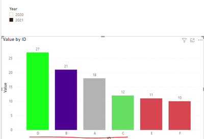
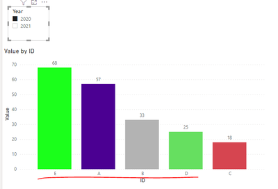
I assigned the measure to the fill color of a bar chart (not a reasonable data visualization - I know)
Hopefully, this provides what you are looking for.
Regards,
Tom
Did I answer your question? Mark my post as a solution, this will help others!
Proud to be a Super User!
I accept Kudos 😉
Hamburg, Germany
- Mark as New
- Bookmark
- Subscribe
- Mute
- Subscribe to RSS Feed
- Permalink
- Report Inappropriate Content
@TomMartens Unfortunately there is no way to predict which speaker ID(s) will be selected by the user, and I probably should have mentioned in the beginning that this is a line chart, which I'm now finding out doesn't have conditional formatting in Power BI out of the box. Previous posts point to a workaround described in this blog:
https://exceleratorbi.com.au/line-chart-conditional-formatting/
In retrospect, I don't really need something this fancy. Realistically a user is not going to pick more than 5 values for the line chart because more than that will be too cluttered, so if I can manually specifiy the colors for the first 8 values (just like you pick 8 colors for a theme) it will work.
- Mark as New
- Bookmark
- Subscribe
- Mute
- Subscribe to RSS Feed
- Permalink
- Report Inappropriate Content
Hi @rcheskin ,
Does your problem have been solved? If it is solved, please mark a reply which is helpful to you.
If the problem is still not resolved, please provide detailed error information or the expected result you expect. Let me know immediately, looking forward to your reply.
Best Regards,
Winniz
- Mark as New
- Bookmark
- Subscribe
- Mute
- Subscribe to RSS Feed
- Permalink
- Report Inappropriate Content
I believe I did, and I don't have a solution yet. I want to have the first 8 data colors of a line chart specified dynamically, without using a theme.
- Mark as New
- Bookmark
- Subscribe
- Mute
- Subscribe to RSS Feed
- Permalink
- Report Inappropriate Content
Hi @rcheskin ,
Try to create measures shown below for the top 8 data.
Rank =
RANKX(
    ALLSELECTED('Table'[ID]),
    CALCULATE( SUM('Table'[Value]) )
)
Color =
SWITCH(
[Rank],
1, "#1AFF1A",
2, "#4B0092",
3, "#B3B3B3",
4, "#66DF60",
"#D64550"
)If the problem is still not resolved, please provide detailed error information or the expected result you expect. Let me know immediately, looking forward to your reply.
Best Regards,
Winniz
If this post helps, then please consider Accept it as the solution to help the other members find it more quickly.
- Mark as New
- Bookmark
- Subscribe
- Mute
- Subscribe to RSS Feed
- Permalink
- Report Inappropriate Content
Hi @v-kkf-msft ,
This method does not work with line charts because there is no option to specify conditional formatting of colors.
Helpful resources

Microsoft Fabric Learn Together
Covering the world! 9:00-10:30 AM Sydney, 4:00-5:30 PM CET (Paris/Berlin), 7:00-8:30 PM Mexico City

Power BI Monthly Update - April 2024
Check out the April 2024 Power BI update to learn about new features.

| User | Count |
|---|---|
| 108 | |
| 98 | |
| 79 | |
| 65 | |
| 60 |
| User | Count |
|---|---|
| 148 | |
| 113 | |
| 97 | |
| 84 | |
| 67 |


