- Power BI forums
- Updates
- News & Announcements
- Get Help with Power BI
- Desktop
- Service
- Report Server
- Power Query
- Mobile Apps
- Developer
- DAX Commands and Tips
- Custom Visuals Development Discussion
- Health and Life Sciences
- Power BI Spanish forums
- Translated Spanish Desktop
- Power Platform Integration - Better Together!
- Power Platform Integrations (Read-only)
- Power Platform and Dynamics 365 Integrations (Read-only)
- Training and Consulting
- Instructor Led Training
- Dashboard in a Day for Women, by Women
- Galleries
- Community Connections & How-To Videos
- COVID-19 Data Stories Gallery
- Themes Gallery
- Data Stories Gallery
- R Script Showcase
- Webinars and Video Gallery
- Quick Measures Gallery
- 2021 MSBizAppsSummit Gallery
- 2020 MSBizAppsSummit Gallery
- 2019 MSBizAppsSummit Gallery
- Events
- Ideas
- Custom Visuals Ideas
- Issues
- Issues
- Events
- Upcoming Events
- Community Blog
- Power BI Community Blog
- Custom Visuals Community Blog
- Community Support
- Community Accounts & Registration
- Using the Community
- Community Feedback
Register now to learn Fabric in free live sessions led by the best Microsoft experts. From Apr 16 to May 9, in English and Spanish.
- Power BI forums
- Forums
- Get Help with Power BI
- Desktop
- Re: Single color in scatter chart legend
- Subscribe to RSS Feed
- Mark Topic as New
- Mark Topic as Read
- Float this Topic for Current User
- Bookmark
- Subscribe
- Printer Friendly Page
- Mark as New
- Bookmark
- Subscribe
- Mute
- Subscribe to RSS Feed
- Permalink
- Report Inappropriate Content
Single color in scatter chart legend
Hi All,
I have requirement where i need to display data in scatter chart as date wise salesamount grouped by agent.
i am added columns in chart as below,
X- Axis --> Date
Y-Axis --> Salesamount
legend --> Agent
this is showing results as expected but since i have added agent in legend it is showing multiple color,but requirement is i need to show all bubbles in single color.
i tried adding Agent in Details but it is asking to summarize Date column which is not the requirement.
Any work around to acheive this?
Thanks in Advance,
Suyog
- Mark as New
- Bookmark
- Subscribe
- Mute
- Subscribe to RSS Feed
- Permalink
- Report Inappropriate Content
Hi @suyogbi ,
Unfortunately in a Scatter Chart, you can't set Data Colours to same colour by a single click.
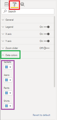
What you can do is, suppose you have 3-4 Agents then you can manually modify colours to same under formatting options for the chart:
This was doable at my end, as I just have 4 categories in my Legend.
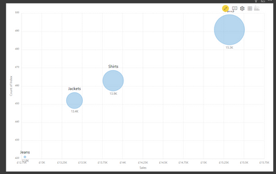
If in case you want to use a custom visual, then try Bubble/Scatter Chart by Xviz. That gives you flexibility to give same colours to your bubbles:
Thanks,
Pragati
- Mark as New
- Bookmark
- Subscribe
- Mute
- Subscribe to RSS Feed
- Permalink
- Report Inappropriate Content
Thank you so much for your reply.
i have 100's of agents , number will be increased on time basis, so want to avoid manual color modification.
and customer dont want to go for custom visuals.
- Mark as New
- Bookmark
- Subscribe
- Mute
- Subscribe to RSS Feed
- Permalink
- Report Inappropriate Content
Hi @suyogbi ,
If you can't use custom visuals, then I am not sure on how you can achieve this as Scatter plot doesn't allow to give a calculation as a colour as well.
You may have to look into some other chart rather than scatter plot chart.
Thanks,
Pragati
Helpful resources

Microsoft Fabric Learn Together
Covering the world! 9:00-10:30 AM Sydney, 4:00-5:30 PM CET (Paris/Berlin), 7:00-8:30 PM Mexico City

Power BI Monthly Update - April 2024
Check out the April 2024 Power BI update to learn about new features.

| User | Count |
|---|---|
| 114 | |
| 100 | |
| 78 | |
| 75 | |
| 50 |
| User | Count |
|---|---|
| 144 | |
| 109 | |
| 108 | |
| 88 | |
| 61 |


