- Power BI forums
- Updates
- News & Announcements
- Get Help with Power BI
- Desktop
- Service
- Report Server
- Power Query
- Mobile Apps
- Developer
- DAX Commands and Tips
- Custom Visuals Development Discussion
- Health and Life Sciences
- Power BI Spanish forums
- Translated Spanish Desktop
- Power Platform Integration - Better Together!
- Power Platform Integrations (Read-only)
- Power Platform and Dynamics 365 Integrations (Read-only)
- Training and Consulting
- Instructor Led Training
- Dashboard in a Day for Women, by Women
- Galleries
- Community Connections & How-To Videos
- COVID-19 Data Stories Gallery
- Themes Gallery
- Data Stories Gallery
- R Script Showcase
- Webinars and Video Gallery
- Quick Measures Gallery
- 2021 MSBizAppsSummit Gallery
- 2020 MSBizAppsSummit Gallery
- 2019 MSBizAppsSummit Gallery
- Events
- Ideas
- Custom Visuals Ideas
- Issues
- Issues
- Events
- Upcoming Events
- Community Blog
- Power BI Community Blog
- Custom Visuals Community Blog
- Community Support
- Community Accounts & Registration
- Using the Community
- Community Feedback
Register now to learn Fabric in free live sessions led by the best Microsoft experts. From Apr 16 to May 9, in English and Spanish.
- Power BI forums
- Forums
- Get Help with Power BI
- Desktop
- Re: Simple matrix to bar chart does not work prope...
- Subscribe to RSS Feed
- Mark Topic as New
- Mark Topic as Read
- Float this Topic for Current User
- Bookmark
- Subscribe
- Printer Friendly Page
- Mark as New
- Bookmark
- Subscribe
- Mute
- Subscribe to RSS Feed
- Permalink
- Report Inappropriate Content
Simple matrix to bar chart does not work properly
Hello!
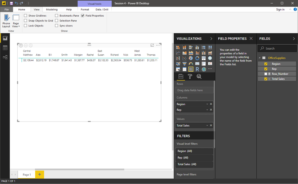
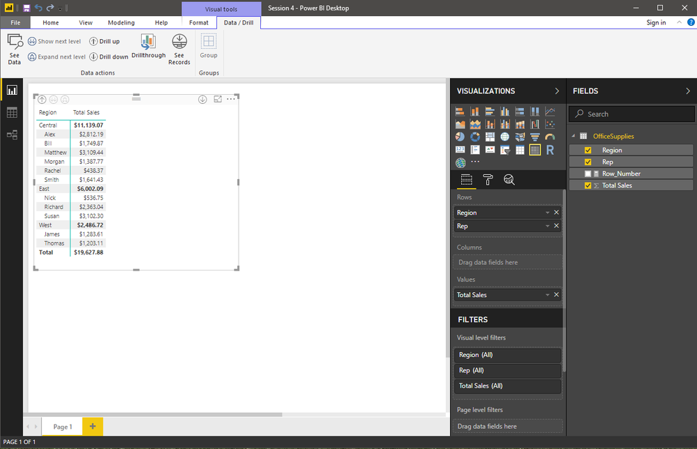
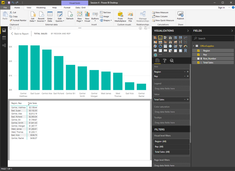
I am trying to place a simple set of matrix data that is grouped by region and sorted by total sales into a bar chart. The data is correctly shown below.
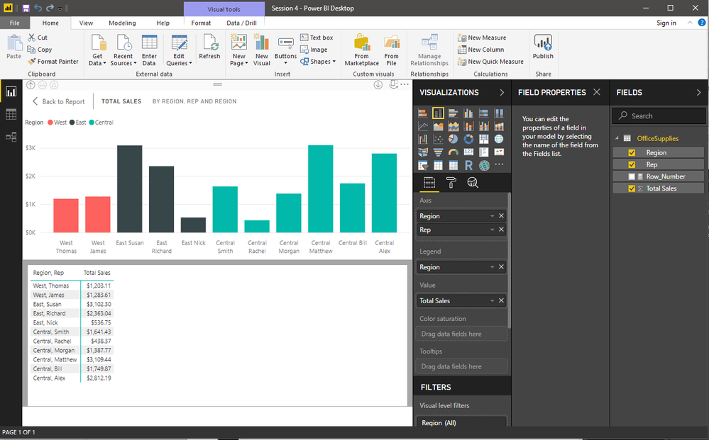
Now the problem occurs when selecting the bar chart (stacked column chart or clustered column chart). Once this occurs, the data is no longer grouped properly and the chart is not correct.
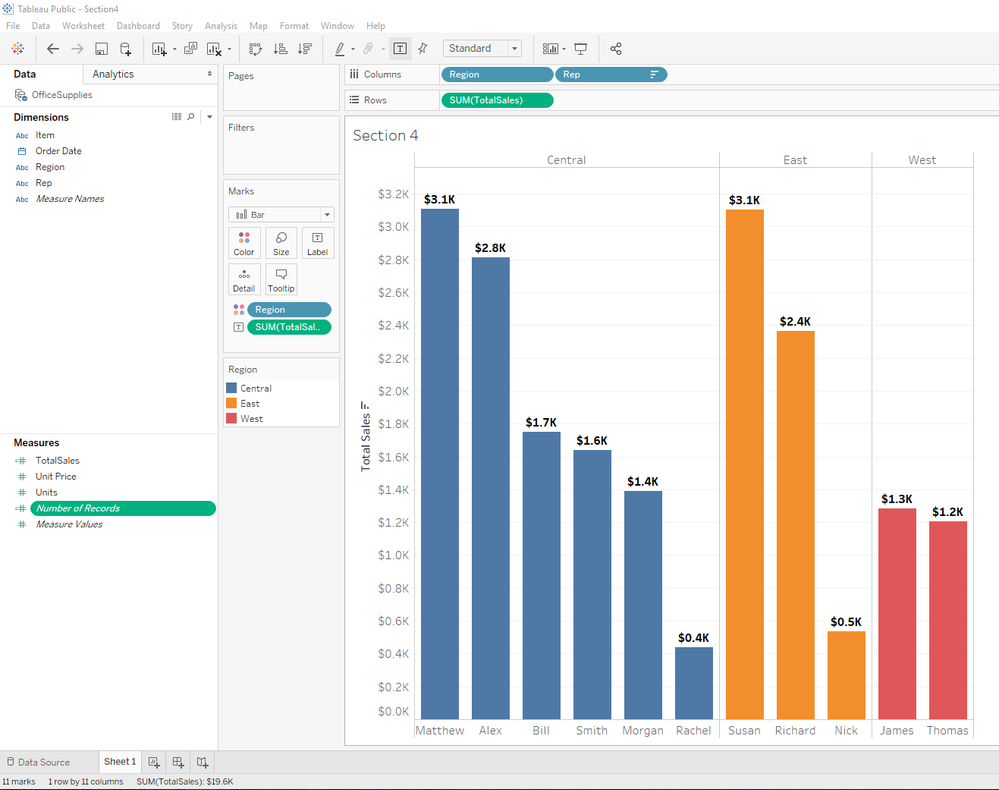
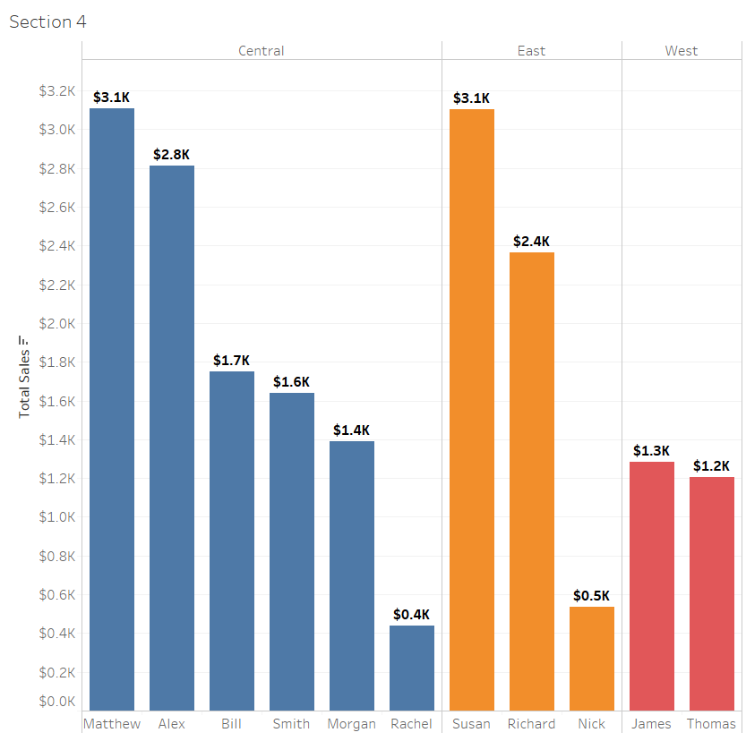
Ultimately, the chart should look something like this that was accomplished in Tableau (formatting aside). However, we don't want to use Tableau, we want to use Power BI.
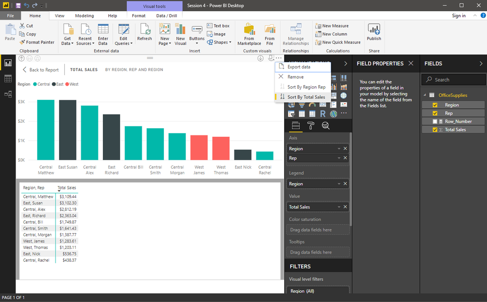
Is the ability to do this not available in the May 2018 release of Power BI, or is there more configuration that has to be done that is not immediately apparent? I've tried everything that I can think of and formatting a simple table is just not easy and it should be. Even sorting the chart by Total Sales doesn't provide the correct solution as the Regions do not remain grouped as shown above with Tableau.
Does anyone have any ideas as how to get where I need to go with Power BI instead of Tableau? Thank you very much for your help!!
James
- Mark as New
- Bookmark
- Subscribe
- Mute
- Subscribe to RSS Feed
- Permalink
- Report Inappropriate Content
Hi @jamesb1013
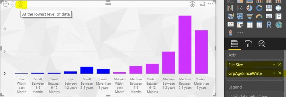
Lets make you a power bi convert. I've done this with a similar dataset, see image below, and the steps to do it are below also.
So what you need to do here is:
1. As you've done, take a copy of your matrix and use the 'Stacked Column Chart' visual.
2. Organise your columns so that they both sit on above each other on the x-axis area. See image.
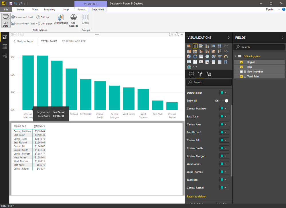
3. On the graph, select the icon that drills down all the data down to the bottom levels, again see image.
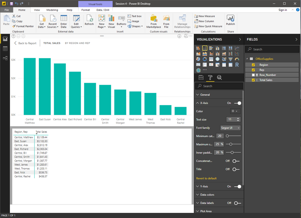
4. On the options section for the graph (the paintbrush icon), under x-axis, there's a switch that says 'Concatenate columns'. Switch that to off. See image.
This should then get your data split up as you want. Use the data colours to colour them in as necessary.
Let me know how you get on,
Thanks
shebr
- Mark as New
- Bookmark
- Subscribe
- Mute
- Subscribe to RSS Feed
- Permalink
- Report Inappropriate Content
Thank you for the quick response! I have attempted to do as you have suggested but could not make it work but I'm sure it is something on my end. Your directions were very clear so I'll provide my steps below as I interpreted them from your email.
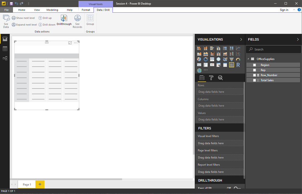
I start by adding a new matrix to the desktop.
After that, I drag Region and Rep into the Axis area followed by Total Sales into the Value area.
Next, I clicked on the double arrow button (Show next level), until I reached the lowest level to obtain the same view as you had in your screenshot with the subtotals.
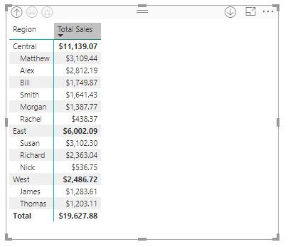
I then proceeded to sort the Total Sales column in decending order by clicking the small arrow beside Total Sales. This provides the correct grouping and order that the bar chart needs to follow.
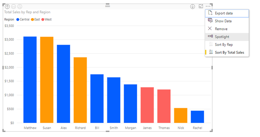
I have confirmed that the Region and Rep fields are on top of each other as noted in your second step. I then proceeded to click on the Stacked Column Chart icon to obtain the base bar chart. For visual reference, I also clicked on the See Data icon on the ribbon bar under Visual Tools > Data/Drill. On the upper left hand corner of the graph I drilled through the data (Expand next level) to get where we are below so as to closely mirror your image.
The last thing I did was went to the options, under the x-axis and turned off 'Concatenate columns', however, I didn't see that it did anything visible.
At this point, is where I believe is the disconnect. You mentioned at this point I could go into Data Colors and change the colors as I want, and I can do that but it is a lot of work to do especially if I have quite a few more columns. I think the better way is to just drop in Region in the Legend area and change the colors that way. However, we still have a couple of issues.
(I've dropped in the Region into the Legend area.)
So, in order to get rid of the Region name on the X-axis so as not to clutter the name of the Rep, I went back up to the upper left hand corner and drilled to the top level and then selected the double arrow button (Show next level) until I reached the bottom. It didn't change the chart layout other than to remove the Region name, so that problem is solved, but the Regions are still dispersed and not grouped and properly sorted as in the original matrix.
Our end goal is to reach something similar, if not exact, to the original Tableau bar chart below, and we're nearly there. What elementary thing(s) am I missing that is preventing success? Thank you again @shebr for your help! -James
- Mark as New
- Bookmark
- Subscribe
- Mute
- Subscribe to RSS Feed
- Permalink
- Report Inappropriate Content
Hi @jamesb1013
At your step 5 image, there is an icon on your graph in the top left corner that represents 'drill up' If you drill up to the top level, then use the 3rd icon in the top left to drill to the bottom of all levels that should group them up as you want.
Toggle the concatenate on and off if it does not work immediately.
Let me know how you get on. If not, send me over your pbix and i can have a look.
Thanks
shebr
- Mark as New
- Bookmark
- Subscribe
- Mute
- Subscribe to RSS Feed
- Permalink
- Report Inappropriate Content
Shebr,
Did you have any luck with the two files I sent you? I tried again and I still can't get things to work with PBI May 2018 edition. I'm not sure PBI can do it, yet. Maybe in a future release.
- Mark as New
- Bookmark
- Subscribe
- Mute
- Subscribe to RSS Feed
- Permalink
- Report Inappropriate Content
Can you click on the ellipsis and select Sort by Region instead of Sort by Total Sales?
- Mark as New
- Bookmark
- Subscribe
- Mute
- Subscribe to RSS Feed
- Permalink
- Report Inappropriate Content
@Anonymous,
Hello! Unfortunately that is not an option. I can either sort by Rep or Total Sales. I would be nice to be able to just simply group the Regions and then execute a descending sort within each Region. Thank you for the response!
Helpful resources

Microsoft Fabric Learn Together
Covering the world! 9:00-10:30 AM Sydney, 4:00-5:30 PM CET (Paris/Berlin), 7:00-8:30 PM Mexico City

Power BI Monthly Update - April 2024
Check out the April 2024 Power BI update to learn about new features.

| User | Count |
|---|---|
| 112 | |
| 100 | |
| 76 | |
| 74 | |
| 49 |
| User | Count |
|---|---|
| 146 | |
| 108 | |
| 106 | |
| 90 | |
| 62 |
