- Power BI forums
- Updates
- News & Announcements
- Get Help with Power BI
- Desktop
- Service
- Report Server
- Power Query
- Mobile Apps
- Developer
- DAX Commands and Tips
- Custom Visuals Development Discussion
- Health and Life Sciences
- Power BI Spanish forums
- Translated Spanish Desktop
- Power Platform Integration - Better Together!
- Power Platform Integrations (Read-only)
- Power Platform and Dynamics 365 Integrations (Read-only)
- Training and Consulting
- Instructor Led Training
- Dashboard in a Day for Women, by Women
- Galleries
- Community Connections & How-To Videos
- COVID-19 Data Stories Gallery
- Themes Gallery
- Data Stories Gallery
- R Script Showcase
- Webinars and Video Gallery
- Quick Measures Gallery
- 2021 MSBizAppsSummit Gallery
- 2020 MSBizAppsSummit Gallery
- 2019 MSBizAppsSummit Gallery
- Events
- Ideas
- Custom Visuals Ideas
- Issues
- Issues
- Events
- Upcoming Events
- Community Blog
- Power BI Community Blog
- Custom Visuals Community Blog
- Community Support
- Community Accounts & Registration
- Using the Community
- Community Feedback
Register now to learn Fabric in free live sessions led by the best Microsoft experts. From Apr 16 to May 9, in English and Spanish.
- Power BI forums
- Forums
- Get Help with Power BI
- Desktop
- Simple DAX (why is this so hard to grasp)
- Subscribe to RSS Feed
- Mark Topic as New
- Mark Topic as Read
- Float this Topic for Current User
- Bookmark
- Subscribe
- Printer Friendly Page
- Mark as New
- Bookmark
- Subscribe
- Mute
- Subscribe to RSS Feed
- Permalink
- Report Inappropriate Content
Simple DAX (why is this so hard to grasp)
Hi all,
I've done bits in batch scripting, VBScripting, VBA. I know Java, HTML, PHP and SQL. For some reason, I am really struggling to understand even the basic concepts of DAX.
I have sales data lets say item_name, sale_price, item_category. All i want to do is sum the total sale_price per item_category. Lets say i have 4 categories. So i want the output to be like this this (totals per category)
Category1 - 15000
Category2 - 21000
Category3 - 3000
Category4 - 6500
then from that I am going to convert the data into percentages. Ie:
Category1 - 32%
Category2 - 46%
Category3 - 6.5%
Category4 - 14%
this takes me literally 1 minute in excel. Yet i've spent 2 hours now trying to get it going in Power BI. The problem I keep having is it just outputs 1 number, the total of everything. I'd give you my attempts so far but i've literally tried writing this 10 different ways (and didn't save all the different ways). This is absolute last way i've tried
% Mix = SUM(Table1[unitprice_exclusive])/CALCULATE(SUM(Table1[unitprice_exclusive]), ALL(Table1[gl_description]))
and
% Mix = SUM(Table1[unitprice_exclusive])/CALCULATE(SUM(Table1[unitprice_exclusive]), ALL(Table1))
Solved! Go to Solution.
- Mark as New
- Bookmark
- Subscribe
- Mute
- Subscribe to RSS Feed
- Permalink
- Report Inappropriate Content
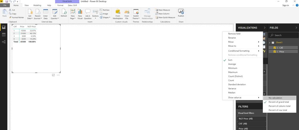
Glad to be of help to you. It takes only less than a minute. One more snip to help you.
From Visualization pane>Choose Matrix and plot the columns as per the screenshot
- Mark as New
- Bookmark
- Subscribe
- Mute
- Subscribe to RSS Feed
- Permalink
- Report Inappropriate Content
Is this what are you looking for @Anonymous
- Mark as New
- Bookmark
- Subscribe
- Mute
- Subscribe to RSS Feed
- Permalink
- Report Inappropriate Content
Yes that is exactly what im after
- Mark as New
- Bookmark
- Subscribe
- Mute
- Subscribe to RSS Feed
- Permalink
- Report Inappropriate Content
Glad to be of help to you. It takes only less than a minute. One more snip to help you.
From Visualization pane>Choose Matrix and plot the columns as per the screenshot
- Mark as New
- Bookmark
- Subscribe
- Mute
- Subscribe to RSS Feed
- Permalink
- Report Inappropriate Content
okay so your solution is that i shouldn't use DAX for this?
- Mark as New
- Bookmark
- Subscribe
- Mute
- Subscribe to RSS Feed
- Permalink
- Report Inappropriate Content
You may probaly land in the same solution using a custom made complex DAX script (not sure though). But if the built-in operation can give you the same result why waste time?
- Mark as New
- Bookmark
- Subscribe
- Mute
- Subscribe to RSS Feed
- Permalink
- Report Inappropriate Content
I didnt know it would be complex (and i already knew how to do what you suggested). There is a bunch of other stuff i've been asked to do with the data, I was also hoping to learn more from provided solutions
Helpful resources

Microsoft Fabric Learn Together
Covering the world! 9:00-10:30 AM Sydney, 4:00-5:30 PM CET (Paris/Berlin), 7:00-8:30 PM Mexico City

Power BI Monthly Update - April 2024
Check out the April 2024 Power BI update to learn about new features.

| User | Count |
|---|---|
| 111 | |
| 100 | |
| 80 | |
| 64 | |
| 58 |
| User | Count |
|---|---|
| 148 | |
| 111 | |
| 93 | |
| 84 | |
| 66 |


