cancel
Showing results for 
Search instead for 
Did you mean: 

Register now to learn Fabric in free live sessions led by the best Microsoft experts. From Apr 16 to May 9, in English and Spanish.

Reply
sem1
Frequent Visitor

Simple Bar Chart with Label Outside and Colored by Level Above in Hierarchy

Hello,

I'd like to make a simple bar chart with labels on the outside (so that all values are visible immediately) and color it based on a the level above the axis field.

Example data:
Category | Cost Name | Value
Transport | Trucking | 50
Transport | Ocean Freight | 100
Admin | Customs document | 15
Admin | Booking Fee | 10

I've tried doing this with a stacked bar chart:

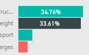
I am able to color the rows by the Category as I would wish. However, I cannot force the labels to show, even with Overflow enabled.

I've also tried doing this with a clustered bar chart:

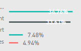
This allows me to have every data label as I would like. However, because for every Cost Name it shows the values for that cost name (which you can see in the picture), but leaves space for every other cost name (which is why each bar is not in the middle of the cost names in the header on the left), it looks unacceptably weird.


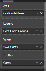
This is what I have in the Fields for the charts:


I'm new to Power BI, am I missing something or is this just not possible with Power BI?

3 REPLIES 3
v-piga-msft
Resident Rockstar
Resident Rockstar

Hi @sem1 ,

If you want to show the data lable outside, you could try with a clustered bar chart and change the data lable position like below.

Capture.PNG

If you still need help, please share a dummy pbix file which can reproduce the scenario and your desired output, so that we can help further investigate on it? You can upload it to OneDrive and post the link here. Do mask sensitive data before uploading.

Best Regards,

Cherry


Community Support Team _ Cherry Gao
If this post helps, then please consider Accept it as the solution to help the other members find it more quickly.
Anonymous
Not applicable

@sem1 : sorry to say that even i was noticed this today even i am experience guy . I think this is how power bi internally designed to but you have the option of background color to able where your user can easily understand the values . can you try that . But this is fixed for yu let me know

Anonymous
Not applicable

try with pie chart once

Helpful resources

Announcements
Microsoft Fabric Learn Together

Microsoft Fabric Learn Together

Covering the world! 9:00-10:30 AM Sydney, 4:00-5:30 PM CET (Paris/Berlin), 7:00-8:30 PM Mexico City

PBI_APRIL_CAROUSEL1

Power BI Monthly Update - April 2024

Check out the April 2024 Power BI update to learn about new features.

April Fabric Community Update

Fabric Community Update - April 2024

Find out what's new and trending in the Fabric Community.