- Power BI forums
- Updates
- News & Announcements
- Get Help with Power BI
- Desktop
- Service
- Report Server
- Power Query
- Mobile Apps
- Developer
- DAX Commands and Tips
- Custom Visuals Development Discussion
- Health and Life Sciences
- Power BI Spanish forums
- Translated Spanish Desktop
- Power Platform Integration - Better Together!
- Power Platform Integrations (Read-only)
- Power Platform and Dynamics 365 Integrations (Read-only)
- Training and Consulting
- Instructor Led Training
- Dashboard in a Day for Women, by Women
- Galleries
- Community Connections & How-To Videos
- COVID-19 Data Stories Gallery
- Themes Gallery
- Data Stories Gallery
- R Script Showcase
- Webinars and Video Gallery
- Quick Measures Gallery
- 2021 MSBizAppsSummit Gallery
- 2020 MSBizAppsSummit Gallery
- 2019 MSBizAppsSummit Gallery
- Events
- Ideas
- Custom Visuals Ideas
- Issues
- Issues
- Events
- Upcoming Events
- Community Blog
- Power BI Community Blog
- Custom Visuals Community Blog
- Community Support
- Community Accounts & Registration
- Using the Community
- Community Feedback
Register now to learn Fabric in free live sessions led by the best Microsoft experts. From Apr 16 to May 9, in English and Spanish.
- Power BI forums
- Forums
- Get Help with Power BI
- Desktop
- Showing Cumulative Monthly Billing from a single t...
- Subscribe to RSS Feed
- Mark Topic as New
- Mark Topic as Read
- Float this Topic for Current User
- Bookmark
- Subscribe
- Printer Friendly Page
- Mark as New
- Bookmark
- Subscribe
- Mute
- Subscribe to RSS Feed
- Permalink
- Report Inappropriate Content
Showing Cumulative Monthly Billing from a single table row
Hi all, I've been struggling with this alone for about a week, so I hope you don't mind me picking your brains.
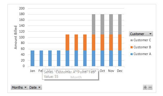
I have a CRM table with a list of opportunities, which each has a monthly billing value and a billing start date. What I want to ultimately acheive is a visual that allows me to show a cumulative month on month billing, for each customer based on their billing start date.
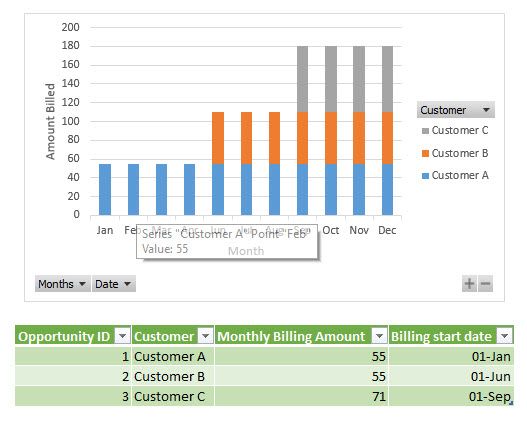
Here's a mockup of the data I have and what I want to get to, done in quickly in Excel:
My actual data model is quite complex, but the part relevant to this is a Opportunity Table (which looks like the above) linked (via inactive relationship) to a date dimension table. (Opportunity['Billing start date'] ---> Date['Date key'])
Would you be able to give me any pointers on how I can create this?
I've so far managed to create the measure to map the amounts into a date, but I can't figure out how to get it cumulative by customer.
What I have so far is:
Predicted Monthly Revenue =
     CALCULATE(SUM(Opportunity['Monthly Billing Amount']),
          USERELATIONSHIP(Opportunity['Billing start date'],'Date'['Date key']))
Many thanks in advance for any help
Solved! Go to Solution.
- Mark as New
- Bookmark
- Subscribe
- Mute
- Subscribe to RSS Feed
- Permalink
- Report Inappropriate Content
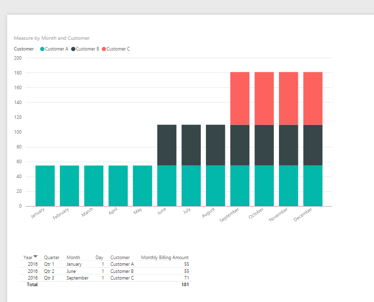
I don't quite get the idea why you need the visual displaying like that, but some tricks can be played to get the expected output.
See more details in the attached pbix.
If you have any question, feel free to let me know.
- Mark as New
- Bookmark
- Subscribe
- Mute
- Subscribe to RSS Feed
- Permalink
- Report Inappropriate Content
Hi
I hope you have a Calendar Table Created
Create a measure BillingAmount:= Sum(OpportunityData[Monthly Billing Amount])
Create a measure called as YTDOpportunity
as
YTDOpportunity:=CALCULATE([BillingAmount], DATESYTD(Calendar[FullDate]))
FullDate is the actual date of billing amount.
Use the YTDOpportunity to plot and you shaould have the results.
Best
Cheenusing
Proud to be a Datanaut!
- Mark as New
- Bookmark
- Subscribe
- Mute
- Subscribe to RSS Feed
- Permalink
- Report Inappropriate Content
Many thanks Cheenusing, that takes me some of the way there, but I'm still not quite getting it. I do have a calendar table.
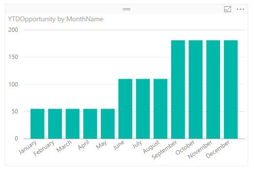
When I follow your instructions I can get an accurate cumulative graph as below:
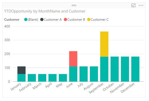
But when I add the customer feild in the legend, the the below happens.
What I really want to do is see the amount of each bar by customer, like my example. Any further thoughts?
- Mark as New
- Bookmark
- Subscribe
- Mute
- Subscribe to RSS Feed
- Permalink
- Report Inappropriate Content
I don't quite get the idea why you need the visual displaying like that, but some tricks can be played to get the expected output.
See more details in the attached pbix.
If you have any question, feel free to let me know.
- Mark as New
- Bookmark
- Subscribe
- Mute
- Subscribe to RSS Feed
- Permalink
- Report Inappropriate Content
Thanks Eric, This does what I need and I understand it. I had no idea what I was asking for ending up being so complex, but I guess I'm on a learning curve with what is and isn't easy to achieve!! Thanks again
- Mark as New
- Bookmark
- Subscribe
- Mute
- Subscribe to RSS Feed
- Permalink
- Report Inappropriate Content
Many thanks Eric.
It's so that we can visually see as monthly revenue increases, which customers contribute what proportion to a given month's income.
I'll take a look at that pbix later today and try to learn your tricks 🙂
Helpful resources

Microsoft Fabric Learn Together
Covering the world! 9:00-10:30 AM Sydney, 4:00-5:30 PM CET (Paris/Berlin), 7:00-8:30 PM Mexico City

Power BI Monthly Update - April 2024
Check out the April 2024 Power BI update to learn about new features.

| User | Count |
|---|---|
| 112 | |
| 100 | |
| 80 | |
| 64 | |
| 57 |
| User | Count |
|---|---|
| 146 | |
| 110 | |
| 93 | |
| 84 | |
| 67 |
