- Power BI forums
- Updates
- News & Announcements
- Get Help with Power BI
- Desktop
- Service
- Report Server
- Power Query
- Mobile Apps
- Developer
- DAX Commands and Tips
- Custom Visuals Development Discussion
- Health and Life Sciences
- Power BI Spanish forums
- Translated Spanish Desktop
- Power Platform Integration - Better Together!
- Power Platform Integrations (Read-only)
- Power Platform and Dynamics 365 Integrations (Read-only)
- Training and Consulting
- Instructor Led Training
- Dashboard in a Day for Women, by Women
- Galleries
- Community Connections & How-To Videos
- COVID-19 Data Stories Gallery
- Themes Gallery
- Data Stories Gallery
- R Script Showcase
- Webinars and Video Gallery
- Quick Measures Gallery
- 2021 MSBizAppsSummit Gallery
- 2020 MSBizAppsSummit Gallery
- 2019 MSBizAppsSummit Gallery
- Events
- Ideas
- Custom Visuals Ideas
- Issues
- Issues
- Events
- Upcoming Events
- Community Blog
- Power BI Community Blog
- Custom Visuals Community Blog
- Community Support
- Community Accounts & Registration
- Using the Community
- Community Feedback
Register now to learn Fabric in free live sessions led by the best Microsoft experts. From Apr 16 to May 9, in English and Spanish.
- Power BI forums
- Forums
- Get Help with Power BI
- Desktop
- Re: Show the last 7 days with X axis as weekdays.
- Subscribe to RSS Feed
- Mark Topic as New
- Mark Topic as Read
- Float this Topic for Current User
- Bookmark
- Subscribe
- Printer Friendly Page
- Mark as New
- Bookmark
- Subscribe
- Mute
- Subscribe to RSS Feed
- Permalink
- Report Inappropriate Content
Show the last 7 days with X axis as weekdays.
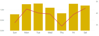
Hi , I have a chart which shows the 7 days data and in the x axis it shows the weekdays(Sun,Mon...). I need to show it in the last 7 day order. ie , if it is Friday today the last day in the chart should be fri and it should dynamically change accordingly.
I have other charts which shows the date in the x axis and when I select the last 7 days in the filter,it works. but not for this case as Sat Sun is in the text pattern. Do let me know the sample data is needed to check?
Solved! Go to Solution.
- Mark as New
- Bookmark
- Subscribe
- Mute
- Subscribe to RSS Feed
- Permalink
- Report Inappropriate Content
Hi,
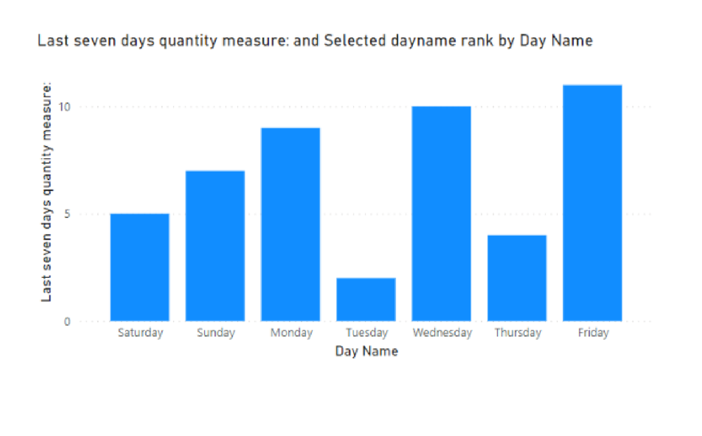
Please check the below picture and the attached pbix file.
I tried to create a sample pbix file like below.
One of ways to sort as you wanted is to create a ranking measure that shows rank of the date of the day, and then insert the measure into the tooltip of the visualization. And then sort the visualization by the ranking measure.
Selected dayname rank =
VAR _today =
    TODAY ()
VAR newtable =
    SUMMARIZE ( 'Calendar', 'Calendar'[Date], 'Calendar'[Day Name] )
VAR rankingtable =
    FILTER (
        ADDCOLUMNS (
            newtable,
            "@lastsevendaysqty", [Last seven days quantity measure:],
            "@ranking",
                CALCULATE (
                    RANKX (
                        DATESINPERIOD ( 'Calendar'[Date], _today, -7, DAY ),
                        CALCULATE ( MAX ( 'Calendar'[Date] ) ),
                        ,
                        ASC
                    )
                )
        ),
        [@lastsevendaysqty] <> BLANK ()
    )
VAR daynameranking =
    SUMMARIZE ( rankingtable, 'Calendar'[Day Name], [@ranking] )
RETURN
    SUMX ( daynameranking, [@ranking] )
If this post helps, then please consider accepting it as the solution to help other members find it faster, and give a big thumbs up.
- Mark as New
- Bookmark
- Subscribe
- Mute
- Subscribe to RSS Feed
- Permalink
- Report Inappropriate Content
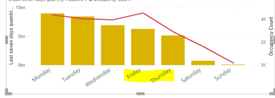
@Jihwan_Kim Thanks a lot for the help I am almost there but got stuck with a small issue. The sorting goes wrong in this case for some days as shown below.
Last time when I faced this issue, what I did was sorting the weekday column using another column with weekday numbers but since this is dynamic, I can't use that option. Any thoughts about it?
- Mark as New
- Bookmark
- Subscribe
- Mute
- Subscribe to RSS Feed
- Permalink
- Report Inappropriate Content
Hi,
Thank you for your feedback.
Could you please share your sample pbix file's link here? And then I can try to look into it to come up with a more accurate solution.
thank you.
If this post helps, then please consider accepting it as the solution to help other members find it faster, and give a big thumbs up.
- Mark as New
- Bookmark
- Subscribe
- Mute
- Subscribe to RSS Feed
- Permalink
- Report Inappropriate Content
here is the link.
in the last 7 days data, data from sunday is missing due to server error.
https://drive.google.com/file/d/1SaHsSvCTaasPMOlqIKmgbpEAMiTcGfbf/view?usp=sharing.
Could help me why the error happens for the sort issue as I could not resolve it.Thanks.
- Mark as New
- Bookmark
- Subscribe
- Mute
- Subscribe to RSS Feed
- Permalink
- Report Inappropriate Content
Hi,
Thank you very much for your link.
I looked into it but sorry to say that it was quite difficult for me to understand the model.
- A Calendar table is not connected to the table that other measures are calculating.
- The Visualization's X-axis is not coming from a calendar table, and I cannot know how to connect two tables.
If this post helps, then please consider accepting it as the solution to help other members find it faster, and give a big thumbs up.
- Mark as New
- Bookmark
- Subscribe
- Mute
- Subscribe to RSS Feed
- Permalink
- Report Inappropriate Content
Helpful resources

Microsoft Fabric Learn Together
Covering the world! 9:00-10:30 AM Sydney, 4:00-5:30 PM CET (Paris/Berlin), 7:00-8:30 PM Mexico City

Power BI Monthly Update - April 2024
Check out the April 2024 Power BI update to learn about new features.

| User | Count |
|---|---|
| 113 | |
| 97 | |
| 85 | |
| 70 | |
| 61 |
| User | Count |
|---|---|
| 151 | |
| 121 | |
| 104 | |
| 87 | |
| 67 |


