- Power BI forums
- Updates
- News & Announcements
- Get Help with Power BI
- Desktop
- Service
- Report Server
- Power Query
- Mobile Apps
- Developer
- DAX Commands and Tips
- Custom Visuals Development Discussion
- Health and Life Sciences
- Power BI Spanish forums
- Translated Spanish Desktop
- Power Platform Integration - Better Together!
- Power Platform Integrations (Read-only)
- Power Platform and Dynamics 365 Integrations (Read-only)
- Training and Consulting
- Instructor Led Training
- Dashboard in a Day for Women, by Women
- Galleries
- Community Connections & How-To Videos
- COVID-19 Data Stories Gallery
- Themes Gallery
- Data Stories Gallery
- R Script Showcase
- Webinars and Video Gallery
- Quick Measures Gallery
- 2021 MSBizAppsSummit Gallery
- 2020 MSBizAppsSummit Gallery
- 2019 MSBizAppsSummit Gallery
- Events
- Ideas
- Custom Visuals Ideas
- Issues
- Issues
- Events
- Upcoming Events
- Community Blog
- Power BI Community Blog
- Custom Visuals Community Blog
- Community Support
- Community Accounts & Registration
- Using the Community
- Community Feedback
Register now to learn Fabric in free live sessions led by the best Microsoft experts. From Apr 16 to May 9, in English and Spanish.
- Power BI forums
- Forums
- Get Help with Power BI
- Desktop
- Re: Show the details of a calculation
- Subscribe to RSS Feed
- Mark Topic as New
- Mark Topic as Read
- Float this Topic for Current User
- Bookmark
- Subscribe
- Printer Friendly Page
- Mark as New
- Bookmark
- Subscribe
- Mute
- Subscribe to RSS Feed
- Permalink
- Report Inappropriate Content
Show the details of a calculation
Hello,
I have a measure with the active employees in my company. What I want to get is who are those employees in a a table, excel or similar. Something like a detail report (Name, Address, etc...).
Is this possible in Power BI?
Thanks in advance!
- Mark as New
- Bookmark
- Subscribe
- Mute
- Subscribe to RSS Feed
- Permalink
- Report Inappropriate Content
I assume you’re still working around the dataset of your previous topic Cumulative measure in past years and months. You can drag a Table chart into your canvas and select the values you want to display along with the active employees measure.
Best Regards,
Herbert
- Mark as New
- Bookmark
- Subscribe
- Mute
- Subscribe to RSS Feed
- Permalink
- Report Inappropriate Content
Yes, that is the idea. The problem is when the chart is not selected, then the table shows data and this could be confusing to the user. Could see the table only when the chart is selected?
- Mark as New
- Bookmark
- Subscribe
- Mute
- Subscribe to RSS Feed
- Permalink
- Report Inappropriate Content
I can only come up with a trick as below.
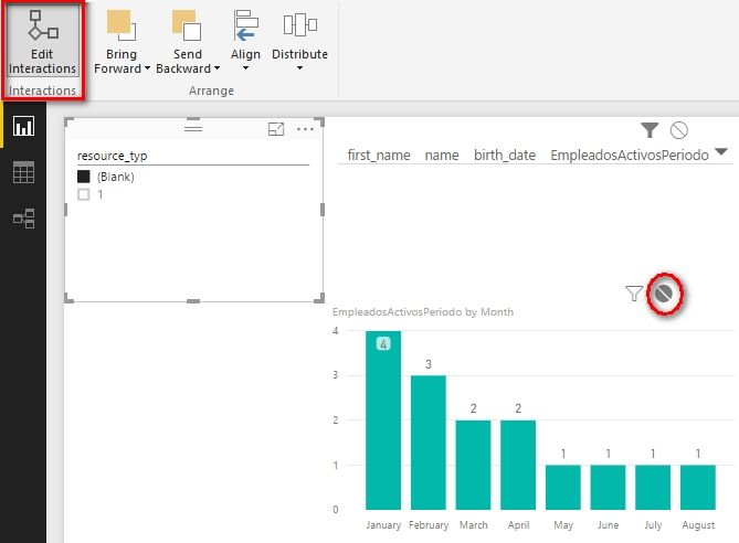
Drag a slicer into your canvas (select any column you wanted, I use resource_typ here). Edit interactions of it to make it can only filter the table chart.
When the column chart is not selected, select (Blank) and table chart will show nothing.
Before you want to select one column in the column chart, unselect (Blank) and then select in the column chart.
Best Regards,
Herbert
- Mark as New
- Bookmark
- Subscribe
- Mute
- Subscribe to RSS Feed
- Permalink
- Report Inappropriate Content
I have some problem with the interaction between a bart chart and its table to show the details.
The situation is:
- Bar Chart showing Incorporation by year. The calculation is:
IncorporacionesPorAños =
IF
(
MIN (DimFecha[Date]) <= TODAY ();
CALCULATE
(
COUNTROWS(Empleados);
FILTER(Empleados;Empleados[Año_incorporacion] <= YEAR(MIN(DimFecha[Date])) && Empleados[Año_incorporacion] = YEAR(MIN(DimFecha[Date])))
);
BLANK()
)
- Second bar chart showing the incoporation by month based on the first year selected. The calculation is:
IncorporacionesPorMeses =
IF
(
MIN (DimFecha[Date]) <= TODAY ();
CALCULATE
(
COUNTROWS(Empleados);
FILTER(Empleados;Empleados[Mes_incorporacion] = MONTH(MIN(DimFecha[Date])) && Empleados[Año_incorporacion] =YEAR(MAX(DimFecha[Date])))
);
BLANK()
)
- And a table to show the employees of this second month basr chart selected.
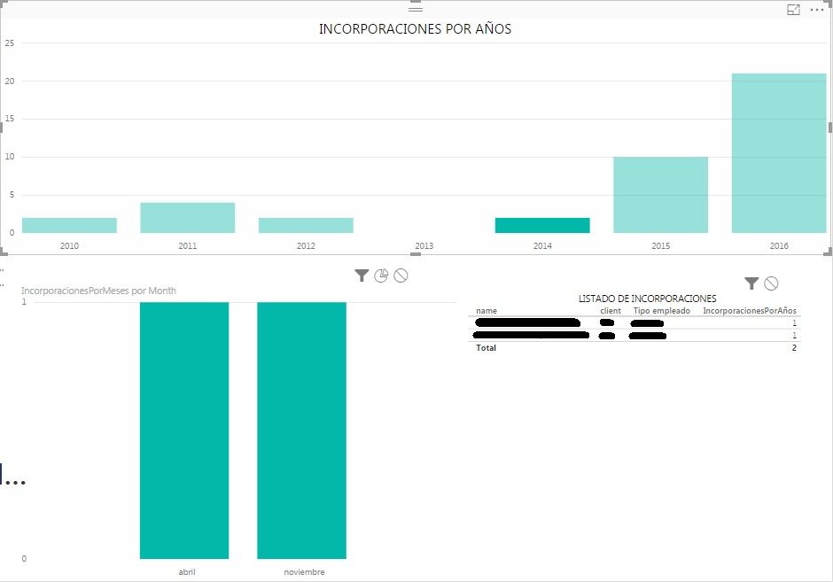
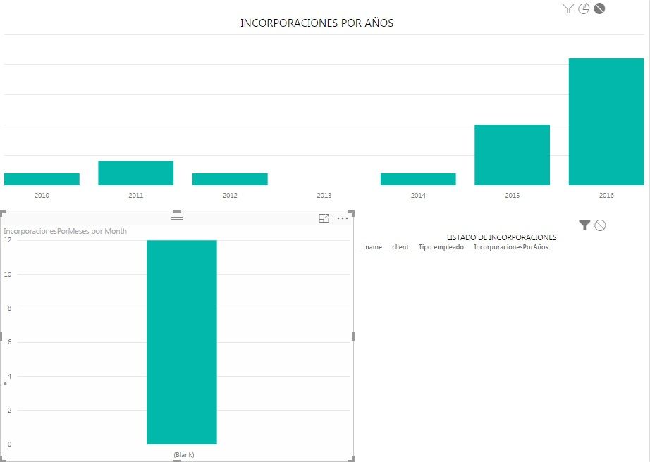
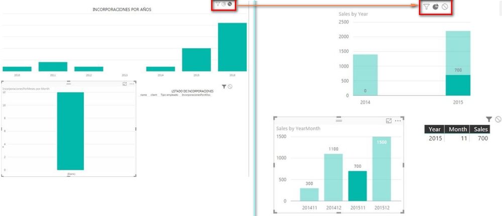
Here is the problem, when I select the value of a month, nothing is showed in the third table, the bar chart from which I select the month changes and (Blank) is showed and the first bar chart looses the value previous selected.
Any ideas about what could be happening?
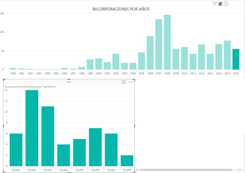
BEFORE SELECT THE MONTH IN SECOND BAR CHART:
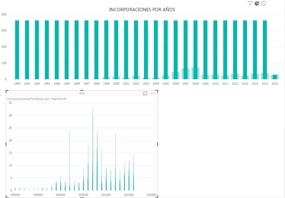
AFTER SELECT THE MONTH IN SECOND BAR CHART:
- Mark as New
- Bookmark
- Subscribe
- Mute
- Subscribe to RSS Feed
- Permalink
- Report Inappropriate Content
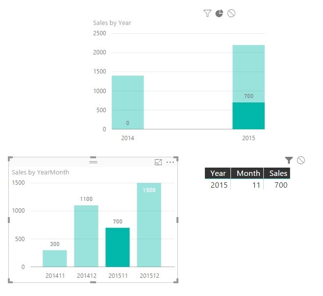
Please try to change the Month in second bar chart to YearMonth. In your above chart, if you select Month from second chart, the first bar chart will lose the value selected because this month exist in all years. Please see following simple chart sample.
Best Regards,
Herbert
- Mark as New
- Bookmark
- Subscribe
- Mute
- Subscribe to RSS Feed
- Permalink
- Report Inappropriate Content
The problem is not solved...
When I select the month in the second chart, both charts looses the value selected. ¿Could be the problem in the metrics showed in the charts?
The first is:
IncorporacionesPorAños =
IF
(
MIN (DimFecha[Date]) <= TODAY ();
CALCULATE
(
COUNTROWS(Empleados);
FILTER(Empleados;Empleados[Año_incorporacion] <= YEAR(MIN(DimFecha[Date])) && Empleados[Año_incorporacion] = YEAR(MIN(DimFecha[Date])))
);
BLANK()
)
And the second is:
IncorporacionesPorMeses =
IF
(
MIN (DimFecha[Date]) <= TODAY ();
CALCULATE
(
COUNTROWS(Empleados);
FILTER(Empleados;Empleados[Mes_incorporacion] = MONTH(MIN(DimFecha[Date])) && Empleados[Año_incorporacion] =YEAR(MAX(DimFecha[Date])))
);
BLANK()
)
- Mark as New
- Bookmark
- Subscribe
- Mute
- Subscribe to RSS Feed
- Permalink
- Report Inappropriate Content
- Mark as New
- Bookmark
- Subscribe
- Mute
- Subscribe to RSS Feed
- Permalink
- Report Inappropriate Content
Yes...
And when I select a year-month in the second chart (201608 for example) the result is:
- Mark as New
- Bookmark
- Subscribe
- Mute
- Subscribe to RSS Feed
- Permalink
- Report Inappropriate Content
If possible, could you please upload your PBIX file and share with me for troubleshooting? You can remove the sensitive information from your file.
Best Regards,
Herbert
- Mark as New
- Bookmark
- Subscribe
- Mute
- Subscribe to RSS Feed
- Permalink
- Report Inappropriate Content
Thanks for thr trick @v-haibl-msft
I don't know if it is a good solution for my customer, I will try!
Thanks!
- Mark as New
- Bookmark
- Subscribe
- Mute
- Subscribe to RSS Feed
- Permalink
- Report Inappropriate Content
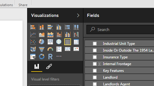
You could use the Table Visualisation and add the (Name, Address, etc...) fields as columns in the table.
- Mark as New
- Bookmark
- Subscribe
- Mute
- Subscribe to RSS Feed
- Permalink
- Report Inappropriate Content
Sorry, my explanation wasn't complete. I want to show this data when I click in a bar chart, for example...
What I want is to get the data of these 19 employees. thanks!
- Mark as New
- Bookmark
- Subscribe
- Mute
- Subscribe to RSS Feed
- Permalink
- Report Inappropriate Content
@bebeto Oh Okay!
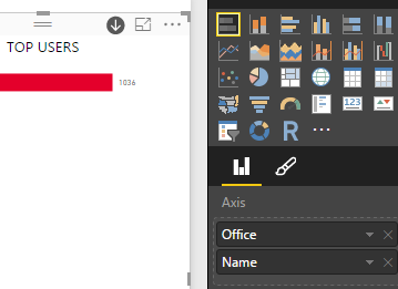
Yep: on the axis add (for example) the Office as the top level and the Employees (Name in the screen grab) in that office as the next level down in the hierachy.
i.e. drag Office onto the axis and then Employee below it. If they aren't from the same table you will need to create a Relationship between tables.
- Mark as New
- Bookmark
- Subscribe
- Mute
- Subscribe to RSS Feed
- Permalink
- Report Inappropriate Content
If you wanted more info: you would use the bar-chart as a 'filter' and add a table underneath it as a separate visualisation. This could then display address etc...
Helpful resources

Microsoft Fabric Learn Together
Covering the world! 9:00-10:30 AM Sydney, 4:00-5:30 PM CET (Paris/Berlin), 7:00-8:30 PM Mexico City

Power BI Monthly Update - April 2024
Check out the April 2024 Power BI update to learn about new features.

| User | Count |
|---|---|
| 117 | |
| 107 | |
| 70 | |
| 70 | |
| 43 |
| User | Count |
|---|---|
| 148 | |
| 106 | |
| 104 | |
| 89 | |
| 65 |

