- Power BI forums
- Updates
- News & Announcements
- Get Help with Power BI
- Desktop
- Service
- Report Server
- Power Query
- Mobile Apps
- Developer
- DAX Commands and Tips
- Custom Visuals Development Discussion
- Health and Life Sciences
- Power BI Spanish forums
- Translated Spanish Desktop
- Power Platform Integration - Better Together!
- Power Platform Integrations (Read-only)
- Power Platform and Dynamics 365 Integrations (Read-only)
- Training and Consulting
- Instructor Led Training
- Dashboard in a Day for Women, by Women
- Galleries
- Community Connections & How-To Videos
- COVID-19 Data Stories Gallery
- Themes Gallery
- Data Stories Gallery
- R Script Showcase
- Webinars and Video Gallery
- Quick Measures Gallery
- 2021 MSBizAppsSummit Gallery
- 2020 MSBizAppsSummit Gallery
- 2019 MSBizAppsSummit Gallery
- Events
- Ideas
- Custom Visuals Ideas
- Issues
- Issues
- Events
- Upcoming Events
- Community Blog
- Power BI Community Blog
- Custom Visuals Community Blog
- Community Support
- Community Accounts & Registration
- Using the Community
- Community Feedback
Register now to learn Fabric in free live sessions led by the best Microsoft experts. From Apr 16 to May 9, in English and Spanish.
- Power BI forums
- Forums
- Get Help with Power BI
- Desktop
- Show percentage and number together in steak chart...
- Subscribe to RSS Feed
- Mark Topic as New
- Mark Topic as Read
- Float this Topic for Current User
- Bookmark
- Subscribe
- Printer Friendly Page
- Mark as New
- Bookmark
- Subscribe
- Mute
- Subscribe to RSS Feed
- Permalink
- Report Inappropriate Content
Show percentage and number together in steak chart for multiple value
Hi dears,
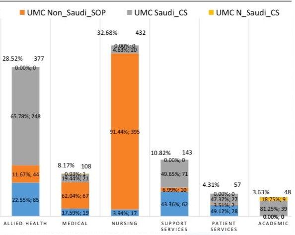
I am trying to show in Stake Chart the values and parcentage of a column contain many categoreis.
Could you help me to write a DAX code to fix this issue (as the down photo ) or do you have any suggestion.
Thanks for your support in advance!
Best Regards
Mahmoud
Solved! Go to Solution.
- Mark as New
- Bookmark
- Subscribe
- Mute
- Subscribe to RSS Feed
- Permalink
- Report Inappropriate Content
Hi @aboshabo ,
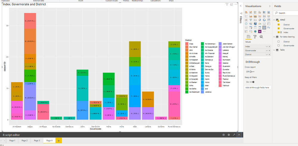
Since Power BI removes duplicate data, we need to add an Index column in Power Query Editor.
Then, try this:
library(reshape2)
library(scales)
library(dplyr)
library(stats)
library(base)
library(ggplot2)
library(tseries)
library(gridExtra)
library(quantmod)
dataset1<-dataset%>% group_by(Governorate) %>% count(District)
dataset2<-dataset1%>% group_by(Governorate)%>% mutate(percent=round(n/sum(n)*100,2))
CountPercent<-paste(dataset1$n," (",dataset2$percent,"%"," )")
ft<-data.frame(coredata(CountPercent))
ggplot(dataset2, aes(x = Governorate, y = dataset1$n, fill = District, label = ft$coredata.CountPercent)) +
  geom_bar(stat = "identity") +
  geom_text(size = 3, position = position_stack(vjust = 0.5))
For details, please check the attached PBIX file.
Best Regards,
Icey
If this post helps, then please consider Accept it as the solution to help the other members find it more quickly.
- Mark as New
- Bookmark
- Subscribe
- Mute
- Subscribe to RSS Feed
- Permalink
- Report Inappropriate Content
Hi @aboshabo ,
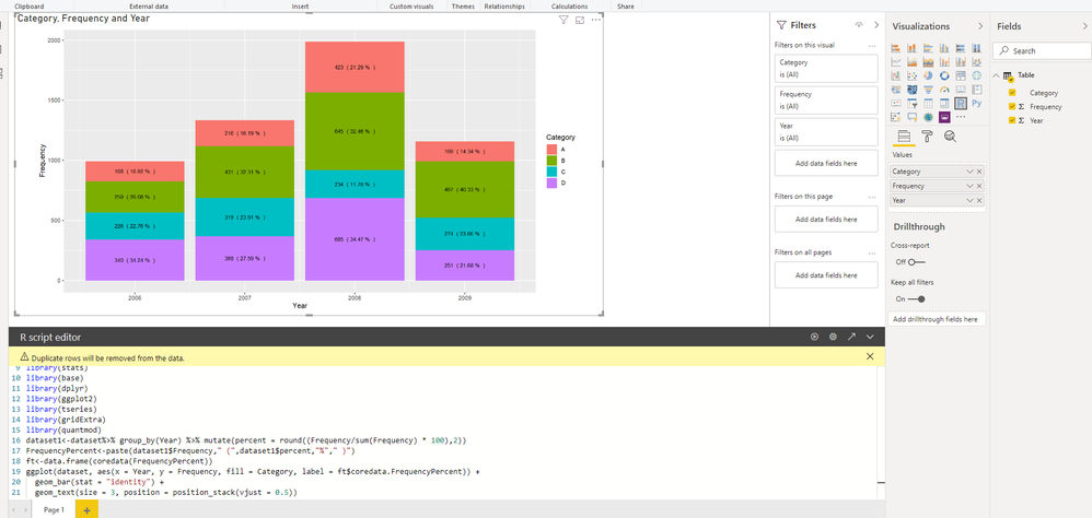
You can try to use R script visual.
R scripts:
# The following code to create a dataframe and remove duplicated rows is always executed and acts as a preamble for your script:

# dataset <- data.frame(Category, Frequency, Year)
# dataset <- unique(dataset)

# Paste or type your script code here:
library(reshape2)
library(scales)
library(stats)
library(base)
library(dplyr)
library(ggplot2)
library(tseries)
library(gridExtra)
library(quantmod)
dataset1<-dataset%>% group_by(Year) %>% mutate(percent = round((Frequency/sum(Frequency) * 100),2))
FrequencyPercent<-paste(dataset1$Frequency," (",dataset1$percent,"%"," )")
ft<-data.frame(coredata(FrequencyPercent))
ggplot(dataset, aes(x = Year, y = Frequency, fill = Category, label = ft$coredata.FrequencyPercent)) +
  geom_bar(stat = "identity") +
  geom_text(size = 3, position = position_stack(vjust = 0.5))
For details, please check the attached PBIX file.
Best Regards,
Icey
If this post helps, then please consider Accept it as the solution to help the other members find it more quickly.
- Mark as New
- Bookmark
- Subscribe
- Mute
- Subscribe to RSS Feed
- Permalink
- Report Inappropriate Content
Dear @Icey
Thanks for your answer! it is great!
As you used a numeric column, can you please help me to us a text column to count the values in that column based on its categories.
I added Page 2 to show what i mean (count and show text column).
https://www.dropbox.com/s/66lsux94w24gqpy/Show%20percentage%20and%20number%20together.pbix?dl=0
please if the file does not open directly, please use open >> file
Thanks for your support in advance!
Best Regards
Mahmoud
- Mark as New
- Bookmark
- Subscribe
- Mute
- Subscribe to RSS Feed
- Permalink
- Report Inappropriate Content
Hi @aboshabo ,
Since Power BI removes duplicate data, we need to add an Index column in Power Query Editor.
Then, try this:
library(reshape2)
library(scales)
library(dplyr)
library(stats)
library(base)
library(ggplot2)
library(tseries)
library(gridExtra)
library(quantmod)
dataset1<-dataset%>% group_by(Governorate) %>% count(District)
dataset2<-dataset1%>% group_by(Governorate)%>% mutate(percent=round(n/sum(n)*100,2))
CountPercent<-paste(dataset1$n," (",dataset2$percent,"%"," )")
ft<-data.frame(coredata(CountPercent))
ggplot(dataset2, aes(x = Governorate, y = dataset1$n, fill = District, label = ft$coredata.CountPercent)) +
  geom_bar(stat = "identity") +
  geom_text(size = 3, position = position_stack(vjust = 0.5))
For details, please check the attached PBIX file.
Best Regards,
Icey
If this post helps, then please consider Accept it as the solution to help the other members find it more quickly.
- Mark as New
- Bookmark
- Subscribe
- Mute
- Subscribe to RSS Feed
- Permalink
- Report Inappropriate Content
Dear @Icey thanks for your support! it is great!
My last two questions,
1. Is there a solution for the Arabic letters? it does not shows as a proper way, as you see in the photo.
2. Is there a solution to give x and y a different lable?
Best Regards
Mahmoud
- Mark as New
- Bookmark
- Subscribe
- Mute
- Subscribe to RSS Feed
- Permalink
- Report Inappropriate Content
@aboshabo you cannot show both value and % as data label but you can surely add % as tool tip and it will show on hover over.
To do so, add following 3 measures. if you want you can combine all these in one measure as well.
change table name and colume name as per your data model. ALLSELECTED function take column name you are showing on X-Axis, in my case it is Line column
Sum Hrs = SUM ( hrs[Hrs] )

Total Hrs = CALCULATE( [Sum Hrs], ALLSELECTED ( hrs[Line] ) )

% = DIVIDE ( [Sum Hrs], [Total Hrs] )
One above is done, put % measure on tool tip and that will get you what you are looking for.
Subscribe to the @PowerBIHowTo YT channel for an upcoming video on List and Record functions in Power Query!!
Learn Power BI and Fabric - subscribe to our YT channel - Click here: @PowerBIHowTo
If my solution proved useful, I'd be delighted to receive Kudos. When you put effort into asking a question, it's equally thoughtful to acknowledge and give Kudos to the individual who helped you solve the problem. It's a small gesture that shows appreciation and encouragement! ❤
Did I answer your question? Mark my post as a solution. Proud to be a Super User! Appreciate your Kudos 🙂
Feel free to email me with any of your BI needs.
- Mark as New
- Bookmark
- Subscribe
- Mute
- Subscribe to RSS Feed
- Permalink
- Report Inappropriate Content
@parry2k thanks for your awnser, I know how to show the values as a tooltip, but it's demanded from me to show the values as it in the photo.
thanks for your support!
Best Regards
Mahmoud
- Mark as New
- Bookmark
- Subscribe
- Mute
- Subscribe to RSS Feed
- Permalink
- Report Inappropriate Content
@aboshabo unfortunately you cannot have custom data labels, only tooltips. I think your request is genuine and would recommend to add an idea on ideas forum if it doesn't already exists or vote existing idea.
Subscribe to the @PowerBIHowTo YT channel for an upcoming video on List and Record functions in Power Query!!
Learn Power BI and Fabric - subscribe to our YT channel - Click here: @PowerBIHowTo
If my solution proved useful, I'd be delighted to receive Kudos. When you put effort into asking a question, it's equally thoughtful to acknowledge and give Kudos to the individual who helped you solve the problem. It's a small gesture that shows appreciation and encouragement! ❤
Did I answer your question? Mark my post as a solution. Proud to be a Super User! Appreciate your Kudos 🙂
Feel free to email me with any of your BI needs.
Helpful resources

Microsoft Fabric Learn Together
Covering the world! 9:00-10:30 AM Sydney, 4:00-5:30 PM CET (Paris/Berlin), 7:00-8:30 PM Mexico City

Power BI Monthly Update - April 2024
Check out the April 2024 Power BI update to learn about new features.

| User | Count |
|---|---|
| 111 | |
| 100 | |
| 80 | |
| 64 | |
| 58 |
| User | Count |
|---|---|
| 146 | |
| 110 | |
| 93 | |
| 84 | |
| 67 |


