- Power BI forums
- Updates
- News & Announcements
- Get Help with Power BI
- Desktop
- Service
- Report Server
- Power Query
- Mobile Apps
- Developer
- DAX Commands and Tips
- Custom Visuals Development Discussion
- Health and Life Sciences
- Power BI Spanish forums
- Translated Spanish Desktop
- Power Platform Integration - Better Together!
- Power Platform Integrations (Read-only)
- Power Platform and Dynamics 365 Integrations (Read-only)
- Training and Consulting
- Instructor Led Training
- Dashboard in a Day for Women, by Women
- Galleries
- Community Connections & How-To Videos
- COVID-19 Data Stories Gallery
- Themes Gallery
- Data Stories Gallery
- R Script Showcase
- Webinars and Video Gallery
- Quick Measures Gallery
- 2021 MSBizAppsSummit Gallery
- 2020 MSBizAppsSummit Gallery
- 2019 MSBizAppsSummit Gallery
- Events
- Ideas
- Custom Visuals Ideas
- Issues
- Issues
- Events
- Upcoming Events
- Community Blog
- Power BI Community Blog
- Custom Visuals Community Blog
- Community Support
- Community Accounts & Registration
- Using the Community
- Community Feedback
Register now to learn Fabric in free live sessions led by the best Microsoft experts. From Apr 16 to May 9, in English and Spanish.
- Power BI forums
- Forums
- Get Help with Power BI
- Desktop
- Re: Show opened vs closed tasks per week
- Subscribe to RSS Feed
- Mark Topic as New
- Mark Topic as Read
- Float this Topic for Current User
- Bookmark
- Subscribe
- Printer Friendly Page
- Mark as New
- Bookmark
- Subscribe
- Mute
- Subscribe to RSS Feed
- Permalink
- Report Inappropriate Content
Show opened vs closed tasks per week
Hi all,
I'm working on some ticket reporting and want to plot a graph that shows tickets that have been opened or closed per week.
My raw data is this:
| Ticket ID | Opened week | Closed week |
| 123001 | 2020-CW1 | 2020-CW3 |
| 123002 | 2020-CW2 | 2020-CW2 |
| 123003 | 2020-CW2 | 2020-CW3 |
I would like my bar chart to have the weeks on the X axis, and per week have two bars showing the count of opened and closed tickets.
I can do that in two separate charts, but how can I combine the two?
Thanks in advance!
Solved! Go to Solution.
- Mark as New
- Bookmark
- Subscribe
- Mute
- Subscribe to RSS Feed
- Permalink
- Report Inappropriate Content
Hi @_n_MarianLein ,
There're 2 ways:
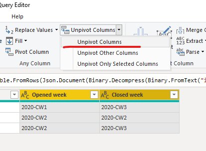
1.Go to "edit queries">select"open week" and "close week">"unpivot columns":
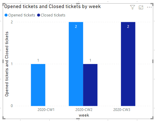
Back to the report view, and put the columns in the clustered bar chart visual:
2.Another way is to create a dimweek table using a dax expression as below:
Dim week = DISTINCT(UNION(VALUES('Table'[Opened week]),VALUES('Table'[Closed week])))
Then create 2 measures:
Opened tickets = CALCULATE(COUNTA('Table'[Ticket ID]),USERELATIONSHIP('Dim week'[week],'Table'[Opened week]))Closed tickets = CALCULATE(COUNTA('Table'[Ticket ID]),USERELATIONSHIP('Dim week'[week],'Table'[Closed week]))
Finally,put the dimweek and measures in the clustered bar chart visual:
For the related .pbix file,pls click here.
Best Regards,
Kelly
Did I answer your question? Mark my post as a solution!
- Mark as New
- Bookmark
- Subscribe
- Mute
- Subscribe to RSS Feed
- Permalink
- Report Inappropriate Content
Hey @_n_MarianLein
@bfernandez Is awesome and very thurough. If you want to simplify it a little you can create a week table with you CW1, CW2 and then use that as your "date" table and create a helper column for both close and open (=Right(opened/Closed week, 3)). You could even create the week table by referencing the original query and then deleting the other columns. All this does different from @bfernandez post is it allows you to show CW1 etc in the Axis instead of a date and it saves your from having to create a relational column in the original data with the week start date.
Then you can create a clustered column chart and drag your week table column to the Axis field and your opened week and closed week as your values.
@bfernandez solution is the better route to go, but this is kind of cheating and may be more in line with what you want the end result to look like.
I recommend @bfernandez as a solution (and for kudos), but you are welcome to kudo here and accept it as a second solution lol. Let us know if this helps.
- Mark as New
- Bookmark
- Subscribe
- Mute
- Subscribe to RSS Feed
- Permalink
- Report Inappropriate Content
This can get a little bit tricky but I have come across this same issue before.
One thing I would suggest is before moving forward, get the actual week start date.
I am assuming Opened week and closed week is based off of a date field?
If so, in the PowerQuery, extract the Start of Week in the Transform tab.
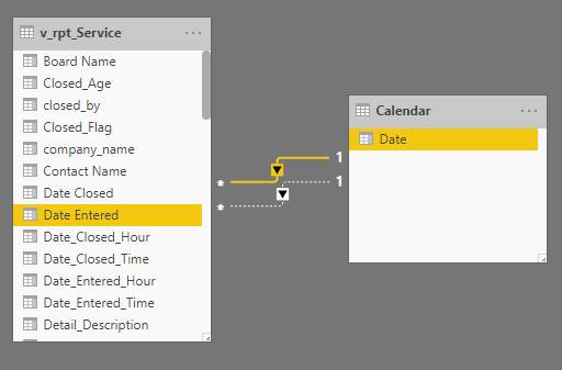
From there, you will need to create a Calendar table to connect the dates.
https://kohera.be/blog/power-bi/how-to-create-a-date-table-in-power-bi-in-2-simple-steps/
Then by creating measures that sum the ticket counts, you can use the USERELATIONSHIP DAX function to seperate these values accordingly.
Tickets_Closed = CALCULATE(COUNT([column][Date Closed]),USERELATIONSHIP('Calendar'[Date],[column][Date Closed]))


Helpful resources

Microsoft Fabric Learn Together
Covering the world! 9:00-10:30 AM Sydney, 4:00-5:30 PM CET (Paris/Berlin), 7:00-8:30 PM Mexico City

Power BI Monthly Update - April 2024
Check out the April 2024 Power BI update to learn about new features.

| User | Count |
|---|---|
| 109 | |
| 96 | |
| 77 | |
| 66 | |
| 53 |
| User | Count |
|---|---|
| 144 | |
| 105 | |
| 102 | |
| 89 | |
| 63 |


