- Power BI forums
- Updates
- News & Announcements
- Get Help with Power BI
- Desktop
- Service
- Report Server
- Power Query
- Mobile Apps
- Developer
- DAX Commands and Tips
- Custom Visuals Development Discussion
- Health and Life Sciences
- Power BI Spanish forums
- Translated Spanish Desktop
- Power Platform Integration - Better Together!
- Power Platform Integrations (Read-only)
- Power Platform and Dynamics 365 Integrations (Read-only)
- Training and Consulting
- Instructor Led Training
- Dashboard in a Day for Women, by Women
- Galleries
- Community Connections & How-To Videos
- COVID-19 Data Stories Gallery
- Themes Gallery
- Data Stories Gallery
- R Script Showcase
- Webinars and Video Gallery
- Quick Measures Gallery
- 2021 MSBizAppsSummit Gallery
- 2020 MSBizAppsSummit Gallery
- 2019 MSBizAppsSummit Gallery
- Events
- Ideas
- Custom Visuals Ideas
- Issues
- Issues
- Events
- Upcoming Events
- Community Blog
- Power BI Community Blog
- Custom Visuals Community Blog
- Community Support
- Community Accounts & Registration
- Using the Community
- Community Feedback
Register now to learn Fabric in free live sessions led by the best Microsoft experts. From Apr 16 to May 9, in English and Spanish.
- Power BI forums
- Forums
- Get Help with Power BI
- Desktop
- Show max and min of days in a linear timeline (...
- Subscribe to RSS Feed
- Mark Topic as New
- Mark Topic as Read
- Float this Topic for Current User
- Bookmark
- Subscribe
- Printer Friendly Page
- Mark as New
- Bookmark
- Subscribe
- Mute
- Subscribe to RSS Feed
- Permalink
- Report Inappropriate Content
Show max and min of days in a linear timeline (area chart)
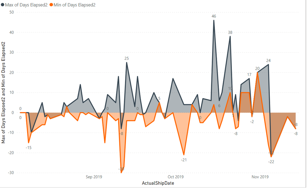
Hi Everyone - I am close to what I am looking for but not there yet. The below graph is from a caclulated SharePoint column that sums the amount of days elapsed between an actual ship date, and a planned ship date. The Power Bi column is simply a whole number column and I've used the min or max of that column in the "values" field for the visual.
Although this generally works, for line items where there is just one entry (one date value) the min and the max appear on the same data point (showing whatever the value is). So for example, on the last data point, November 8, the elapsed time was -8, but you can see both graph lines end up registering this point.
Do I need to create two separate measures (or calculated columns?) that only show positive values (which would be a late shipment), or negative values (which indicates it shipped earlier than planned)? And if so, how to do it?
As it is now, this visual will be confusing to my audience. Thanks for any help!
- Mark as New
- Bookmark
- Subscribe
- Mute
- Subscribe to RSS Feed
- Permalink
- Report Inappropriate Content
Hi @Anonymous ,
Yes you can create calculated measures showing a value only when the number is positive (for Max) or only when it is negative (for Min).
The formulas would look like this:
Late shipment days =
var daysElapsedMax = MAX(Table[Days Elapsed])
RETURN IF(daysElapsedMax >0, daysElapsedMax, BLANK())
Early shipment days =
var daysElapsedMin = MIN(Table[Days Elapsed])
RETURN IF(daysElapsedMin <0, daysElapsedMin, BLANK())
Does this help you?
LC
Interested in Power BI and DAX tutorials? Check out my blog at www.finance-bi.com
- Mark as New
- Bookmark
- Subscribe
- Mute
- Subscribe to RSS Feed
- Permalink
- Report Inappropriate Content
Hi LC,
Thank you. This seems to work pretty well...but one strange thing is happening. Note how on the graph it seems to stop showing late shipments around Week 41. On the table at left, you can see there are late shipments for Oct 25, 28, 31, and for Nov 4, but these values do not get shown in the graph.
I have no filters applied and can't figure out why they are not showing in the graph. Any ideas? Otherwise, it is perfect!
And just to be clear, if I show at the Month level using Actual Ship Date (not hiearchy view), then the plots do show up if I skim across the line.
I have the graph below drilled down to the "Week" (from my date table) So perhaps it has something to do with that?
- Mark as New
- Bookmark
- Subscribe
- Mute
- Subscribe to RSS Feed
- Permalink
- Report Inappropriate Content
Hi @Anonymous ,
yes, the problem might be the week level. However, without the Power BI in front of me, it's not easy to say what could be the problem.
Can you try to add a separate Calendar table with the DAX formula:
Calendar = CALENDARAUTO()then create a relationship between this table and your table.
Moreover, modify the early shipment and late shipment days formulas to use the new calendar table.
And finally, use the new calendar table in the chart instead of the initial table.
Does this help?
Otherwise, are you able to share a sample version of your Power BI?
LC
Interested in Power BI and DAX tutorials? Check out my blog at www.finance-bi.com
Helpful resources

Microsoft Fabric Learn Together
Covering the world! 9:00-10:30 AM Sydney, 4:00-5:30 PM CET (Paris/Berlin), 7:00-8:30 PM Mexico City

Power BI Monthly Update - April 2024
Check out the April 2024 Power BI update to learn about new features.

| User | Count |
|---|---|
| 113 | |
| 99 | |
| 82 | |
| 70 | |
| 60 |
| User | Count |
|---|---|
| 149 | |
| 114 | |
| 107 | |
| 89 | |
| 67 |


