- Power BI forums
- Updates
- News & Announcements
- Get Help with Power BI
- Desktop
- Service
- Report Server
- Power Query
- Mobile Apps
- Developer
- DAX Commands and Tips
- Custom Visuals Development Discussion
- Health and Life Sciences
- Power BI Spanish forums
- Translated Spanish Desktop
- Power Platform Integration - Better Together!
- Power Platform Integrations (Read-only)
- Power Platform and Dynamics 365 Integrations (Read-only)
- Training and Consulting
- Instructor Led Training
- Dashboard in a Day for Women, by Women
- Galleries
- Community Connections & How-To Videos
- COVID-19 Data Stories Gallery
- Themes Gallery
- Data Stories Gallery
- R Script Showcase
- Webinars and Video Gallery
- Quick Measures Gallery
- 2021 MSBizAppsSummit Gallery
- 2020 MSBizAppsSummit Gallery
- 2019 MSBizAppsSummit Gallery
- Events
- Ideas
- Custom Visuals Ideas
- Issues
- Issues
- Events
- Upcoming Events
- Community Blog
- Power BI Community Blog
- Custom Visuals Community Blog
- Community Support
- Community Accounts & Registration
- Using the Community
- Community Feedback
Register now to learn Fabric in free live sessions led by the best Microsoft experts. From Apr 16 to May 9, in English and Spanish.
- Power BI forums
- Forums
- Get Help with Power BI
- Desktop
- Show latest 5 years only in line chart visualizati...
- Subscribe to RSS Feed
- Mark Topic as New
- Mark Topic as Read
- Float this Topic for Current User
- Bookmark
- Subscribe
- Printer Friendly Page
- Mark as New
- Bookmark
- Subscribe
- Mute
- Subscribe to RSS Feed
- Permalink
- Report Inappropriate Content
Show latest 5 years only in line chart visualization
Hi,
I have a line chart visualization with the Financial Year on the Legend. This implies one line for each year starting from 1994 till 2019.
The requirement is to only show the latest 5 years by default and have the other years available for selection via slicer etc. So at present the default view will be years 2019,2018,2017,2016 and 2015. Rest of the years
How to achieve this?
Thanks,
Vishy
- Mark as New
- Bookmark
- Subscribe
- Mute
- Subscribe to RSS Feed
- Permalink
- Report Inappropriate Content
Hi @vishy86 ,
I create a sample you can have a try.
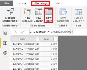
- Create a calendar table. And get the year of date between two tables. (Note : there is no relationship between two tables.)
Calendar = CALENDARAUTO()
Year = YEAR('Calendar'[Date])
Year = YEAR('Table'[Date])- Create a measure
last5 =
var sel = SELECTEDVALUE('Calendar'[Year])
var curr = YEAR(TODAY())
var last5 = curr - 4
var a = CALCULATE(SUM('Table'[ Sales]),FILTER('Table','Table'[Year]<=curr && 'Table'[Year] >=last5))
var b = CALCULATE(SUM('Table'[ Sales]),ALL('Table'[Year]),FILTER('Table','Table'[Year] = sel))
return
IF(ISFILTERED('Calendar'[Year]),b,a)
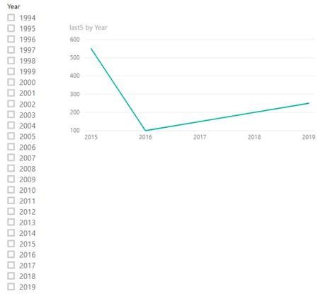
Note : The year of the slicer is from the calendar table. And the year of the line chart is from the original table.
Best Regards,
Xue Ding
If this post helps, then please consider Accept it as the solution to help the other members find it more quickly.
Xue Ding
If this post helps, then please consider Accept it as the solution to help the other members find it more quickly.
- Mark as New
- Bookmark
- Subscribe
- Mute
- Subscribe to RSS Feed
- Permalink
- Report Inappropriate Content
Hi Xue,
My bad for not making my exact requirement clear.
I have a line chart at present with -
Axis: Accident Year Age which is a calculated column based on a formula.
Values: Calculated Measure based on another formula.
Legend: Financial Year
So the line graph gets plotted and shows 26 lines, one each for each financial year from 1994 to 2019.
The requirement is to have the same line chart as above with only latest 5 financial years shown i.e. 2015 to 2019. So only 5 lines and the rest of the years are available for selection via slicer if user wants to see the other years.
In your sample graph, you have the financial year on the axis which is not the case here.
Let me know if you have additional queries.
Thanks,
Vishy
- Mark as New
- Bookmark
- Subscribe
- Mute
- Subscribe to RSS Feed
- Permalink
- Report Inappropriate Content
Hi @vishy86 ,
Don't know if this answer is still on time, but you can do one of 2 things:
- If you are using a Date column you can filter your visualization with a relative date within last 5 years (filter pane option)
- You can create measure with the following code:
Filter = IF(SELECTEDVALUE('Table'[Year]) >= YEAR(TODAY()) - 5;1;BLANK())
Hope this helps.
Regards
Miguel Félix
Did I answer your question? Mark my post as a solution!
Proud to be a Super User!
Check out my blog: Power BI em PortuguêsHelpful resources

Microsoft Fabric Learn Together
Covering the world! 9:00-10:30 AM Sydney, 4:00-5:30 PM CET (Paris/Berlin), 7:00-8:30 PM Mexico City

Power BI Monthly Update - April 2024
Check out the April 2024 Power BI update to learn about new features.

| User | Count |
|---|---|
| 114 | |
| 99 | |
| 83 | |
| 70 | |
| 60 |
| User | Count |
|---|---|
| 150 | |
| 115 | |
| 104 | |
| 89 | |
| 65 |


