- Power BI forums
- Updates
- News & Announcements
- Get Help with Power BI
- Desktop
- Service
- Report Server
- Power Query
- Mobile Apps
- Developer
- DAX Commands and Tips
- Custom Visuals Development Discussion
- Health and Life Sciences
- Power BI Spanish forums
- Translated Spanish Desktop
- Power Platform Integration - Better Together!
- Power Platform Integrations (Read-only)
- Power Platform and Dynamics 365 Integrations (Read-only)
- Training and Consulting
- Instructor Led Training
- Dashboard in a Day for Women, by Women
- Galleries
- Community Connections & How-To Videos
- COVID-19 Data Stories Gallery
- Themes Gallery
- Data Stories Gallery
- R Script Showcase
- Webinars and Video Gallery
- Quick Measures Gallery
- 2021 MSBizAppsSummit Gallery
- 2020 MSBizAppsSummit Gallery
- 2019 MSBizAppsSummit Gallery
- Events
- Ideas
- Custom Visuals Ideas
- Issues
- Issues
- Events
- Upcoming Events
- Community Blog
- Power BI Community Blog
- Custom Visuals Community Blog
- Community Support
- Community Accounts & Registration
- Using the Community
- Community Feedback
Register now to learn Fabric in free live sessions led by the best Microsoft experts. From Apr 16 to May 9, in English and Spanish.
- Power BI forums
- Forums
- Get Help with Power BI
- Desktop
- Re: Show items with no data and slicers
- Subscribe to RSS Feed
- Mark Topic as New
- Mark Topic as Read
- Float this Topic for Current User
- Bookmark
- Subscribe
- Printer Friendly Page
- Mark as New
- Bookmark
- Subscribe
- Mute
- Subscribe to RSS Feed
- Permalink
- Report Inappropriate Content
Show items with no data and slicers
Hi
I have made a new thread because there seems to be various problems with this function but none that match the one I am having.
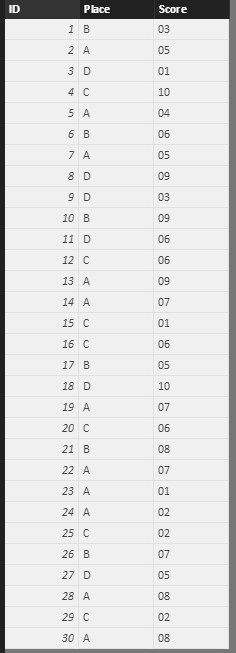
So, for example, I have this data set:
I create a column chart and a slicer like so:
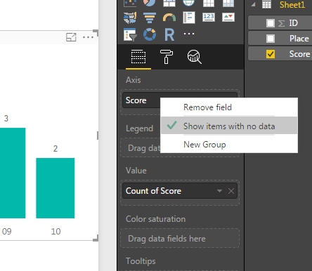
I tick the "Show items with no data" option for the column chart:
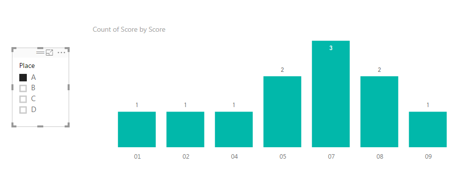
Now when I slice by, for example, "A", the result is this:
As you can see, there are no entries for 'Place A' with a 'Score' of 3/6/10, so they have been removed from the axis. I do not want them removed from the axis, which was the rational for ticking "Show items with no data" on the column chart. I want the axis to remain static regardless of whether there is a count for the individual axis columns.
What am I missing?
Thanks guys
- Mark as New
- Bookmark
- Subscribe
- Mute
- Subscribe to RSS Feed
- Permalink
- Report Inappropriate Content
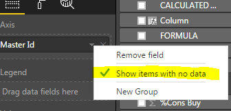
I believe in this case you have to have another table with "Id" and set relationship with your data table and put "Id" from your new table on "Axis"
Subscribe to the @PowerBIHowTo YT channel for an upcoming video on List and Record functions in Power Query!!
Learn Power BI and Fabric - subscribe to our YT channel - Click here: @PowerBIHowTo
If my solution proved useful, I'd be delighted to receive Kudos. When you put effort into asking a question, it's equally thoughtful to acknowledge and give Kudos to the individual who helped you solve the problem. It's a small gesture that shows appreciation and encouragement! ❤
Did I answer your question? Mark my post as a solution. Proud to be a Super User! Appreciate your Kudos 🙂
Feel free to email me with any of your BI needs.
- Mark as New
- Bookmark
- Subscribe
- Mute
- Subscribe to RSS Feed
- Permalink
- Report Inappropriate Content
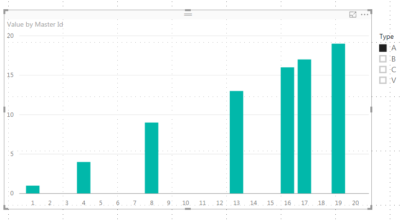
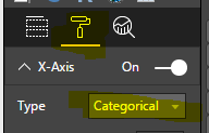
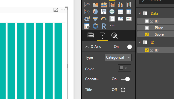
also you have to select "Type" as Categorical on "X" Axis, here are some screen shot for your reference:
Subscribe to the @PowerBIHowTo YT channel for an upcoming video on List and Record functions in Power Query!!
Learn Power BI and Fabric - subscribe to our YT channel - Click here: @PowerBIHowTo
If my solution proved useful, I'd be delighted to receive Kudos. When you put effort into asking a question, it's equally thoughtful to acknowledge and give Kudos to the individual who helped you solve the problem. It's a small gesture that shows appreciation and encouragement! ❤
Did I answer your question? Mark my post as a solution. Proud to be a Super User! Appreciate your Kudos 🙂
Feel free to email me with any of your BI needs.
- Mark as New
- Bookmark
- Subscribe
- Mute
- Subscribe to RSS Feed
- Permalink
- Report Inappropriate Content
OK parry2k, thanks for your help. I may need a little more clarification.
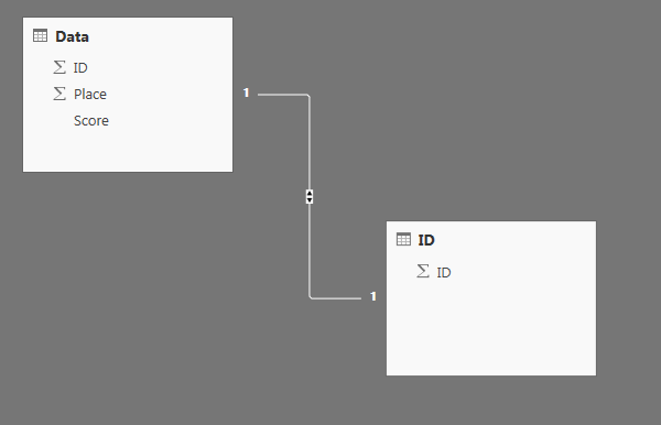
So I have now made a seperate table with just ID - and set the 1:1 relationship with the other data table:
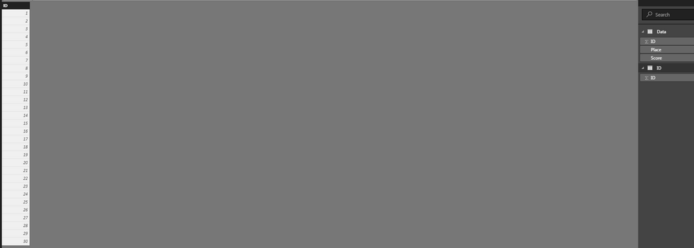
The first problem I have is when I put "ID" from the new table on the Axis:
I fail to understand how this could possibly generate the same chart? (Even with catagorical selected as 'type' in the X-Axis):
Have I misunderstood something already?
- Mark as New
- Bookmark
- Subscribe
- Mute
- Subscribe to RSS Feed
- Permalink
- Report Inappropriate Content
You are correct, I misread some requirement here, I did put together a pbix file which I can send it to you, shoot me your email id in private message.
Thanks,
P
Subscribe to the @PowerBIHowTo YT channel for an upcoming video on List and Record functions in Power Query!!
Learn Power BI and Fabric - subscribe to our YT channel - Click here: @PowerBIHowTo
If my solution proved useful, I'd be delighted to receive Kudos. When you put effort into asking a question, it's equally thoughtful to acknowledge and give Kudos to the individual who helped you solve the problem. It's a small gesture that shows appreciation and encouragement! ❤
Did I answer your question? Mark my post as a solution. Proud to be a Super User! Appreciate your Kudos 🙂
Feel free to email me with any of your BI needs.
- Mark as New
- Bookmark
- Subscribe
- Mute
- Subscribe to RSS Feed
- Permalink
- Report Inappropriate Content
Hello Der,
I am also facing similar issue in my report, could you please share the file with me if possible.
Thanks,
Radhi
- Mark as New
- Bookmark
- Subscribe
- Mute
- Subscribe to RSS Feed
- Permalink
- Report Inappropriate Content
Hi Radhi
I'm afraid I don't have the file anymore.
As far as I can remember, I ultimately resolved this issue by creating a custom column in the data set and using the 'sort by column' fuction under the 'modelling' tab - this gave me more freedom with the axis labelling/order - but I'm afraid I cannot show you or remember the exact details.
Hope this helps.
- Mark as New
- Bookmark
- Subscribe
- Mute
- Subscribe to RSS Feed
- Permalink
- Report Inappropriate Content
I am facing the similar issue in my report, could you please share me the file wherein you have sorted this issue.
Thanks,
Radhi
- Mark as New
- Bookmark
- Subscribe
- Mute
- Subscribe to RSS Feed
- Permalink
- Report Inappropriate Content
Hi Parry
I've looked at the file and had a play around, and I understand what you've done. You did, technically, fix the problem, so thanks for that - though my real issue was slightly shoruded. I kept getting the same results even after applying your method, which looked the like:
The reason for this was that I had the 'Score' column modelled as text. And here's why my problem was shrouded somewhat -
The colum HAD to be formatted as text, because that is the only way I could list that row as 01, 02, 03, 04 etc, instead of what it would automatically be changed to if I formatted as a number column (1, 2, 3, 4, etc). The reason I needed them to be 01, 02, 03, 04 etc is because these values are actually supposed to represent months. When I make a chart, I cannot move columns around as I please, so I need to build into the data the pillars necessary so that I can later 'Sort by score', which will visually allow me to show Jan, Feb Mar, Apr as 01, 02, 03, 04... etc. This is only a problem because of the limited functionality when organising colums in charts.
I received a dataset with January representaed as Jan, February represented as Feb, etc. In order to chart this out, I created a colum which made Jan=01, Feb=02, Mar=03, etc. The idea is I would then use these values as the axis on a bar chart, counting instances of the months:
As you can see, the idea was to use a slicer so that the effect on the counts of the values in the differing months could be explored. The reason they have to be represented as 01, 02, 03 - is because it represents a year cycle, and changing the 'Score' colum to number would make that impossible.
Anyway, that was just a little explanation of why I needed what I needed, and why your solution did work - but not under the strict circumstances I was trying to make it work.
Thanks for your help, much appreciated.
Helpful resources

Microsoft Fabric Learn Together
Covering the world! 9:00-10:30 AM Sydney, 4:00-5:30 PM CET (Paris/Berlin), 7:00-8:30 PM Mexico City

Power BI Monthly Update - April 2024
Check out the April 2024 Power BI update to learn about new features.

| User | Count |
|---|---|
| 113 | |
| 100 | |
| 78 | |
| 76 | |
| 52 |
| User | Count |
|---|---|
| 144 | |
| 109 | |
| 108 | |
| 88 | |
| 61 |
