- Power BI forums
- Updates
- News & Announcements
- Get Help with Power BI
- Desktop
- Service
- Report Server
- Power Query
- Mobile Apps
- Developer
- DAX Commands and Tips
- Custom Visuals Development Discussion
- Health and Life Sciences
- Power BI Spanish forums
- Translated Spanish Desktop
- Power Platform Integration - Better Together!
- Power Platform Integrations (Read-only)
- Power Platform and Dynamics 365 Integrations (Read-only)
- Training and Consulting
- Instructor Led Training
- Dashboard in a Day for Women, by Women
- Galleries
- Community Connections & How-To Videos
- COVID-19 Data Stories Gallery
- Themes Gallery
- Data Stories Gallery
- R Script Showcase
- Webinars and Video Gallery
- Quick Measures Gallery
- 2021 MSBizAppsSummit Gallery
- 2020 MSBizAppsSummit Gallery
- 2019 MSBizAppsSummit Gallery
- Events
- Ideas
- Custom Visuals Ideas
- Issues
- Issues
- Events
- Upcoming Events
- Community Blog
- Power BI Community Blog
- Custom Visuals Community Blog
- Community Support
- Community Accounts & Registration
- Using the Community
- Community Feedback
Register now to learn Fabric in free live sessions led by the best Microsoft experts. From Apr 16 to May 9, in English and Spanish.
- Power BI forums
- Forums
- Get Help with Power BI
- Desktop
- Re: Show historical evolution in line chart after ...
- Subscribe to RSS Feed
- Mark Topic as New
- Mark Topic as Read
- Float this Topic for Current User
- Bookmark
- Subscribe
- Printer Friendly Page
- Mark as New
- Bookmark
- Subscribe
- Mute
- Subscribe to RSS Feed
- Permalink
- Report Inappropriate Content
Show historical evolution in line chart after selection of period
Hello Experts,
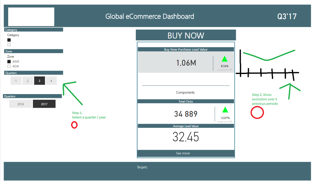
I would like to allow to my users to select YEAR/ QUARTER and then in tiles show YTD values - currently works.
But as well as they are challanging me to show evolution for previous 5 quaters after the selection in the line chart. Where I have no clue at all. The interaction is really tricky in this case.
Please see the screenshot for desired results.
Is this possible?
I will really appreciate your help.
Kind regards,
Martin-Prague
- Mark as New
- Bookmark
- Subscribe
- Mute
- Subscribe to RSS Feed
- Permalink
- Report Inappropriate Content
Hi @Martin-Prague,
I would like to allow to my users to select YEAR/ QUARTER and then in tiles show YTD values - currently works.
But as well as they are challanging me to show evolution for previous 5 quaters after the selection in the line chart. Where I have no clue at all. The interaction is really tricky in this case.
What values about previous 5 quaters do you want to show? YTD or sum total?
If it is convenient, could you share a dummy pbix file which can reproduce the scenario, so that we can help further investigate on it? You can upload it to OneDrive or Dropbox and post the link here. Do mask sensitive data before uploading.)
For reference, here is a thread that similars to your case which calculate the previous 5 years values based on selection.
BestRegards,
Cherry
If this post helps, then please consider Accept it as the solution to help the other members find it more quickly.
- Mark as New
- Bookmark
- Subscribe
- Mute
- Subscribe to RSS Feed
- Permalink
- Report Inappropriate Content
Hello,
my requiremet has littble bit evolved since the time.
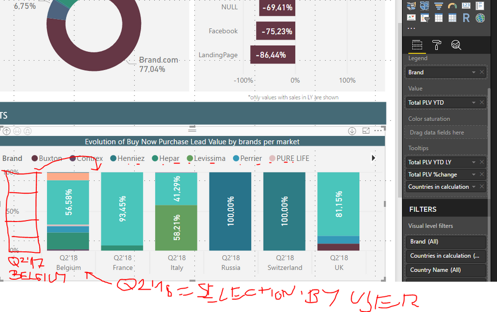
I should be able to select e.g. Q2'18 with once slicer and show in 100% comparison between Q2'17 (Same period last year).
Same period last year should be shown as another column.
See the pircture.. this is for BELGIUM. Same for France, Italy,.....
Do you have any idea?
It is similar to the link you shared, but should not be showing continuous previous periods but SAME PERIOD LAST YEAR in 100% COLUMN STACKED CHART SPLIT BY BRAND.
Important is that selection and same period last year is in 2 diffrent columns to be able to easily compare.
Kind regards,
Martin-Prague
- Mark as New
- Bookmark
- Subscribe
- Mute
- Subscribe to RSS Feed
- Permalink
- Report Inappropriate Content
As my requiremet has little bit changed, here is the new thread:
- Mark as New
- Bookmark
- Subscribe
- Mute
- Subscribe to RSS Feed
- Permalink
- Report Inappropriate Content
Helpful resources

Microsoft Fabric Learn Together
Covering the world! 9:00-10:30 AM Sydney, 4:00-5:30 PM CET (Paris/Berlin), 7:00-8:30 PM Mexico City

Power BI Monthly Update - April 2024
Check out the April 2024 Power BI update to learn about new features.

| User | Count |
|---|---|
| 107 | |
| 98 | |
| 78 | |
| 66 | |
| 53 |
| User | Count |
|---|---|
| 144 | |
| 104 | |
| 100 | |
| 86 | |
| 64 |


