- Power BI forums
- Updates
- News & Announcements
- Get Help with Power BI
- Desktop
- Service
- Report Server
- Power Query
- Mobile Apps
- Developer
- DAX Commands and Tips
- Custom Visuals Development Discussion
- Health and Life Sciences
- Power BI Spanish forums
- Translated Spanish Desktop
- Power Platform Integration - Better Together!
- Power Platform Integrations (Read-only)
- Power Platform and Dynamics 365 Integrations (Read-only)
- Training and Consulting
- Instructor Led Training
- Dashboard in a Day for Women, by Women
- Galleries
- Community Connections & How-To Videos
- COVID-19 Data Stories Gallery
- Themes Gallery
- Data Stories Gallery
- R Script Showcase
- Webinars and Video Gallery
- Quick Measures Gallery
- 2021 MSBizAppsSummit Gallery
- 2020 MSBizAppsSummit Gallery
- 2019 MSBizAppsSummit Gallery
- Events
- Ideas
- Custom Visuals Ideas
- Issues
- Issues
- Events
- Upcoming Events
- Community Blog
- Power BI Community Blog
- Custom Visuals Community Blog
- Community Support
- Community Accounts & Registration
- Using the Community
- Community Feedback
Register now to learn Fabric in free live sessions led by the best Microsoft experts. From Apr 16 to May 9, in English and Spanish.
- Power BI forums
- Forums
- Get Help with Power BI
- Desktop
- Re: Show different columns/values in a matrix base...
- Subscribe to RSS Feed
- Mark Topic as New
- Mark Topic as Read
- Float this Topic for Current User
- Bookmark
- Subscribe
- Printer Friendly Page
- Mark as New
- Bookmark
- Subscribe
- Mute
- Subscribe to RSS Feed
- Permalink
- Report Inappropriate Content
Show different columns/values in a matrix based on the date measurement on relative date slicer
Hello team,
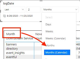
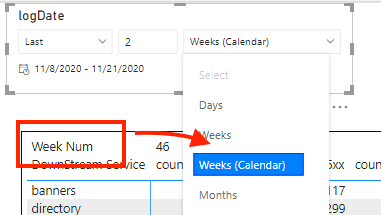
My need is, when relative date measurement is selected as "Week", I want to show aggregation column as Week(no month shown), and value as Week-over-week trend(WowTrend in the screenshot) and no Month-over-month trend(MomTrend in the screenshot) value shown. And when relative date measurement is selected as "Month", I need to show aggregation column as Month(no week), and value as Month-over-month trend and no week-over-week trend value. Is it do-able? Thanks!
- Mark as New
- Bookmark
- Subscribe
- Mute
- Subscribe to RSS Feed
- Permalink
- Report Inappropriate Content
@zhihai , You can not change the axis/column/row using this method. To change That you can use bookmark button or convert columns to rows.
refer
https://www.youtube.com/watch?v=6jeSIRpjv0M
https://datamonkeysite.com/2020/10/22/change-dimension-dynamically-using-parameter-in-powerbi/
https://radacad.com/bookmarks-and-buttons-making-power-bi-charts-even-more-interactive
Microsoft Power BI Learning Resources, 2023 !!
Learn Power BI - Full Course with Dec-2022, with Window, Index, Offset, 100+ Topics !!
Did I answer your question? Mark my post as a solution! Appreciate your Kudos !! Proud to be a Super User! !!
- Mark as New
- Bookmark
- Subscribe
- Mute
- Subscribe to RSS Feed
- Permalink
- Report Inappropriate Content
Thanks again @amitchandak ! These references are very help to create dynamic columns, I think bookmark button are a decent solution:
- I need to create a "week" button and a "month" button, and relates their actions to some bookmark
- User has to click "week"/"month" button aside from clicking from the date measurement dropdown menu in the date range slicer to see the updated visual.
To make user experience more smooth, I want to reduce 2 clicks to 1 click:
- Is there a way to associate the click of the dropdown in date range slicer with the action to show a bookmark?
- Is there a way to know the value(Weeks/Months) that user selected in the dropdown list in date range slicer?
Thanks in advance!
- Mark as New
- Bookmark
- Subscribe
- Mute
- Subscribe to RSS Feed
- Permalink
- Report Inappropriate Content
@zhihai , Not very clear. For WOW refer my blog
Power BI — Week on Week and WTD
https://medium.com/@amitchandak.1978/power-bi-wtd-questions-time-intelligence-4-5-98c30fab69d3
https://community.powerbi.com/t5/Community-Blog/Week-Is-Not-So-Weak-WTD-Last-WTD-and-This-Week-vs-La...
Refer for MOM
Power BI — Month on Month with or Without Time Intelligence
https://medium.com/@amitchandak.1978/power-bi-mtd-questions-time-intelligence-3-5-64b0b4a4090e
Microsoft Power BI Learning Resources, 2023 !!
Learn Power BI - Full Course with Dec-2022, with Window, Index, Offset, 100+ Topics !!
Did I answer your question? Mark my post as a solution! Appreciate your Kudos !! Proud to be a Super User! !!
- Mark as New
- Bookmark
- Subscribe
- Mute
- Subscribe to RSS Feed
- Permalink
- Report Inappropriate Content
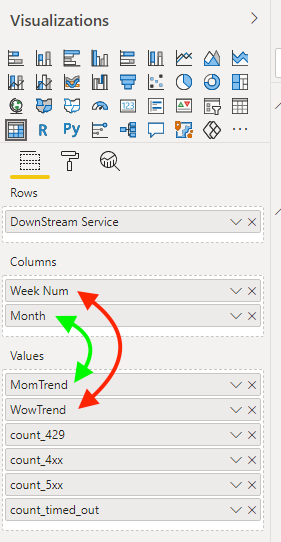
Thanks for your prompt reply @amitchandak ! My issue is not for calculation of WoW or MoM trend, it is how to switch the trend value, and the matrix column based on the relative date period. In other words, if user choose relative week in date slicer, the matrix aggregates on week(the data has week num column), if user choose relative month, the matrix aggregates on month(The data has month column). I showed a screenshot of what I wanna to acheive.
Red arrow shows the pair of week aggregation, and green arrow shows the pair of month aggregation as below. If relative date slicer is in week, then only red pair shows, and if relative date slicer is in month, then only green pair shows.
Helpful resources

Microsoft Fabric Learn Together
Covering the world! 9:00-10:30 AM Sydney, 4:00-5:30 PM CET (Paris/Berlin), 7:00-8:30 PM Mexico City

Power BI Monthly Update - April 2024
Check out the April 2024 Power BI update to learn about new features.

| User | Count |
|---|---|
| 114 | |
| 101 | |
| 78 | |
| 75 | |
| 49 |
| User | Count |
|---|---|
| 145 | |
| 108 | |
| 107 | |
| 89 | |
| 61 |


