- Power BI forums
- Updates
- News & Announcements
- Get Help with Power BI
- Desktop
- Service
- Report Server
- Power Query
- Mobile Apps
- Developer
- DAX Commands and Tips
- Custom Visuals Development Discussion
- Health and Life Sciences
- Power BI Spanish forums
- Translated Spanish Desktop
- Power Platform Integration - Better Together!
- Power Platform Integrations (Read-only)
- Power Platform and Dynamics 365 Integrations (Read-only)
- Training and Consulting
- Instructor Led Training
- Dashboard in a Day for Women, by Women
- Galleries
- Community Connections & How-To Videos
- COVID-19 Data Stories Gallery
- Themes Gallery
- Data Stories Gallery
- R Script Showcase
- Webinars and Video Gallery
- Quick Measures Gallery
- 2021 MSBizAppsSummit Gallery
- 2020 MSBizAppsSummit Gallery
- 2019 MSBizAppsSummit Gallery
- Events
- Ideas
- Custom Visuals Ideas
- Issues
- Issues
- Events
- Upcoming Events
- Community Blog
- Power BI Community Blog
- Custom Visuals Community Blog
- Community Support
- Community Accounts & Registration
- Using the Community
- Community Feedback
Register now to learn Fabric in free live sessions led by the best Microsoft experts. From Apr 16 to May 9, in English and Spanish.
- Power BI forums
- Forums
- Get Help with Power BI
- Desktop
- Show aggregated values in piechart legend
- Subscribe to RSS Feed
- Mark Topic as New
- Mark Topic as Read
- Float this Topic for Current User
- Bookmark
- Subscribe
- Printer Friendly Page
- Mark as New
- Bookmark
- Subscribe
- Mute
- Subscribe to RSS Feed
- Permalink
- Report Inappropriate Content
Show aggregated values in piechart legend
Hello everyone,
I have been given a task and I am not sure it is possible to achieve in Power BI.
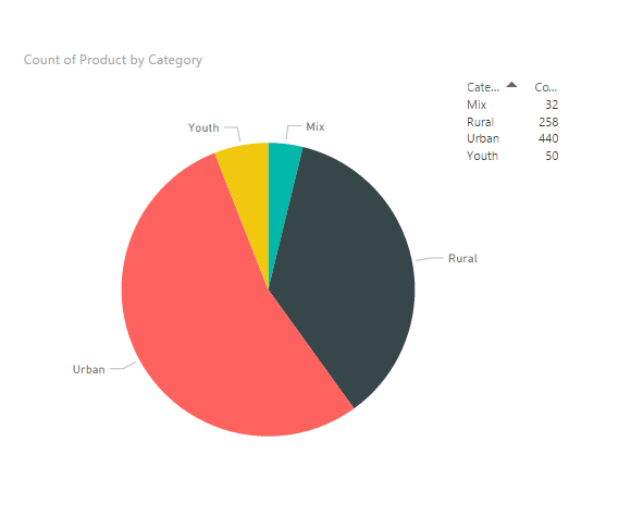
I have a piechart, showing count of entities as values and grouped by categories. In the legend of the piechart I want to see not only the name of the categories but also the aggregated sum amount (another field), that belongs to this category, and is affected by filters.
I see that it is possible to choose multiple fields as "legend", but I'm afraid it only works as a drilldown setting. Also, it is not possible to aggregate there.
Does anyone knows if it's possible to do? Any help would be much appreciated.
- Mark as New
- Bookmark
- Subscribe
- Mute
- Subscribe to RSS Feed
- Permalink
- Report Inappropriate Content
Hi,
I have the same request from a customer. Did you find a way to do this? I tried calculated column but it does not work, the calculation doesn't work.
Thanks.
- Mark as New
- Bookmark
- Subscribe
- Mute
- Subscribe to RSS Feed
- Permalink
- Report Inappropriate Content
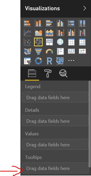
@AlexeyRusinov Get latest version of power bi desktop -> then drop the field for which you want Sum of under Tooltip section for pie chart.
- Mark as New
- Bookmark
- Subscribe
- Mute
- Subscribe to RSS Feed
- Permalink
- Report Inappropriate Content
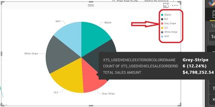
@ankitpatira , thank you for your answer. That will allow me to add summarized values as a tooltip (appearing info when mouse is over a chart), but what I am trying to do is to add these values in a legend, with color descriptions (showed on a picture below).
- Mark as New
- Bookmark
- Subscribe
- Mute
- Subscribe to RSS Feed
- Permalink
- Report Inappropriate Content
@AlexeyRusinov The only way i think you can do that is create a new calculated column using DAX that will give you sum or count of your value field by category field and then concate that with your category field so creating calculated column as 'Grey Stripe - 100'. Then use that calculated column for your category field in pie chart. Legend shown for pie chart is basically your category field you've used.
- Mark as New
- Bookmark
- Subscribe
- Mute
- Subscribe to RSS Feed
- Permalink
- Report Inappropriate Content
@ankitpatira I thought about this, it seems that this option will not work if I want to change filtering (date period, for example).
- Mark as New
- Bookmark
- Subscribe
- Mute
- Subscribe to RSS Feed
- Permalink
- Report Inappropriate Content
In a chart, the legend is only to display the series/ categories, it’s not possible to show aggregated values dynamically in pie chart legend. For your requirement, you can turn off the legend for your pie chart, and use a table visual beside the pie chart, and display the categories and the corresponding aggregated values dynamically on that table which sliced by other field.
Regards
- Mark as New
- Bookmark
- Subscribe
- Mute
- Subscribe to RSS Feed
- Permalink
- Report Inappropriate Content
This is one of the most basic functions that make pie charts even relatively useful. Not having a legend, showing the value of the slice represented, seems to make the chart useless from a functional rather than purely artistic/visual point of view. This has also ben removed from Excel pie charts as far as I can tell, but they at least allow showing the value inside each actual slice (just not in the legend). Why is this no longer a supported feature? That's like not allowing us to see the specific height of a bar in a bar chart. I can see one slice is smaller/larger than the other, just bot to what actual extent. A question almost always asked by almost anyone looking at a pie chart that actually cares about what it represents!
Creating a "fake legend" by showing a grid with the values divorces it from the legend by not allowing it to show the other typical function of the legend, the color of the slice that label represents.
I sincerely wish Microsoft valued the usefulness of its chart types, rather than simply ticking off a "requested feature" list as a bare-bones object.
- Mark as New
- Bookmark
- Subscribe
- Mute
- Subscribe to RSS Feed
- Permalink
- Report Inappropriate Content
Exactly what I think! it's ridiculous, because when my value is so small that the portion of the color in the pie chart is not even viewable, how can they
know the value? and my only hope was that the legend would display the value! but no! and I don't know how to solve this problem 😕
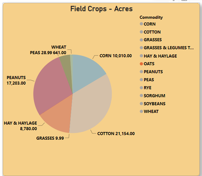
See my image. How many acres of oats? WHO KNOWS!
Helpful resources

Microsoft Fabric Learn Together
Covering the world! 9:00-10:30 AM Sydney, 4:00-5:30 PM CET (Paris/Berlin), 7:00-8:30 PM Mexico City

Power BI Monthly Update - April 2024
Check out the April 2024 Power BI update to learn about new features.

| User | Count |
|---|---|
| 108 | |
| 100 | |
| 78 | |
| 64 | |
| 58 |
| User | Count |
|---|---|
| 148 | |
| 113 | |
| 97 | |
| 84 | |
| 67 |


