- Power BI forums
- Updates
- News & Announcements
- Get Help with Power BI
- Desktop
- Service
- Report Server
- Power Query
- Mobile Apps
- Developer
- DAX Commands and Tips
- Custom Visuals Development Discussion
- Health and Life Sciences
- Power BI Spanish forums
- Translated Spanish Desktop
- Power Platform Integration - Better Together!
- Power Platform Integrations (Read-only)
- Power Platform and Dynamics 365 Integrations (Read-only)
- Training and Consulting
- Instructor Led Training
- Dashboard in a Day for Women, by Women
- Galleries
- Community Connections & How-To Videos
- COVID-19 Data Stories Gallery
- Themes Gallery
- Data Stories Gallery
- R Script Showcase
- Webinars and Video Gallery
- Quick Measures Gallery
- 2021 MSBizAppsSummit Gallery
- 2020 MSBizAppsSummit Gallery
- 2019 MSBizAppsSummit Gallery
- Events
- Ideas
- Custom Visuals Ideas
- Issues
- Issues
- Events
- Upcoming Events
- Community Blog
- Power BI Community Blog
- Custom Visuals Community Blog
- Community Support
- Community Accounts & Registration
- Using the Community
- Community Feedback
Register now to learn Fabric in free live sessions led by the best Microsoft experts. From Apr 16 to May 9, in English and Spanish.
- Power BI forums
- Forums
- Get Help with Power BI
- Desktop
- Show a line graph that uses 100% every time period
- Subscribe to RSS Feed
- Mark Topic as New
- Mark Topic as Read
- Float this Topic for Current User
- Bookmark
- Subscribe
- Printer Friendly Page
- Mark as New
- Bookmark
- Subscribe
- Mute
- Subscribe to RSS Feed
- Permalink
- Report Inappropriate Content
Show a line graph that uses 100% every time period
Greetings,
I'm trying to show a line graph with a time period as x Axis and I wan't every time period to amount to 100%. I see that this is possible by using a slicer for the time period. Example of the data that I want to show:
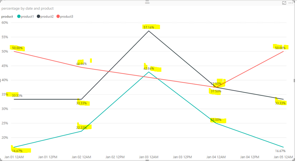
And this is the line graph that I currently have, can I adjust it so that every time period amounts to 100%?:
Solved! Go to Solution.
- Mark as New
- Bookmark
- Subscribe
- Mute
- Subscribe to RSS Feed
- Permalink
- Report Inappropriate Content
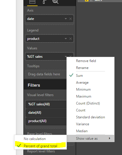
I guess that you're showing the "Percentage of grand total"?
If so, to show as you expected, you'll have to create some measure as below. See more details in the attached pbix file.
percentage = DIVIDE(sum(Table5[sales]),CALCULATE(SUM(Table5[sales]),ALLEXCEPT(Table5,Table5[date])))
- Mark as New
- Bookmark
- Subscribe
- Mute
- Subscribe to RSS Feed
- Permalink
- Report Inappropriate Content
Hello, i have similar problem but i can't seem to get the line graph to total each month at 100%.
Below chart totals 100% across all 4 months. I need each month to total 100%.
I need the line to total to 100% for every month. I have the formula like this
- Mark as New
- Bookmark
- Subscribe
- Mute
- Subscribe to RSS Feed
- Permalink
- Report Inappropriate Content
I guess that you're showing the "Percentage of grand total"?
If so, to show as you expected, you'll have to create some measure as below. See more details in the attached pbix file.
percentage = DIVIDE(sum(Table5[sales]),CALCULATE(SUM(Table5[sales]),ALLEXCEPT(Table5,Table5[date])))
- Mark as New
- Bookmark
- Subscribe
- Mute
- Subscribe to RSS Feed
- Permalink
- Report Inappropriate Content
Dear Eric,
Thank you for sharing how to show a line graph that uses 100% everytime.
Now my question to you is how to make this equation more dynamic, so that it takes into account the data hierarchy and date filters.
I am interested in a calculation that is by months. When I use your equation it only works when I use the date at the lowest level (by the day). I am interested in it being 100% per month. Additionally, I would like to take into account that there are different months in a year that could be flexible when date filters are used.
- Mark as New
- Bookmark
- Subscribe
- Mute
- Subscribe to RSS Feed
- Permalink
- Report Inappropriate Content
Anyone can solve this problem, show line graph that uses 100% every month period?
- Mark as New
- Bookmark
- Subscribe
- Mute
- Subscribe to RSS Feed
- Permalink
- Report Inappropriate Content
Thank you a ton, yesterday I ended up finding this measure to solve my problems but your file will help me greatly in the future.
Yesterday I ended up with the following measure and it seemed to work:
% Van respondenten = DIVIDE(COUNTA('TABLE'[Response]); CALCULATE(COUNTA('Table'[Response); ALLEXCEPT('Table';'Table'[Time column]));0 )
Helpful resources

Microsoft Fabric Learn Together
Covering the world! 9:00-10:30 AM Sydney, 4:00-5:30 PM CET (Paris/Berlin), 7:00-8:30 PM Mexico City

Power BI Monthly Update - April 2024
Check out the April 2024 Power BI update to learn about new features.

| User | Count |
|---|---|
| 112 | |
| 99 | |
| 73 | |
| 72 | |
| 49 |
| User | Count |
|---|---|
| 145 | |
| 109 | |
| 108 | |
| 90 | |
| 64 |


