- Power BI forums
- Updates
- News & Announcements
- Get Help with Power BI
- Desktop
- Service
- Report Server
- Power Query
- Mobile Apps
- Developer
- DAX Commands and Tips
- Custom Visuals Development Discussion
- Health and Life Sciences
- Power BI Spanish forums
- Translated Spanish Desktop
- Power Platform Integration - Better Together!
- Power Platform Integrations (Read-only)
- Power Platform and Dynamics 365 Integrations (Read-only)
- Training and Consulting
- Instructor Led Training
- Dashboard in a Day for Women, by Women
- Galleries
- Community Connections & How-To Videos
- COVID-19 Data Stories Gallery
- Themes Gallery
- Data Stories Gallery
- R Script Showcase
- Webinars and Video Gallery
- Quick Measures Gallery
- 2021 MSBizAppsSummit Gallery
- 2020 MSBizAppsSummit Gallery
- 2019 MSBizAppsSummit Gallery
- Events
- Ideas
- Custom Visuals Ideas
- Issues
- Issues
- Events
- Upcoming Events
- Community Blog
- Power BI Community Blog
- Custom Visuals Community Blog
- Community Support
- Community Accounts & Registration
- Using the Community
- Community Feedback
Register now to learn Fabric in free live sessions led by the best Microsoft experts. From Apr 16 to May 9, in English and Spanish.
- Power BI forums
- Forums
- Get Help with Power BI
- Desktop
- Show Sent and Target Dates in one Chart
- Subscribe to RSS Feed
- Mark Topic as New
- Mark Topic as Read
- Float this Topic for Current User
- Bookmark
- Subscribe
- Printer Friendly Page
- Mark as New
- Bookmark
- Subscribe
- Mute
- Subscribe to RSS Feed
- Permalink
- Report Inappropriate Content
Show Sent and Target Dates in one Chart
Hi All,
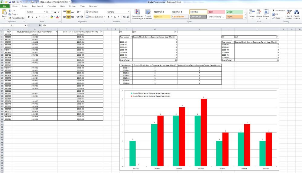
In my source Excel spreadsheet I have a number of 34 items ("ID") which have the "Study Sent to Customer Actual
(Year-Month)" and "Study Sent to Customer Target (Year-Month)" associated fields.
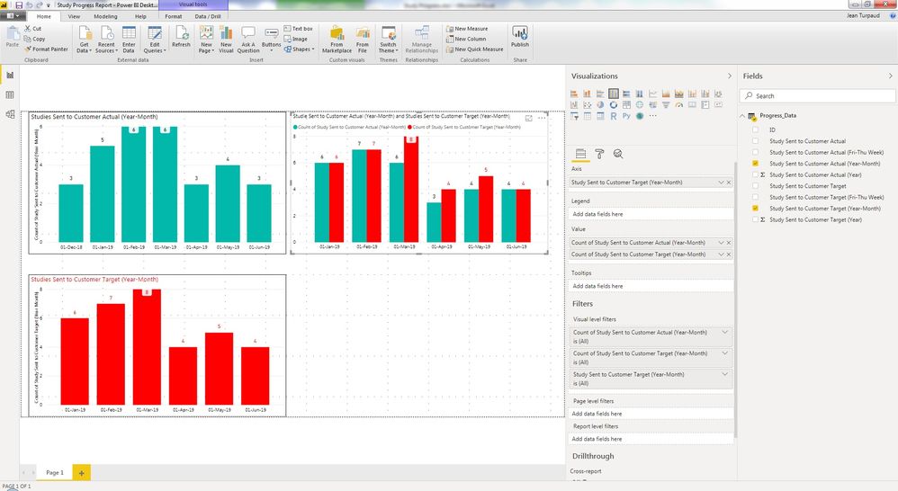
I would like to create in Power BI a Clustered Column Chart correctly containing these "ID" items versus both the
"Study Sent to Customer Actual (Year-Month)" and "Study Sent to Customer Target (Year-Month)" fields with the
correct values as shown in the graph that I was able to produce in Excel (see below).
| ID | Study Sent to Customer Actual (Year-Month) | Study Sent to Customer Target (Year-Month) |
| 980234 | 2018-12 | 2019-01 |
| 980233 | 2019-01 | 2019-01 |
| 980232 | 2019-01 | 2019-01 |
| 980383 | 2018-12 | 2019-01 |
| 980485 | 2019-01 | 2019-03 |
| 980507 | 2019-02 | 2019-02 |
| DQ-5944 | 2019-01 | 2019-01 |
| 980495 | 2019-02 | 2019-01 |
| 980493 | 2019-02 | 2019-03 |
| 980514 | 2019-03 | |
| 980515 | 2019-03 | 2019-02 |
| 980517 | 2019-03 | 2019-03 |
| 980519 | 2019-04 | |
| DQ-5965 | 2018-12 | 2019-02 |
| 980575 | 2019-01 | 2019-02 |
| 980569 | 2019-02 | 2019-02 |
| 980574 | 2019-03 | 2019-02 |
| 980550 | 2019-04 | 2019-03 |
| 980559 | 2019-02 | 2019-03 |
| 980573 | 2019-03 | 2019-02 |
| 980708 | 2019-03 | 2019-04 |
| 980766 | 2019-05 | 2019-05 |
| 980682 | 2019-03 | |
| 980730 | 2019-02 | 2019-04 |
| 980775 | 2019-04 | 2019-04 |
| 980694 | 2019-05 | |
| 980698 | 2019-05 | 2019-05 |
| 980748 | 2019-03 | 2019-05 |
| 980729 | 2019-06 | 2019-05 |
| 980709 | 2019-05 | 2019-06 |
| 980701 | 2019-04 | 2019-03 |
| DQ-5992 | 2019-06 | 2019-06 |
| 980939 | 2019-05 | 2019-06 |
| 981024 | 2019-06 | 2019-06 |
| ID | (All) |
| Row Labels | Count of Study Sent to Customer Actual (Year-Month) |
| 4 | |
| 2018-12 | 3 |
| 2019-01 | 5 |
| 2019-02 | 6 |
| 2019-03 | 6 |
| 2019-04 | 3 |
| 2019-05 | 4 |
| 2019-06 | 3 |
| Grand Total | 34 |
| ID | (All) |
| Row Labels | Count of Study Sent to Customer Target (Year-Month) |
| 2019-01 | 6 |
| 2019-02 | 7 |
| 2019-03 | 8 |
| 2019-04 | 4 |
| 2019-05 | 5 |
| 2019-06 | 4 |
| Grand Total | 34 |
| Year-Month | Count of Study Sent to Customer Actual (Year-Month) | Count of Study Sent to Customer Target (Year-Month) |
| 2018-12 | 3 | 0 |
| 2019-01 | 5 | 6 |
| 2019-02 | 6 | 7 |
| 2019-03 | 6 | 8 |
| 2019-04 | 3 | 4 |
| 2019-05 | 4 | 5 |
| 2019-06 | 3 | 4 |
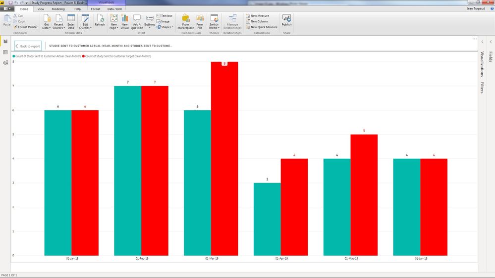
When I try to put together these "ID" items versus both "Study Sent to Customer Actual (Year-Month)" and "Study
Sent to Customer Target (Year-Month)" fields the Clustered Column Chart in Power BI only gets correct numbers for
one of the series "Study Sent to Customer Target (Year-Month)" but not for the other one ("Study Sent to Customer
Actual (Year-Month)").
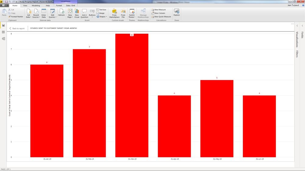
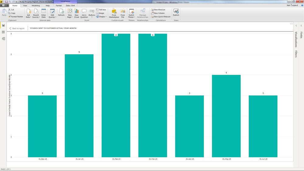
However, when I create in Power BI separate Clustered Column Charts for "ID" items versus "Study Sent to Customer
Actual (Year-Month)" and for "ID" items versus "Study Sent to Customer Target (Year-Month)" fields, each one of
the two separate Power BI separate Clustered Column Charts shows correct values.
I have attached in the links provided below the Excel source file (Study Progress.xlsx) and the Power BI file
(Study Progress Report.pbix).
I would reaaly appreciate it if someone could explain me how could I achieve to create a Clustered Column Charts
for "ID" items versus the "Study Sent to Customer Actual (Year-Month)" and the "Study Sent to Customer Target
(Year-Month)" fields, showing the correct values. In addition to an explanation, it would be great if you could
implement the worked solution in the provided Power BI file (Study Progress Report.pbix).
Thank you very much.
Excel source file (Study Progress.xlsx):
https://drive.google.com/open?id=1EgUHYetPX1ehgU7wKrULn12NDlBCzp0k
Power BI file (Study Progress Report.pbix):
https://drive.google.com/open?id=1B374ZKSQ7YNdpXlTCtAYH8Fqr8Ra7wtF
- Mark as New
- Bookmark
- Subscribe
- Mute
- Subscribe to RSS Feed
- Permalink
- Report Inappropriate Content
3 things.
1. Timing is everything. I saw this exactly as I was put on hold for a phone call - still waiting.
2. you asked nicely and had a well laid out question - good job
3. Here is my part solution. You should be able to work it out from here. https://www.dropbox.com/s/3juvjgvb4uvt8av/Study%20Progress%20Report%20Matt.pbix?dl=1
Read here https://exceleratorbi.com.au/multiple-relationships-between-tables-in-dax/
- Mark as New
- Bookmark
- Subscribe
- Mute
- Subscribe to RSS Feed
- Permalink
- Report Inappropriate Content
Thank you so much Matt, very much appreciated. Your approach uses some concepts which at this stage I am not quite familiar in Power BI. I will review and try to better understand them.
I have a couple of questions:
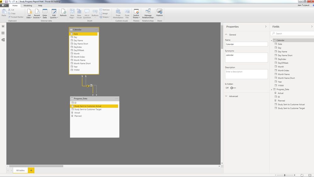
1) If I understood correctly, your approach consists in creating a Calendar table and linking the Date field in the Calendar table to the Study Sent to Customer Actual field in the Progress_Data table (active relationship), as well as also linking the Date field in the Calendar table to the Study Sent to Customer Target field in the Progress_Data table (passive relationship) and doing the trick though creating 2 measures: Actual = COUNTROWS(Progress_Data), and Planned = CALCULATE(COUNTROWS(Progress_Data),USERELATIONSHIP('Calendar'[Date],Progress_Data[Study Sent to Customer Target])) , using the USERELATIONSHIP DAX Power BI function, which allows make a relationship active (even if that relationship is inactive, I hope I am expressing myself clearly and this makes sense!). Question 1: Instead of making the relationship with Study Sent to Customer Actual active, having an Actual measure, and then forcing the relationship with Study Sent to Customer Target to be active active in the Planned mesure, in that order, could I also have done it the other way around (first Target and then Actual) with the same results?
2) Following up with my question to actually reflect my real life scenario, I should mention that I actually presented a succint simplified version of my issue. However, in reality I have a source spreadsheet which in addition to the before described fields (Study Sent to Customer Actual, Study Sent to Customer Target) it also has other pairs of Actual and Target fields (Plan Version 1 Sent to Project Manager Actual / Plan Version 1 Sent to Project Manager Target , Plan Version 2 Sent to Project Manager Actual / Plan Version 2 Sent to Project Manager Target, Plan Version 3 Sent to Project Manager Actual / Plan Version 3 Sent to Project Manager Target, etc.) which I would also like to graph in a similar fasion (Plan Version 1 Sent to Project Manager Actual and Plan Version 1 Sent to Project Manager Target in a single Clustered Column Chart, Plan Version 2 Sent to Project Manager Actual and Plan Version 2 Sent to Project Manager Target in another single Clustered Column Chart, etc.). Question 2: Would I need to create separates Calendar tables for each pair of Actual and Target fields, or could all of them use the same Calendar table?
Thanks again Matt.
JohnT1000
- Mark as New
- Bookmark
- Subscribe
- Mute
- Subscribe to RSS Feed
- Permalink
- Report Inappropriate Content
Hey @Anonymous ,
basically there is no better solution than the one considered by @MattAllington meaning it's essential to create a dedicated calendar table.
Regarding your question if it does matter which relation is active and which is inactive: no this does not matter. From my understanding I would make the target one active, as there are empty value for some surveys that have not been sent to. I tend to make that relationship active that is able to answer the most questions regarding, but of course this is also in a way some kind of esoterical thinking.
Another approach could also be create a slightly different model. I call the table that you presented a wide table. A different approach is to create a long table. I used the following DAX statement
Progress Data Long =
UNION(
    SELECTCOLUMNS(
        FILTER(
            GENERATEALL(
                    SUMMARIZECOLUMNS(
                        'Progress_Data'[ID]
                        , 'Progress_Data'[Study Sent to Customer Actual]
                    )
                    , ROW("Type", "Actual")
            )
            ,NOT(ISBLANK('Progress_Data'[Study Sent to Customer Actual]))
        )
        , "Study ID" , [ID]
        , "Date" , [Study Sent to Customer Actual]
        , "Typye" , [Type]
    )
    ,
    FILTER(
        GENERATEALL(
            SUMMARIZECOLUMNS(
                'Progress_Data'[ID]
                , 'Progress_Data'[Study Sent to Customer Target]
            )
            , ROW("Type" , "Target")
        )
        , NOT(ISBLANK('Progress_Data'[Study Sent to Customer Target]))
    )
)
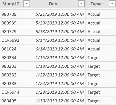
to create this table (just a fraction):
I used DAX to create the table above as I was in a hurry. Basically I would recommend to use Power Query to shape the data model 🙂
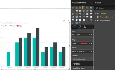
This avoids empty values, and then I create a visual like this without any measure:
Personally, I tend to solve my reporting requirements without writing DAX (of course most of the time this does not word, and I also have to admit that I love writing DAX), but I always recommend to think about the data model first. Due to it's power DAX is able to compensate for a "bad" data model, but this will haunt you sooner or later.
It's difficult to recommend a final solution, besides "you need a separate Calendar table", as I do not fully understand the description of the data from your second post.
Hopefully this will add some additional insights.
Regards,
Tom
Did I answer your question? Mark my post as a solution, this will help others!
Proud to be a Super User!
I accept Kudos 😉
Hamburg, Germany
Helpful resources

Microsoft Fabric Learn Together
Covering the world! 9:00-10:30 AM Sydney, 4:00-5:30 PM CET (Paris/Berlin), 7:00-8:30 PM Mexico City

Power BI Monthly Update - April 2024
Check out the April 2024 Power BI update to learn about new features.

| User | Count |
|---|---|
| 111 | |
| 100 | |
| 80 | |
| 64 | |
| 58 |
| User | Count |
|---|---|
| 146 | |
| 110 | |
| 93 | |
| 84 | |
| 67 |

