- Power BI forums
- Updates
- News & Announcements
- Get Help with Power BI
- Desktop
- Service
- Report Server
- Power Query
- Mobile Apps
- Developer
- DAX Commands and Tips
- Custom Visuals Development Discussion
- Health and Life Sciences
- Power BI Spanish forums
- Translated Spanish Desktop
- Power Platform Integration - Better Together!
- Power Platform Integrations (Read-only)
- Power Platform and Dynamics 365 Integrations (Read-only)
- Training and Consulting
- Instructor Led Training
- Dashboard in a Day for Women, by Women
- Galleries
- Community Connections & How-To Videos
- COVID-19 Data Stories Gallery
- Themes Gallery
- Data Stories Gallery
- R Script Showcase
- Webinars and Video Gallery
- Quick Measures Gallery
- 2021 MSBizAppsSummit Gallery
- 2020 MSBizAppsSummit Gallery
- 2019 MSBizAppsSummit Gallery
- Events
- Ideas
- Custom Visuals Ideas
- Issues
- Issues
- Events
- Upcoming Events
- Community Blog
- Power BI Community Blog
- Custom Visuals Community Blog
- Community Support
- Community Accounts & Registration
- Using the Community
- Community Feedback
Register now to learn Fabric in free live sessions led by the best Microsoft experts. From Apr 16 to May 9, in English and Spanish.
- Power BI forums
- Forums
- Get Help with Power BI
- Desktop
- Show % Change in power BI graph
- Subscribe to RSS Feed
- Mark Topic as New
- Mark Topic as Read
- Float this Topic for Current User
- Bookmark
- Subscribe
- Printer Friendly Page
- Mark as New
- Bookmark
- Subscribe
- Mute
- Subscribe to RSS Feed
- Permalink
- Report Inappropriate Content
Show % Change in power BI graph
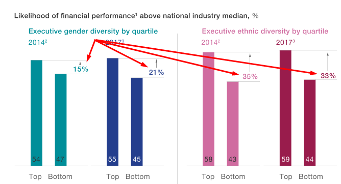
Is there a way to get the % change in the way it is being calculated above in power BI ?
Got to know that Tableau has this option..
Solved! Go to Solution.
- Mark as New
- Bookmark
- Subscribe
- Mute
- Subscribe to RSS Feed
- Permalink
- Report Inappropriate Content
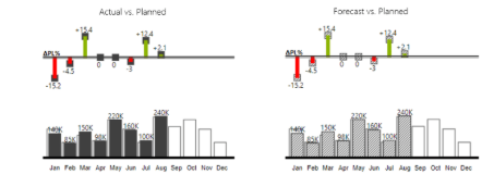
I use this chart when i want to show % change. Like compare current year and past year or another two dimension. You can compare just two dimension at the same time with this chart.
Actually thats not exactly what you are looking for but maybe work
you can get this on marketplace with search as "bar chart with relative variance"
https://appsource.microsoft.com/en-us/product/power-bi-visuals/WA104381912?src=office&tab=Overview
- Mark as New
- Bookmark
- Subscribe
- Mute
- Subscribe to RSS Feed
- Permalink
- Report Inappropriate Content
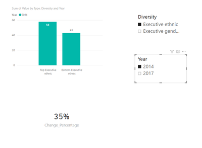
Yes, you can also achieve this in power bi. You can refer to steps below.
1. Create two slicer visuals based on Diversity and Year column.
2. Create a cluster column chart and drag Type column and Diversity column to the axis field, Year column to the legend field and Value column to the value field.
3. Create a measure using DAX below and drag the measure to card visual field.
Change_Percentage =
VAR Bottom_Value = CALCULATE(MAX(Table1[Value]), FILTER(ALL(Table1), Table1[Diversity] = SELECTEDVALUE(Table1[Diversity]) && Table1[Year] = SELECTEDVALUE(Table1[Year]) && Table1[Type] = "Bottom"))
VAR Top_Value = CALCULATE(MAX(Table1[Value]), FILTER(ALL(Table1), Table1[Diversity] = SELECTEDVALUE(Table1[Diversity]) && Table1[Year] = SELECTEDVALUE(Table1[Year]) && Table1[Type] = "Top"))
RETURN
(Top_Value - Bottom_Value) / Bottom_Value
Finally, you will achieve a report like pattern below:

Community Support Team _ Jimmy Tao
If this post helps, then please consider Accept it as the solution to help the other members find it more quickly.
- Mark as New
- Bookmark
- Subscribe
- Mute
- Subscribe to RSS Feed
- Permalink
- Report Inappropriate Content
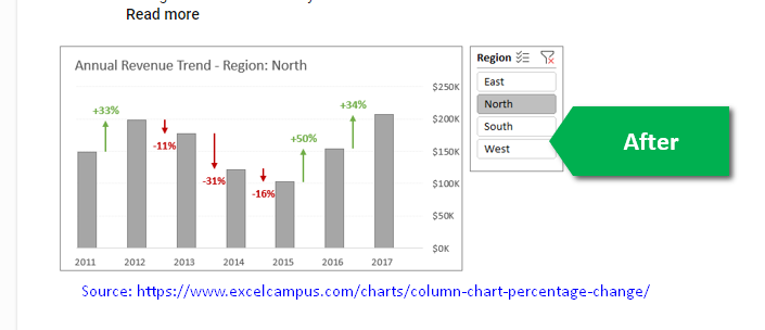
Thanks v-yuta-msft. I was looking for a solution to put this measure placed along with the bar charts as shown in below screenshot from https://www.excelcampus.com/charts/column-chart-percentage-change/comment-page-1/. This is a workaround in Excel.
- Mark as New
- Bookmark
- Subscribe
- Mute
- Subscribe to RSS Feed
- Permalink
- Report Inappropriate Content
You can add the measure to the tooltip of the bar chart.
Community Support Team _ Jimmy Tao
If this post helps, then please consider Accept it as the solution to help the other members find it more quickly.
- Mark as New
- Bookmark
- Subscribe
- Mute
- Subscribe to RSS Feed
- Permalink
- Report Inappropriate Content
I don't get the question
do you want to know if it's possible to visualize as in the screenshot, or to calculate the change? if the latter, can you share the sample data?
Thank you for the kudos 🙂
Helpful resources

Microsoft Fabric Learn Together
Covering the world! 9:00-10:30 AM Sydney, 4:00-5:30 PM CET (Paris/Berlin), 7:00-8:30 PM Mexico City

Power BI Monthly Update - April 2024
Check out the April 2024 Power BI update to learn about new features.

| User | Count |
|---|---|
| 112 | |
| 99 | |
| 73 | |
| 72 | |
| 49 |
| User | Count |
|---|---|
| 145 | |
| 109 | |
| 109 | |
| 90 | |
| 64 |


