- Power BI forums
- Updates
- News & Announcements
- Get Help with Power BI
- Desktop
- Service
- Report Server
- Power Query
- Mobile Apps
- Developer
- DAX Commands and Tips
- Custom Visuals Development Discussion
- Health and Life Sciences
- Power BI Spanish forums
- Translated Spanish Desktop
- Power Platform Integration - Better Together!
- Power Platform Integrations (Read-only)
- Power Platform and Dynamics 365 Integrations (Read-only)
- Training and Consulting
- Instructor Led Training
- Dashboard in a Day for Women, by Women
- Galleries
- Community Connections & How-To Videos
- COVID-19 Data Stories Gallery
- Themes Gallery
- Data Stories Gallery
- R Script Showcase
- Webinars and Video Gallery
- Quick Measures Gallery
- 2021 MSBizAppsSummit Gallery
- 2020 MSBizAppsSummit Gallery
- 2019 MSBizAppsSummit Gallery
- Events
- Ideas
- Custom Visuals Ideas
- Issues
- Issues
- Events
- Upcoming Events
- Community Blog
- Power BI Community Blog
- Custom Visuals Community Blog
- Community Support
- Community Accounts & Registration
- Using the Community
- Community Feedback
Register now to learn Fabric in free live sessions led by the best Microsoft experts. From Apr 16 to May 9, in English and Spanish.
- Power BI forums
- Forums
- Get Help with Power BI
- Desktop
- Re: Share your thoughts on the new format pane (pr...
- Subscribe to RSS Feed
- Mark Topic as New
- Mark Topic as Read
- Float this Topic for Current User
- Bookmark
- Subscribe
- Printer Friendly Page
- Mark as New
- Bookmark
- Subscribe
- Mute
- Subscribe to RSS Feed
- Permalink
- Report Inappropriate Content
Share your thoughts on the new format pane (preview)
Hit Reply to tell us what you think about the new format pane so we can continue to improve.
For example:
- What changes would you like to see?
- If you turned off the preview switch, why?
- Any suggestions for addititional settings or capabilities?
Thanks,
-Power BI team
To read more about the feature see the announcement in the Power BI Product Blog
- Mark as New
- Bookmark
- Subscribe
- Mute
- Subscribe to RSS Feed
- Permalink
- Report Inappropriate Content
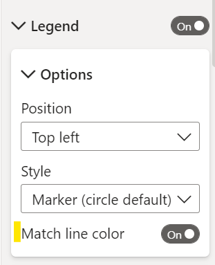
Should be this setting for combo charts:
I don't see one for the line chart, the old pane seems to be missing this as well. I can dig into why we we're missing it for line charts. Does this help?
- Mark as New
- Bookmark
- Subscribe
- Mute
- Subscribe to RSS Feed
- Permalink
- Report Inappropriate Content
Hi,
Yes, seems you are right. I did find it in the Column/Line chart now (in the new format pane). Although it would also be nice if not only the 0 would be aligned but also the Max. value, so the relation between both values matches.
Thank you.
BR Daniel
- Mark as New
- Bookmark
- Subscribe
- Mute
- Subscribe to RSS Feed
- Permalink
- Report Inappropriate Content
Exactly what I was thinking too.
- Mark as New
- Bookmark
- Subscribe
- Mute
- Subscribe to RSS Feed
- Permalink
- Report Inappropriate Content
UX changes go in the wrong direction. It is even worse on the website powerbi.com (especially the changing position of the functions, the lack of a black theme, duplicated functionalities in many places, which makes the whole thing overwhelming).
For me, there is a regress in this topic, and many of the users I talk to hope that you will finally change your UX designer.
It would not be bad if you could work the old way, unfortunately you do not give this opportunity.
I like your products from the functional side, but the interface drives me crazy. And it's not just my opinion.
- Mark as New
- Bookmark
- Subscribe
- Mute
- Subscribe to RSS Feed
- Permalink
- Report Inappropriate Content
Hello. I'm experiencing a problem with the new Format pane, when using Subtotals and aply configuration by row level:
Thanks in advance.
- Mark as New
- Bookmark
- Subscribe
- Mute
- Subscribe to RSS Feed
- Permalink
- Report Inappropriate Content
legend colors do not match the colors of the lines in a combined bar/line chart. To avoid this, you must use markers and assign a color to each dimension seperately. Was no problem in the old format pane
- Mark as New
- Bookmark
- Subscribe
- Mute
- Subscribe to RSS Feed
- Permalink
- Report Inappropriate Content
Are you on the latest April build? Can you ensure this "match line color" toggle is turned on. Does this help or are you still seeing unexpected behavior?
- Mark as New
- Bookmark
- Subscribe
- Mute
- Subscribe to RSS Feed
- Permalink
- Report Inappropriate Content
I find that the format brush does not seem to consistently apply formatting changes to some visuals. For example, font size value (Visual > Detail Labels > Values > Font) does not change when I copy formatting from one pie chart to another. The same applies to the Percentage decimal places.
Is this a bug or has always been this way? I dont experience this with the bar or column charts
- Mark as New
- Bookmark
- Subscribe
- Mute
- Subscribe to RSS Feed
- Permalink
- Report Inappropriate Content
This a bug. Thanks for reporting, I've filed it with the team.
- Mark as New
- Bookmark
- Subscribe
- Mute
- Subscribe to RSS Feed
- Permalink
- Report Inappropriate Content
First, thank you for the prompt responses and resolutions in this post. This kind of dialogue between Microsoft and the user community is encouraging and productive. Please convey our gratitude to the team!
I like the design of the new Format pane: it’s more compact, consistent, and intuitive. Will the new Format pane become available in Power BI Service when it becomes generally available in the May 2022 Power BI Desktop release?
Ideas
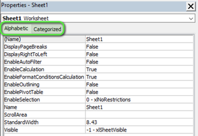
1. Allow users to choose the Format pane theme. This would give users the ability to see format settings according to their preference, and would reduce confusion as to where a particular setting is located. Another grouping option is Alphabetic/Categorized, which is used in Visual Basic, Tabular Editor, etc. There could be an option in Options and Settings for Format pane:
Classic
Visual/General
Alphabetic/Categorized
Example:
2. Preserve the last location in the Format pane. In both the old and new Format panes, once you leave the Format pane by clicking the Fields button, the Format pane resets to the original collapsed display. The last location is preserved, however, if you alternate between the Visual and General categories.
3. Identify cards that have been configured. For example, if you change the font size in Values, it would be helpful to have an indicator that the card Values is no longer using the default settings. This would enable us to instantly identify which cards have been configured. Similar functionality is available in the Fields pane: when a field is used in a visual, a yellow circle with a check mark appears next to the table.
4. Allow users to pin commonly used cards at the top. For example, if I frequently configure the cards Values and Row subtotals, it would be nice to have these at the top so I can quickly access them.
Tooltips
This relates to tooltips of the cards, not the Tooltips card. I tested the matrix in the old and new Format panes and noticed differences regarding card tooltips (when hovering over a card such as Grid). In the old Format pane, the tooltip is simply the card name. For example, when you hover over Values it displays "Values". The exception is Visual header, which has a meaningful tooltip. In the new Format pane, only these matrix cards have tooltips:
Visual: Specific column, Cell elements
General: Title, Header icons
It would be helpful to have a meaningful tooltip for each card. Also, it would be helpful to display tooltips on disabled settings. For example, in a matrix if I hover over Cell elements —> Background color, I don’t see the tooltip unless Background color is toggled on. Requiring a user to "toggle on" just to get additional information results in more clicking.
Thanks, Rosie!
Did I answer your question? Mark my post as a solution!
Proud to be a Super User!
- Mark as New
- Bookmark
- Subscribe
- Mute
- Subscribe to RSS Feed
- Permalink
- Report Inappropriate Content
Thank you for taking the time write this up! Yes, when the new format pane GAs (now moved from May to June) this will be shipped in Service as well. I'll add your ideas to our list. We are hoping to achieve better bulk formatting capabilities like frequent font styles, your example for #4 here, with a formatting ribbon. Great point on adding more tooltips, we'll get on that!
- Mark as New
- Bookmark
- Subscribe
- Mute
- Subscribe to RSS Feed
- Permalink
- Report Inappropriate Content
Wasted a lot of valuable time trying to figure out how to change the number of decimal places in a Table - had to switch back to old formatting pane.
- Mark as New
- Bookmark
- Subscribe
- Mute
- Subscribe to RSS Feed
- Permalink
- Report Inappropriate Content
Cannot find the "Field Formatting" setting in the new format pane. Not sure how to change the display units (in Billions, Millions, etc.) with this new format pane.
- Mark as New
- Bookmark
- Subscribe
- Mute
- Subscribe to RSS Feed
- Permalink
- Report Inappropriate Content
Search for "Display units" and it should come up but you'll need to have selected the right column in the Specific column section to see it.
- Mark as New
- Bookmark
- Subscribe
- Mute
- Subscribe to RSS Feed
- Permalink
- Report Inappropriate Content
Thanks for this solution as it resolved my issue with an inability to find it as well. Still, I think that there should be a closer alignment to the old formatting pane so that it isn't so hard to find what you are looking for. At least make a better search feature so we can find it - for instance, I tried to enter 'decimal' in the formatting search box and it didn't find it.
- Mark as New
- Bookmark
- Subscribe
- Mute
- Subscribe to RSS Feed
- Permalink
- Report Inappropriate Content
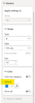
I found another issue - I am needing to be able to customize the color in a scatter chart based on selection - in the previous formatting pane, the "fx" button was available for selecting a caculation to drive the color, this is current missing in the new formatting pane for scatter charts.
- Mark as New
- Bookmark
- Subscribe
- Mute
- Subscribe to RSS Feed
- Permalink
- Report Inappropriate Content
This should be found here:
Or are you referring to something else?
- Mark as New
- Bookmark
- Subscribe
- Mute
- Subscribe to RSS Feed
- Permalink
- Report Inappropriate Content
Hi - yes, that's what I was looking for - It wasn't available for me in the formatting pane, even when I selected "Reset to default". Thanks!
- Mark as New
- Bookmark
- Subscribe
- Mute
- Subscribe to RSS Feed
- Permalink
- Report Inappropriate Content
Just want to double check, are you still seeing it missing?
- Mark as New
- Bookmark
- Subscribe
- Mute
- Subscribe to RSS Feed
- Permalink
- Report Inappropriate Content
@RosieL The bug with the text input boxes (cursor jumps around, text gets overwritten etc.) is NOT fixed in the April release as promised. When do you expect this to be resolved??
Also, in the selection pane, if you move an object further down, it is random where it places the object (and rarely in the intended place). Do you plan to fix this as well??
- Mark as New
- Bookmark
- Subscribe
- Mute
- Subscribe to RSS Feed
- Permalink
- Report Inappropriate Content
Hi, we fixed part of the cursor issue where characters would be missed if the user typed too fast, team is investigating the jumping behavior as we speak.
For selection pane, are you referring to the drag/drop not landing in correct spot? We have a bug tracking that as well. Stay tuned.
Helpful resources

Microsoft Fabric Learn Together
Covering the world! 9:00-10:30 AM Sydney, 4:00-5:30 PM CET (Paris/Berlin), 7:00-8:30 PM Mexico City

Power BI Monthly Update - April 2024
Check out the April 2024 Power BI update to learn about new features.

| User | Count |
|---|---|
| 113 | |
| 100 | |
| 78 | |
| 76 | |
| 52 |
| User | Count |
|---|---|
| 144 | |
| 109 | |
| 108 | |
| 88 | |
| 61 |


