- Power BI forums
- Updates
- News & Announcements
- Get Help with Power BI
- Desktop
- Service
- Report Server
- Power Query
- Mobile Apps
- Developer
- DAX Commands and Tips
- Custom Visuals Development Discussion
- Health and Life Sciences
- Power BI Spanish forums
- Translated Spanish Desktop
- Power Platform Integration - Better Together!
- Power Platform Integrations (Read-only)
- Power Platform and Dynamics 365 Integrations (Read-only)
- Training and Consulting
- Instructor Led Training
- Dashboard in a Day for Women, by Women
- Galleries
- Community Connections & How-To Videos
- COVID-19 Data Stories Gallery
- Themes Gallery
- Data Stories Gallery
- R Script Showcase
- Webinars and Video Gallery
- Quick Measures Gallery
- 2021 MSBizAppsSummit Gallery
- 2020 MSBizAppsSummit Gallery
- 2019 MSBizAppsSummit Gallery
- Events
- Ideas
- Custom Visuals Ideas
- Issues
- Issues
- Events
- Upcoming Events
- Community Blog
- Power BI Community Blog
- Custom Visuals Community Blog
- Community Support
- Community Accounts & Registration
- Using the Community
- Community Feedback
Register now to learn Fabric in free live sessions led by the best Microsoft experts. From Apr 16 to May 9, in English and Spanish.
- Power BI forums
- Forums
- Get Help with Power BI
- Desktop
- Re: Share your thoughts on the new format pane (pr...
- Subscribe to RSS Feed
- Mark Topic as New
- Mark Topic as Read
- Float this Topic for Current User
- Bookmark
- Subscribe
- Printer Friendly Page
- Mark as New
- Bookmark
- Subscribe
- Mute
- Subscribe to RSS Feed
- Permalink
- Report Inappropriate Content
Share your thoughts on the new format pane (preview)
Hit Reply to tell us what you think about the new format pane so we can continue to improve.
For example:
- What changes would you like to see?
- If you turned off the preview switch, why?
- Any suggestions for addititional settings or capabilities?
Thanks,
-Power BI team
To read more about the feature see the announcement in the Power BI Product Blog
- Mark as New
- Bookmark
- Subscribe
- Mute
- Subscribe to RSS Feed
- Permalink
- Report Inappropriate Content
Hi,
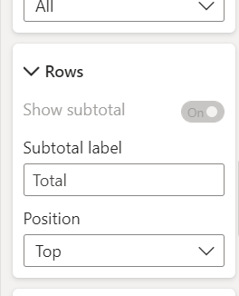
Any idea why Show Subtotals is diabled?
Also if my position of total is top it is being displayed at bottom.
Is that a bug? My work is being affected
- Mark as New
- Bookmark
- Subscribe
- Mute
- Subscribe to RSS Feed
- Permalink
- Report Inappropriate Content
The parent toggle for your subtotals should still be enabled. This nested toggle is only enabled when you choose a particular series for per row level customization, so this is by design.
If you have your have position set to top but they are showing at the bottom, that is a bug. I'll forward along to the team.
- Mark as New
- Bookmark
- Subscribe
- Mute
- Subscribe to RSS Feed
- Permalink
- Report Inappropriate Content
The new format pane makes things more complicated and requires too many clicks.
The best part of the "normal format pane" is the visual sizing - you can tab easily from x, y, width, height and click on another visual and do the same without clicking the drop down between x, y/ width height - which you now can't do in the new version. This is important when you have a lot of slicers and you need to align them perfectly.
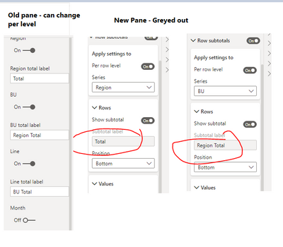
Also there is a fairly large bug regarding Row Subtotal Labels. In the new version you can't apply a label to any of the rows individually - they're greyed out. When you flip back to the normal pane it works fine.
Examples
- Mark as New
- Bookmark
- Subscribe
- Mute
- Subscribe to RSS Feed
- Permalink
- Report Inappropriate Content
far too many nested menu's and inconsistent styles.
the top selections of the Visualiations Menu doesn't really match anything else.
under Format visual, there's Visual and General sub menus. Under those further dropdown.
to be honest, it would've improved thing further by flattening everything. no sub menus, and endless scroll (no sub scroll bars), and a search option up the top. put the menu in logic order. visual type > data > filters > general stuff > visual specific.
i thought the purpose of the changes were to speed up report building. the new menu simply slows it down, and has made the product less approachable to new users. since the update, queries to my team on how to do even simply things has increase significantly.
all in all, the changes are a massive step back.
- Mark as New
- Bookmark
- Subscribe
- Mute
- Subscribe to RSS Feed
- Permalink
- Report Inappropriate Content
Completely agree, these updates seem to impede report development rather than help.
- Mark as New
- Bookmark
- Subscribe
- Mute
- Subscribe to RSS Feed
- Permalink
- Report Inappropriate Content
Missing Value alignment in new format pane for Matrix.
- Mark as New
- Bookmark
- Subscribe
- Mute
- Subscribe to RSS Feed
- Permalink
- Report Inappropriate Content
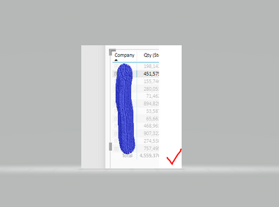
I turned it of because I couldn't customize my shape map - the below inserted option from the original customize pane is really missing or well hidden.
In general, I didn't find the customize pane very intuitive, but this is probably the same with all new designs you have get used to...
- Mark as New
- Bookmark
- Subscribe
- Mute
- Subscribe to RSS Feed
- Permalink
- Report Inappropriate Content
Thanks for reporting. We have fixed this issue for the upcoming April release.
- Mark as New
- Bookmark
- Subscribe
- Mute
- Subscribe to RSS Feed
- Permalink
- Report Inappropriate Content
Barely used it for a day but having to click two different tabs instead of being able to simply scroll down makes it more cumbersome. Not sure the rationale behind spliting them (Visual and General) and then while like all things, getting used to new items takes time, this doesnt work for me but willing to give it time. It does seem a little harder to detect which effects are on or notas the old slider seemed to be more indicative of whats on or not.
Then the pane seems to take up more space which on small screens is desperately needed
- Mark as New
- Bookmark
- Subscribe
- Mute
- Subscribe to RSS Feed
- Permalink
- Report Inappropriate Content
Not being able to custom color a shape map is a complete showstopper. If there's a way to do it, it is not at all obvious, so I had to go back to the non-preview version.
- Mark as New
- Bookmark
- Subscribe
- Mute
- Subscribe to RSS Feed
- Permalink
- Report Inappropriate Content
Thanks for reporting. We have fixed this issue for the upcoming April release.
- Mark as New
- Bookmark
- Subscribe
- Mute
- Subscribe to RSS Feed
- Permalink
- Report Inappropriate Content
Hello Team,
Sorry to say but the experience with new Format pane has been good at all for me. Its extremely confusing, the labelling of sections needs lots of re-work. Some features from prior format pane have been not adopted entirely for all visuals. For now, I have disabled the new format pane feature, its way too confusing, the earlier version was much better. I think, we over-did here. As far as I feel, this feature has unnecessarily been pushed without thorough quality check. It has been too shrinked....
- Mark as New
- Bookmark
- Subscribe
- Mute
- Subscribe to RSS Feed
- Permalink
- Report Inappropriate Content
for Shape Maps you can do longer update the colors with this view, had to turn off.
Also was confusing when modifying in the Service is still old view then Desktop is different and seems to be more clicks to get to anything
- Mark as New
- Bookmark
- Subscribe
- Mute
- Subscribe to RSS Feed
- Permalink
- Report Inappropriate Content
3 reasons why I turned it off:
- More clicks to get to settings. Simple example: Changing a position value used to require 2 steps, now it requires 3. These extra clicks add up over time.
- The mental effort of finding a setting. Is Title under the Visual tab or the General tab? I'm constantly pausing to ask myself these types of questions.
- The changes break behavior for some tiles. The HTML 3rd party tile can no longer take a field value as the CSS content. I used to be able to change the CSS content in one place and have it update all my HTML visuals. Now I have to past the changes into a text box for each visual.
I don't know what was gained by these visual changes, but I know what was lost: productivity. I'm keeping it off as long as is possible.
- Mark as New
- Bookmark
- Subscribe
- Mute
- Subscribe to RSS Feed
- Permalink
- Report Inappropriate Content
Thanks for this feedback. We're looking into the first 2. Can you elaborate on your 3rd bullet here? Can you share an example?
- Mark as New
- Bookmark
- Subscribe
- Mute
- Subscribe to RSS Feed
- Permalink
- Report Inappropriate Content
Could you and your team just not look into it and drop the feature update altogether? That would be better and save you and the users time. Just a suggestion!
- Mark as New
- Bookmark
- Subscribe
- Mute
- Subscribe to RSS Feed
- Permalink
- Report Inappropriate Content
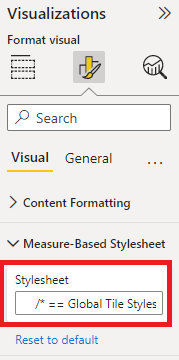
Hi, yes. I am referring to the HTML Content visual from the AppSource marketplace. Before the Feb update, this visual supported dropping a query column containing CSS text into the Stylesheet field. This was very handy, as we could change the CSS content once and all visuals using that stylesheet would automatically get the updated style changes.
After the Feb update, the Stylesheet field is now a text field, meaning the CSS text has to be pasted into the field for every visual. Below is a screen clip of the visual's setting after the Feb update (the field with the red box around it).
I was able to mitigate this problem by turning off the nav pane refresh, but the field disappears and becomes a link to an advanced controls dialog. This is a functional solution, but only as long as I'm able to disable the new nav pane. (screen clip of the setting with new nav turned off).
Let me know if you need more details.
Thanks!
- Mark as New
- Bookmark
- Subscribe
- Mute
- Subscribe to RSS Feed
- Permalink
- Report Inappropriate Content
I have the same problem with Daniel Marsh-Partick's HTML Content visual too. I've turned off the new format pane as a workaround.
I'd prefer to use the new experience but I'm concerned about its support for 3rd party visuals.
- Mark as New
- Bookmark
- Subscribe
- Mute
- Subscribe to RSS Feed
- Permalink
- Report Inappropriate Content
We have identified the problem and working on a fix! Apologies for the inconvenience.
For 3rd party visuals they should be fully supported as with the old pane, the only expected change would be the style updates not functional gaps like this one. Again, apologies for the regression here we'll get this updated ASAP.
- Mark as New
- Bookmark
- Subscribe
- Mute
- Subscribe to RSS Feed
- Permalink
- Report Inappropriate Content
Update: fix is in for the upcoming May release
- Mark as New
- Bookmark
- Subscribe
- Mute
- Subscribe to RSS Feed
- Permalink
- Report Inappropriate Content
This is too much of a UI change for experienced users.
Please dont move all our buttons around on us like this, it's wasting a lot of my time re-learning everything.
This is probably a great feature if you're just learning PowerBI but if you had all that muscle memory from years of using the old format pane, it's like starting again from scratch!
Helpful resources

Microsoft Fabric Learn Together
Covering the world! 9:00-10:30 AM Sydney, 4:00-5:30 PM CET (Paris/Berlin), 7:00-8:30 PM Mexico City

Power BI Monthly Update - April 2024
Check out the April 2024 Power BI update to learn about new features.

| User | Count |
|---|---|
| 106 | |
| 94 | |
| 75 | |
| 62 | |
| 50 |
| User | Count |
|---|---|
| 147 | |
| 106 | |
| 104 | |
| 87 | |
| 61 |


