- Power BI forums
- Updates
- News & Announcements
- Get Help with Power BI
- Desktop
- Service
- Report Server
- Power Query
- Mobile Apps
- Developer
- DAX Commands and Tips
- Custom Visuals Development Discussion
- Health and Life Sciences
- Power BI Spanish forums
- Translated Spanish Desktop
- Power Platform Integration - Better Together!
- Power Platform Integrations (Read-only)
- Power Platform and Dynamics 365 Integrations (Read-only)
- Training and Consulting
- Instructor Led Training
- Dashboard in a Day for Women, by Women
- Galleries
- Community Connections & How-To Videos
- COVID-19 Data Stories Gallery
- Themes Gallery
- Data Stories Gallery
- R Script Showcase
- Webinars and Video Gallery
- Quick Measures Gallery
- 2021 MSBizAppsSummit Gallery
- 2020 MSBizAppsSummit Gallery
- 2019 MSBizAppsSummit Gallery
- Events
- Ideas
- Custom Visuals Ideas
- Issues
- Issues
- Events
- Upcoming Events
- Community Blog
- Power BI Community Blog
- Custom Visuals Community Blog
- Community Support
- Community Accounts & Registration
- Using the Community
- Community Feedback
Register now to learn Fabric in free live sessions led by the best Microsoft experts. From Apr 16 to May 9, in English and Spanish.
- Power BI forums
- Forums
- Get Help with Power BI
- Desktop
- Re: Share your thoughts on the new format pane (pr...
- Subscribe to RSS Feed
- Mark Topic as New
- Mark Topic as Read
- Float this Topic for Current User
- Bookmark
- Subscribe
- Printer Friendly Page
- Mark as New
- Bookmark
- Subscribe
- Mute
- Subscribe to RSS Feed
- Permalink
- Report Inappropriate Content
Share your thoughts on the new format pane (preview)
Hit Reply to tell us what you think about the new format pane so we can continue to improve.
For example:
- What changes would you like to see?
- If you turned off the preview switch, why?
- Any suggestions for addititional settings or capabilities?
Thanks,
-Power BI team
To read more about the feature see the announcement in the Power BI Product Blog
- Mark as New
- Bookmark
- Subscribe
- Mute
- Subscribe to RSS Feed
- Permalink
- Report Inappropriate Content
I had to switch off the preview switch as I needed the "Show Blank values" option (Y-axis options in the old format pane - Scatter Chart). Couldn't find an alternative in the new formatting pane. Otherwise, I've really enjoyed the change. Taking me some time to find my way around, but I generally find the clicks are worth not getting lost in the scroll bars.
- Mark as New
- Bookmark
- Subscribe
- Mute
- Subscribe to RSS Feed
- Permalink
- Report Inappropriate Content
Thank you for reporting. We have brought this back for the upcoming April release.
- Mark as New
- Bookmark
- Subscribe
- Mute
- Subscribe to RSS Feed
- Permalink
- Report Inappropriate Content
Excellent news! Thank you.
- Mark as New
- Bookmark
- Subscribe
- Mute
- Subscribe to RSS Feed
- Permalink
- Report Inappropriate Content
I turned it off.
- The position settings not being expanded by default or at least not staying expanded after you expand it is going to really slow me down. That needs to be really easy to get to without so many clicks.
- In old version when expand the font dropdown you can just type a letter to bring you to that font. This is something I use a lot and a basic funtion that is not in the new format pane.
- and all the things the other users said in their feedback. Turning this off until it has been worked on some more.
- Mark as New
- Bookmark
- Subscribe
- Mute
- Subscribe to RSS Feed
- Permalink
- Report Inappropriate Content
I ended up having to turn off the preview feature in order to create my bookmarks. Too many bugs for me to make it work in preview.
- Mark as New
- Bookmark
- Subscribe
- Mute
- Subscribe to RSS Feed
- Permalink
- Report Inappropriate Content
Hi Team,
In general, I really like the new formatting pane - especially as I get used to it. However, the bugs are driving me batty.
- Titles on visuals – when typing, the cursor jumps around, removes letters, scrambles what I’ve typed. It also does not account for multiple spaces in a row – for example, if I want to format a title spread out like this for looks (spaces between the letters): "T I T L E $" It will not accept multiple spaces in a row. Multiple spaces always equals one space.
- Bookmarks do not hold. I’ve updated some bookmarks - the same exact one - multiple times and it does not hold, and it’s like it's gone – not all the time, but sometimes.
- Visuals hide and show different than when I updated the bookmark
- Measure filters do not stick
- Also, not sure if I'm doing something wrong, but when I add a measure to a table visual so I can then use it on the visual as a filter and then delete it as a column on the table - this also seems to cause a problem. Sometimes it works and sometimes it doesn't.
- Conditional formatting with icons – often doesn’t let me select value instead of percentage. I have to try to get it to take anything, save it and then go back in and fix the rules. What’s even worse is that I set some of the rules, like must be > 0 and go back in and it says >= 0. No, I don't want the zeros. This one is kind of scary because it's changing what I entered.
- Not sure if this is related, but the desktop is back to locking up and freezing on me at random times again, just like the December version. I think I just had the third incident today.
I hope this helps. I could really explain this better in person; so, if you want to talk, please let me know.
Thanks,
Shelley
- Mark as New
- Bookmark
- Subscribe
- Mute
- Subscribe to RSS Feed
- Permalink
- Report Inappropriate Content
Hi Shelley,
I replied above on your first bullet. We have a fix for April release to address the delay in cursor position causing this weird text input behavior.
For the bookmarks issue, can you give us a bit more information. Is this happening in Desktop or Service or both? Which build of desktop is causing this issue?
- Mark as New
- Bookmark
- Subscribe
- Mute
- Subscribe to RSS Feed
- Permalink
- Report Inappropriate Content
@RosieL It was in the desktop. It looks like my desktop updated to the March version, so it would've been the version before. I haven't tried it with this March version. I was creating this pretty cool tool, using bookmarks and was getting so frustrated, I turned off the preview feature and was finally able to get everything to work. I was adding a measure to a table visual, filtering on the measure on the visual, and then removing the measure from the visual (I didn't want to show the measure, but wanted to filter on it), and bookmarking this filtering scenario. Sometimes it would work and sometimes it wouldn't. It was one table, but using different measures to filter it for different bookmarks. Perhaps it worked when I filtered it the first time by one measure and then when I tried to add another measure to the same table and filter on it, then the bookmark would "forget" the new filter? I don't know the exact scenario as I was setting up and testing only to find out at didn't work - and trying it over and over again. I was using "flag" measures - to indicate if an account was participating in certain parts of the business, and then creating bookmarks, so users could click on a button and see all "A" customers, click on a different button and see all "B" customers, and so on.
- Mark as New
- Bookmark
- Subscribe
- Mute
- Subscribe to RSS Feed
- Permalink
- Report Inappropriate Content
Thanks for these details, looks like we'll need the pbix to debug. Can you submit a support ticket through https://powerbi.microsoft.com/support/ so our engineering team will can follow up accordingly?
- Mark as New
- Bookmark
- Subscribe
- Mute
- Subscribe to RSS Feed
- Permalink
- Report Inappropriate Content
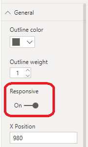
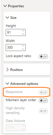
I turn off "Responsive" on all date slicers. This option was missing in November and greyed out in December and February updates.
- Mark as New
- Bookmark
- Subscribe
- Mute
- Subscribe to RSS Feed
- Permalink
- Report Inappropriate Content
Regarding matrix outline options, it is nice to see them back but it would be good if we could have some consistency between matrix and table as I often show a combination of the two on my reports and it is impossible to make them look similar. On the left is a table which has an outline option for totals at the bottom. The same option is not there for matrix on the right so looks inconsistent when the two are next to one another on a page.
- Mark as New
- Bookmark
- Subscribe
- Mute
- Subscribe to RSS Feed
- Permalink
- Report Inappropriate Content
I agree with all the responses regarding far too many clicks.
The separation between visual options and general is also confusing and unneccessary - who knows what is hiding under which panel i.e. background color under General/Effects/Background takes some discovery, especially when fill is somewhere else completely.
At the least, we need an option to keep the expandos expanded (not an expand all but instead a remember all option) and much better would be to add keyboard shortcuts to all navigation options to quickly move between them.
Also, I should not have to click "on" to access and enable an option in a panel - clicking the option I want should automatically turn the panel to "on" where I can then turn it off if I change my mind.
- Mark as New
- Bookmark
- Subscribe
- Mute
- Subscribe to RSS Feed
- Permalink
- Report Inappropriate Content
It would be nice to have them in a format similar to the Adobe tools that allow for customization or choice on whether there are icons for tool choices, expanded and remembering what level the tool is expanded based on the workspace settings, rather than report depended tool settings.
- Mark as New
- Bookmark
- Subscribe
- Mute
- Subscribe to RSS Feed
- Permalink
- Report Inappropriate Content
Every time I select a different object (visual, shape) the entire pane collapses, so to adjust button position I need to every time expand the position menu which takes a couple of clicks. The entire process takes 5x longer because of this, it's unusable.
- Mark as New
- Bookmark
- Subscribe
- Mute
- Subscribe to RSS Feed
- Permalink
- Report Inappropriate Content
Hi Microsoft,
The formula button (fx) is missing from the page navigation of the Action pane of a Button:
- Mark as New
- Bookmark
- Subscribe
- Mute
- Subscribe to RSS Feed
- Permalink
- Report Inappropriate Content
This has been fixed and ported for the February release, please ensure you have the latest update.
- Mark as New
- Bookmark
- Subscribe
- Mute
- Subscribe to RSS Feed
- Permalink
- Report Inappropriate Content
It took a few days to get used to, and knowing where everything is, but happy with the changes, especially the single scroll bar. Love for it to be wider, but I guess space is at a premium.
But have just noticed the Multi-Row Card Chart, is missing the 'Display Units' and 'Decimal places'. Both are available for the Single Card Chart. Can live without Decimals, as is available in Column Tools, but Display Units would be great. Or add 'Display Units' to Column/Measure Tools.
Thanks..
- Mark as New
- Bookmark
- Subscribe
- Mute
- Subscribe to RSS Feed
- Permalink
- Report Inappropriate Content
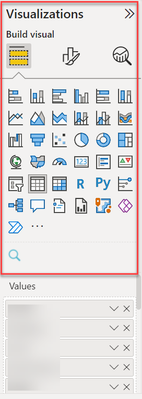
I was really excited for some of these changes (very tired of scrolling for miles to change the title of visuals) but it's made it even harder to work on a laptop or any kind of smaller screen. The viz panel is now WAY too taken over by the navigation and chart select options! All my working area with fields is reduced to a teeny tiny scrolling window!
I like the changes to the formatting pane but there is still a TON of wasted white space. It's a complicated program that is never going to have a ~pretty~ UI so please just make it functional and easier to use.
- Mark as New
- Bookmark
- Subscribe
- Mute
- Subscribe to RSS Feed
- Permalink
- Report Inappropriate Content
Is MS getting paid per click now? this new format pane is too many clicks. It took 4 clicks to just change the x and y position before it was just 2. The new organization of the options is kinda nice, but find a way to do it without a million clicks. I found my self almost doubling the time it took to fine tune the final layout of a dashbaord.
I finally realized I could turn off the new format pane and stop taking asprin for the headache it was causing.
- Mark as New
- Bookmark
- Subscribe
- Mute
- Subscribe to RSS Feed
- Permalink
- Report Inappropriate Content
Thank you for this feedback. Have you been using the context menu to quickly expand all the categories? Would adding an option to persistent this expansion always, address your concern on the added clicks?
- Mark as New
- Bookmark
- Subscribe
- Mute
- Subscribe to RSS Feed
- Permalink
- Report Inappropriate Content
Please give us the option to have the new pane disabled. Many of us do not find the new format pane to be effective.
Helpful resources

Microsoft Fabric Learn Together
Covering the world! 9:00-10:30 AM Sydney, 4:00-5:30 PM CET (Paris/Berlin), 7:00-8:30 PM Mexico City

Power BI Monthly Update - April 2024
Check out the April 2024 Power BI update to learn about new features.

| User | Count |
|---|---|
| 107 | |
| 96 | |
| 77 | |
| 66 | |
| 53 |
| User | Count |
|---|---|
| 144 | |
| 104 | |
| 100 | |
| 86 | |
| 64 |


