- Power BI forums
- Updates
- News & Announcements
- Get Help with Power BI
- Desktop
- Service
- Report Server
- Power Query
- Mobile Apps
- Developer
- DAX Commands and Tips
- Custom Visuals Development Discussion
- Health and Life Sciences
- Power BI Spanish forums
- Translated Spanish Desktop
- Power Platform Integration - Better Together!
- Power Platform Integrations (Read-only)
- Power Platform and Dynamics 365 Integrations (Read-only)
- Training and Consulting
- Instructor Led Training
- Dashboard in a Day for Women, by Women
- Galleries
- Community Connections & How-To Videos
- COVID-19 Data Stories Gallery
- Themes Gallery
- Data Stories Gallery
- R Script Showcase
- Webinars and Video Gallery
- Quick Measures Gallery
- 2021 MSBizAppsSummit Gallery
- 2020 MSBizAppsSummit Gallery
- 2019 MSBizAppsSummit Gallery
- Events
- Ideas
- Custom Visuals Ideas
- Issues
- Issues
- Events
- Upcoming Events
- Community Blog
- Power BI Community Blog
- Custom Visuals Community Blog
- Community Support
- Community Accounts & Registration
- Using the Community
- Community Feedback
Register now to learn Fabric in free live sessions led by the best Microsoft experts. From Apr 16 to May 9, in English and Spanish.
- Power BI forums
- Forums
- Get Help with Power BI
- Desktop
- Shapemap show places on map
- Subscribe to RSS Feed
- Mark Topic as New
- Mark Topic as Read
- Float this Topic for Current User
- Bookmark
- Subscribe
- Printer Friendly Page
- Mark as New
- Bookmark
- Subscribe
- Mute
- Subscribe to RSS Feed
- Permalink
- Report Inappropriate Content
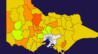
Shapemap show places on map
Hi PBI community members,
I am using a shapemap visualisation as a choropleth map. I am interested to know if it is possible to have the place names showing on the map? Currently, to see the place a user either has to use a slicer, or hover over the map to bring up a tool tip. I though users might appreciate if the place names were shown on the choropleth map.
Suggestions welcome!
Cheers,
Brent
Solved! Go to Solution.
- Mark as New
- Bookmark
- Subscribe
- Mute
- Subscribe to RSS Feed
- Permalink
- Report Inappropriate Content
Hi Brent,
Yeah could be worth trying out the bubble, filled, or bing map visuals to see if any of those meet the requirements. Lastly, the ArcGis visual is very customizable so this one might be a good option as well, though this visual does require a licence to function completely.
Regards,
Tim
P.s.: thanks for the compliment!
Did I answer your question? Mark my post as a solution!
Proud to be a Super User!
- Mark as New
- Bookmark
- Subscribe
- Mute
- Subscribe to RSS Feed
- Permalink
- Report Inappropriate Content
Hi Brent,
Trhough tooltips it is currently possible. You can find an example here, hovering over the province will provide the name and location (COVID-19 – Tim Gitsels). However, showing fixed labels in a shape map is currently not available.
There is an idea for it though so voting for it might move it up the ladder: Microsoft Idea · Shape Map (powerbi.com).
Regards,
Tim
Did I answer your question? Mark my post as a solution!
Proud to be a Super User!
- Mark as New
- Bookmark
- Subscribe
- Mute
- Subscribe to RSS Feed
- Permalink
- Report Inappropriate Content
Thanks @timg for the reply.
I thought this was the case. I might try exploring the other map options available in PBI, though I think I've looked at the available options and they all have their limitations.
I really like your PBI Covid-19 mapping report. Nice job.
Cheers,
Brent
- Mark as New
- Bookmark
- Subscribe
- Mute
- Subscribe to RSS Feed
- Permalink
- Report Inappropriate Content
Hi Brent,
Yeah could be worth trying out the bubble, filled, or bing map visuals to see if any of those meet the requirements. Lastly, the ArcGis visual is very customizable so this one might be a good option as well, though this visual does require a licence to function completely.
Regards,
Tim
P.s.: thanks for the compliment!
Did I answer your question? Mark my post as a solution!
Proud to be a Super User!
Helpful resources

Microsoft Fabric Learn Together
Covering the world! 9:00-10:30 AM Sydney, 4:00-5:30 PM CET (Paris/Berlin), 7:00-8:30 PM Mexico City

Power BI Monthly Update - April 2024
Check out the April 2024 Power BI update to learn about new features.

| User | Count |
|---|---|
| 109 | |
| 98 | |
| 77 | |
| 66 | |
| 54 |
| User | Count |
|---|---|
| 144 | |
| 104 | |
| 101 | |
| 86 | |
| 64 |

