- Power BI forums
- Updates
- News & Announcements
- Get Help with Power BI
- Desktop
- Service
- Report Server
- Power Query
- Mobile Apps
- Developer
- DAX Commands and Tips
- Custom Visuals Development Discussion
- Health and Life Sciences
- Power BI Spanish forums
- Translated Spanish Desktop
- Power Platform Integration - Better Together!
- Power Platform Integrations (Read-only)
- Power Platform and Dynamics 365 Integrations (Read-only)
- Training and Consulting
- Instructor Led Training
- Dashboard in a Day for Women, by Women
- Galleries
- Community Connections & How-To Videos
- COVID-19 Data Stories Gallery
- Themes Gallery
- Data Stories Gallery
- R Script Showcase
- Webinars and Video Gallery
- Quick Measures Gallery
- 2021 MSBizAppsSummit Gallery
- 2020 MSBizAppsSummit Gallery
- 2019 MSBizAppsSummit Gallery
- Events
- Ideas
- Custom Visuals Ideas
- Issues
- Issues
- Events
- Upcoming Events
- Community Blog
- Power BI Community Blog
- Custom Visuals Community Blog
- Community Support
- Community Accounts & Registration
- Using the Community
- Community Feedback
Register now to learn Fabric in free live sessions led by the best Microsoft experts. From Apr 16 to May 9, in English and Spanish.
- Power BI forums
- Forums
- Get Help with Power BI
- Desktop
- Re: Several Values for Stacked Column Chart
- Subscribe to RSS Feed
- Mark Topic as New
- Mark Topic as Read
- Float this Topic for Current User
- Bookmark
- Subscribe
- Printer Friendly Page
- Mark as New
- Bookmark
- Subscribe
- Mute
- Subscribe to RSS Feed
- Permalink
- Report Inappropriate Content
Several Values for Stacked Column Chart
Hello everyone,
I have this dataset:
| Dimension | Column1 | Column2 | Column3 | Column4 |
| row1 | 22 | 32 | 77 | Extern |
| row2 | 11 | 43 | 68 | Extern |
| row3 | 44 | 54 | 87 | Extern |
| row4 | 33 | 65 | 98 | Intern |
| row5 | 55 | 76 | 89 | Intern |
| row6 | 66 | 78 | 87 | Intern |
And I need to represent a chart where divides each column (column1, column2 and column3) by Extern or Intern (it's going to be the Legend taken from column4) and it is possible to do it with the Stacked Column Chart, but the difference here is that I have several rows for Axis Field and several columns for Values Field... and this chart looks like only accepts one single column in the Values Field because it doesn't allow to put more than one...
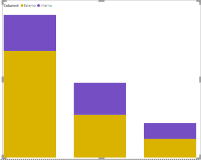
Please, anyone could help me to show the values of column1, column2 and column3 divided by the legend (Extern and Intern). This is what I would like to get:
Thank you so much, I will appreciate your help.
Have a nice day.
Ana M.
Solved! Go to Solution.
- Mark as New
- Bookmark
- Subscribe
- Mute
- Subscribe to RSS Feed
- Permalink
- Report Inappropriate Content
Hi @Anonymous ,
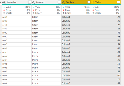
For achieving this you need to unpivot the values columns. On the query editor select the column 1,2 ,3 and then unpivot:
It will give you the result below:
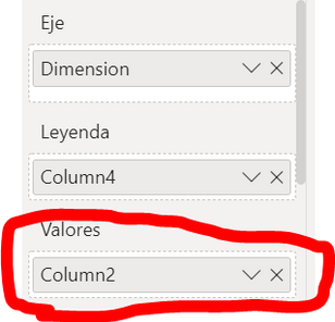
Rename the columns has you wish and do your chart using the following setup:
Regards
Miguel Félix
Did I answer your question? Mark my post as a solution!
Proud to be a Super User!
Check out my blog: Power BI em Português- Mark as New
- Bookmark
- Subscribe
- Mute
- Subscribe to RSS Feed
- Permalink
- Report Inappropriate Content
Thank you so much both of you! @MFelix I used your method and it worked very well, thanks a lot! 🙂
- Mark as New
- Bookmark
- Subscribe
- Mute
- Subscribe to RSS Feed
- Permalink
- Report Inappropriate Content
@Anonymous , You can either have a legend or multiple measures/values
There is a custom visual if that can work
https://www.defteam.com/stacked-clustered-bar-chart/
https://appsource.microsoft.com/en-us/product/power-bi-visuals/wa200001934?tab=overview
Microsoft Power BI Learning Resources, 2023 !!
Learn Power BI - Full Course with Dec-2022, with Window, Index, Offset, 100+ Topics !!
Did I answer your question? Mark my post as a solution! Appreciate your Kudos !! Proud to be a Super User! !!
Helpful resources

Microsoft Fabric Learn Together
Covering the world! 9:00-10:30 AM Sydney, 4:00-5:30 PM CET (Paris/Berlin), 7:00-8:30 PM Mexico City

Power BI Monthly Update - April 2024
Check out the April 2024 Power BI update to learn about new features.

| User | Count |
|---|---|
| 109 | |
| 99 | |
| 77 | |
| 66 | |
| 54 |
| User | Count |
|---|---|
| 144 | |
| 104 | |
| 102 | |
| 87 | |
| 64 |


