- Power BI forums
- Updates
- News & Announcements
- Get Help with Power BI
- Desktop
- Service
- Report Server
- Power Query
- Mobile Apps
- Developer
- DAX Commands and Tips
- Custom Visuals Development Discussion
- Health and Life Sciences
- Power BI Spanish forums
- Translated Spanish Desktop
- Power Platform Integration - Better Together!
- Power Platform Integrations (Read-only)
- Power Platform and Dynamics 365 Integrations (Read-only)
- Training and Consulting
- Instructor Led Training
- Dashboard in a Day for Women, by Women
- Galleries
- Community Connections & How-To Videos
- COVID-19 Data Stories Gallery
- Themes Gallery
- Data Stories Gallery
- R Script Showcase
- Webinars and Video Gallery
- Quick Measures Gallery
- 2021 MSBizAppsSummit Gallery
- 2020 MSBizAppsSummit Gallery
- 2019 MSBizAppsSummit Gallery
- Events
- Ideas
- Custom Visuals Ideas
- Issues
- Issues
- Events
- Upcoming Events
- Community Blog
- Power BI Community Blog
- Custom Visuals Community Blog
- Community Support
- Community Accounts & Registration
- Using the Community
- Community Feedback
Register now to learn Fabric in free live sessions led by the best Microsoft experts. From Apr 16 to May 9, in English and Spanish.
- Power BI forums
- Forums
- Get Help with Power BI
- Desktop
- Set line colors for top N line chart
- Subscribe to RSS Feed
- Mark Topic as New
- Mark Topic as Read
- Float this Topic for Current User
- Bookmark
- Subscribe
- Printer Friendly Page
- Mark as New
- Bookmark
- Subscribe
- Mute
- Subscribe to RSS Feed
- Permalink
- Report Inappropriate Content
Set line colors for top N line chart
I have a fairly simple line chart which uses a Top N (top 5) filter. No matter what the 5 top items are, I need to display the same 5 theme colors. This is easy to do with a bar chart using RANKX measure and conditional formatting, but the conditional formatting option isn't available for line charts. There must be a workaround for this, but I can't find anything. Does anyone here have the answer?
- Mark as New
- Bookmark
- Subscribe
- Mute
- Subscribe to RSS Feed
- Permalink
- Report Inappropriate Content
Hi @Anonymous ,
Currently , it is not supported to set conditional formatting for line chart in Power BI . There is an idea about this issue, please vote it up, Formatting, Annotating, and Highlighting Line Charts , add your comments there to improve Power BI and make this feature coming sooner.
While there is a workaround you may considerate. as amitchandak's suggestion, you may create a Clustered column chart, set conditional formatting in Data color section , format by "Field value" . Then convert the bar visual to line chart. For reference: https://www.youtube.com/watch?v=A4iG8S4EpHs .
Best Regards,
Amy
Community Support Team _ Amy
If this post helps, then please consider Accept it as the solution to help the other members find it more quickly.
- Mark as New
- Bookmark
- Subscribe
- Mute
- Subscribe to RSS Feed
- Permalink
- Report Inappropriate Content
@v-xicai This approach doesn't quite seem to work - possibly because I need each line to be a different color, rather than the data points on a single line to be different colors?
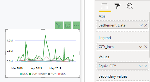
This is my original line chart
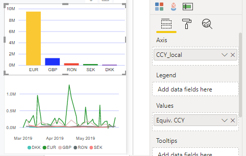
So I need the 5 colors chosen in the legend at the bottom to always be the same, and I have a RANKX function which I could use to conditinally format them as I did with this bar chart:
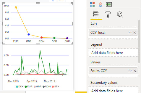
But when I turn that bar chart into a line chart, it starts like this:
And once I change my legend, axis, and values back to match the original line chart (shown on the bottom), then the colors revert back and it's the same thing I started with.
Can you think of any other way this might be accomplished?
Thanks!
- Mark as New
- Bookmark
- Subscribe
- Mute
- Subscribe to RSS Feed
- Permalink
- Report Inappropriate Content
@Anonymous , You can format the Marker. Have a bar visual first, set the conditional formatting there. Change it to the line visual. Maker will have color formatting
Microsoft Power BI Learning Resources, 2023 !!
Learn Power BI - Full Course with Dec-2022, with Window, Index, Offset, 100+ Topics !!
Did I answer your question? Mark my post as a solution! Appreciate your Kudos !! Proud to be a Super User! !!
- Mark as New
- Bookmark
- Subscribe
- Mute
- Subscribe to RSS Feed
- Permalink
- Report Inappropriate Content
@Anonymous not sure if there is a way since conditional formatting is not available for the line chart.
I would ❤ Kudos if my solution helped. 👉 If you can spend time posting the question, you can also make efforts to give Kudos whoever helped to solve your problem. It is a token of appreciation!
⚡Visit us at https://perytus.com, your one-stop shop for Power BI related projects/training/consultancy.⚡
Subscribe to the @PowerBIHowTo YT channel for an upcoming video on List and Record functions in Power Query!!
Learn Power BI and Fabric - subscribe to our YT channel - Click here: @PowerBIHowTo
If my solution proved useful, I'd be delighted to receive Kudos. When you put effort into asking a question, it's equally thoughtful to acknowledge and give Kudos to the individual who helped you solve the problem. It's a small gesture that shows appreciation and encouragement! ❤
Did I answer your question? Mark my post as a solution. Proud to be a Super User! Appreciate your Kudos 🙂
Feel free to email me with any of your BI needs.
Helpful resources

Microsoft Fabric Learn Together
Covering the world! 9:00-10:30 AM Sydney, 4:00-5:30 PM CET (Paris/Berlin), 7:00-8:30 PM Mexico City

Power BI Monthly Update - April 2024
Check out the April 2024 Power BI update to learn about new features.

| User | Count |
|---|---|
| 117 | |
| 107 | |
| 70 | |
| 70 | |
| 43 |
| User | Count |
|---|---|
| 148 | |
| 106 | |
| 104 | |
| 89 | |
| 65 |


