- Power BI forums
- Updates
- News & Announcements
- Get Help with Power BI
- Desktop
- Service
- Report Server
- Power Query
- Mobile Apps
- Developer
- DAX Commands and Tips
- Custom Visuals Development Discussion
- Health and Life Sciences
- Power BI Spanish forums
- Translated Spanish Desktop
- Power Platform Integration - Better Together!
- Power Platform Integrations (Read-only)
- Power Platform and Dynamics 365 Integrations (Read-only)
- Training and Consulting
- Instructor Led Training
- Dashboard in a Day for Women, by Women
- Galleries
- Community Connections & How-To Videos
- COVID-19 Data Stories Gallery
- Themes Gallery
- Data Stories Gallery
- R Script Showcase
- Webinars and Video Gallery
- Quick Measures Gallery
- 2021 MSBizAppsSummit Gallery
- 2020 MSBizAppsSummit Gallery
- 2019 MSBizAppsSummit Gallery
- Events
- Ideas
- Custom Visuals Ideas
- Issues
- Issues
- Events
- Upcoming Events
- Community Blog
- Power BI Community Blog
- Custom Visuals Community Blog
- Community Support
- Community Accounts & Registration
- Using the Community
- Community Feedback
Register now to learn Fabric in free live sessions led by the best Microsoft experts. From Apr 16 to May 9, in English and Spanish.
- Power BI forums
- Forums
- Get Help with Power BI
- Desktop
- Separate Series On Chart With Different Year
- Subscribe to RSS Feed
- Mark Topic as New
- Mark Topic as Read
- Float this Topic for Current User
- Bookmark
- Subscribe
- Printer Friendly Page
- Mark as New
- Bookmark
- Subscribe
- Mute
- Subscribe to RSS Feed
- Permalink
- Report Inappropriate Content
Separate Series On Chart With Different Year
I have a table called FactRawData. It is being filtered by the following slicers:
The following chart, shows the values from factrawdata, for 2018.
I would like to add a second series on this graph, that is the data from the same table, for the selected year in the "Baseline year" slicer, however I can't seem to get the data to show on the graph.
Below is my custom measure.
I have a feeling I need to use ALL, since the slicers forthe first series would be affecting this measure...but I am not sure I am doing it right, since that data does not appear on my graph.
Solved! Go to Solution.
- Mark as New
- Bookmark
- Subscribe
- Mute
- Subscribe to RSS Feed
- Permalink
- Report Inappropriate Content
Hi @MCassady
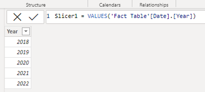
Please try to create slicer using two separate tables.
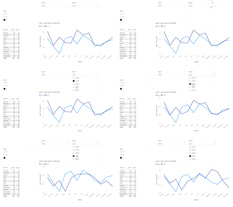
Then create measures for the line chart, one line one measure.
year1 =
CALCULATE (
    SUM ( 'Fact Table'[values] ),
    FILTER (
        ALLSELECTED ( 'Fact Table'[Date].[Year] ),
        [Date].[Year] = MAX ( 'Slicer1'[Year] )
    )
)

year2 =
CALCULATE (
    SUM ( 'Fact Table'[values] ),
    FILTER (
        ALLSELECTED ( 'Fact Table'[Date].[Year] ),
        [Date].[Year] = MAX ( 'Slicer2'[Year] )
    )
)
Result:
Pbix in the end you can refer.
Best Regards
Community Support Team _ chenwu zhu
If this post helps, then please consider Accept it as the solution to help the other members find it more quickly.
- Mark as New
- Bookmark
- Subscribe
- Mute
- Subscribe to RSS Feed
- Permalink
- Report Inappropriate Content
Hi @MCassady , hope you are having a great day. Reason is that Power BI is confused on what you are trying to do having those 2 slicers (Year and Baseline Year). My suggestion is to have a month & year column on your date table and place it on your visuals to have the "series" kind of effect. 😉
How to Create a Month Year Column in Calendar
Helpful resources

Microsoft Fabric Learn Together
Covering the world! 9:00-10:30 AM Sydney, 4:00-5:30 PM CET (Paris/Berlin), 7:00-8:30 PM Mexico City

Power BI Monthly Update - April 2024
Check out the April 2024 Power BI update to learn about new features.

| User | Count |
|---|---|
| 117 | |
| 105 | |
| 69 | |
| 67 | |
| 43 |
| User | Count |
|---|---|
| 148 | |
| 103 | |
| 103 | |
| 88 | |
| 66 |


