- Power BI forums
- Updates
- News & Announcements
- Get Help with Power BI
- Desktop
- Service
- Report Server
- Power Query
- Mobile Apps
- Developer
- DAX Commands and Tips
- Custom Visuals Development Discussion
- Health and Life Sciences
- Power BI Spanish forums
- Translated Spanish Desktop
- Power Platform Integration - Better Together!
- Power Platform Integrations (Read-only)
- Power Platform and Dynamics 365 Integrations (Read-only)
- Training and Consulting
- Instructor Led Training
- Dashboard in a Day for Women, by Women
- Galleries
- Community Connections & How-To Videos
- COVID-19 Data Stories Gallery
- Themes Gallery
- Data Stories Gallery
- R Script Showcase
- Webinars and Video Gallery
- Quick Measures Gallery
- 2021 MSBizAppsSummit Gallery
- 2020 MSBizAppsSummit Gallery
- 2019 MSBizAppsSummit Gallery
- Events
- Ideas
- Custom Visuals Ideas
- Issues
- Issues
- Events
- Upcoming Events
- Community Blog
- Power BI Community Blog
- Custom Visuals Community Blog
- Community Support
- Community Accounts & Registration
- Using the Community
- Community Feedback
Register now to learn Fabric in free live sessions led by the best Microsoft experts. From Apr 16 to May 9, in English and Spanish.
- Power BI forums
- Forums
- Get Help with Power BI
- Desktop
- Re: Select series to show in a graph from slicer
- Subscribe to RSS Feed
- Mark Topic as New
- Mark Topic as Read
- Float this Topic for Current User
- Bookmark
- Subscribe
- Printer Friendly Page
- Mark as New
- Bookmark
- Subscribe
- Mute
- Subscribe to RSS Feed
- Permalink
- Report Inappropriate Content
Select series to show in a graph from slicer
Hi community, today i used the method to show series that i found in another post
Line chart slicer
The problem is that i need to show 2 o more series and this method only works with 1 measure ![]()
Content inside link:
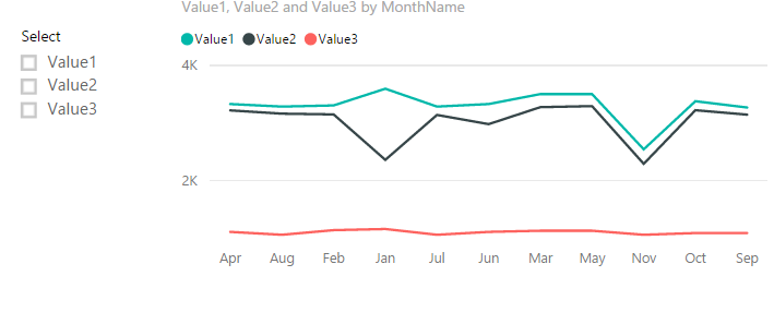
If I understanding correctly, the line chart displays three lines by default without any selection, and if you select a specific value from slicer, this chart should be automatically updated with only the line based on selection.
Below is my test, please review it.
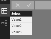
Create an extra table which includes one column to list the available selections in slicer.
Create three measures that will be added into "Value" field of the LineChart. You should change the column name ('total per row[expected]', 'total per row[atual]', 'total per row[Amount]') according to your own scenario.
Value1 =
IF (
    LASTNONBLANK ( 'Select'[Select], 1 ) = "Value1",
    LASTNONBLANK ( 'total per row'[expected], 1 ),
    IF (
        ISFILTERED ( 'Select'[Select] ) = FALSE (),
        LASTNONBLANK ( 'total per row'[expected], 1 ),
        BLANK ()
    )
)

Value2 =
IF (
    LASTNONBLANK ( 'Select'[Select], 1 ) = "Value2",
    LASTNONBLANK ( 'total per row'[atual], 1 ),
    IF (
        ISFILTERED ( 'Select'[Select] ) = FALSE (),
        LASTNONBLANK ( 'total per row'[atual], 1 ),
        BLANK ()
    )
)

Value3 =
IF (
    LASTNONBLANK ( 'Select'[Select], 1 ) = "Value3",
    LASTNONBLANK ( 'total per row'[Amount], 1 ),
    IF (
        ISFILTERED ( 'Select'[Select] ) = FALSE (),
        LASTNONBLANK ( 'total per row'[Amount], 1 ),
        BLANK ()
    )
)
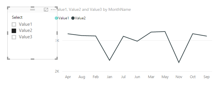
I can get the expect line if I select "Value2".
My case:
I have a table with products (and other things like product categorization) and several fields such as stock, purchasedAmount, quantity already manufactured, etc.
What I should achieve is something similar to the previous case: to use a table to filter that fields easily and show that in a graph so the user can easily compare all, 2 or more categories.
Thanks from Argentina, have a nice day!
/Marcos
- Mark as New
- Bookmark
- Subscribe
- Mute
- Subscribe to RSS Feed
- Permalink
- Report Inappropriate Content
Hi Marcos,
Maybe your scenario is different. Since you have the category filed, you can add it in the legend and in a slicer. Finally, you can select multi-values to compare. Please refer to the snapshot below.
Best Regards,
Dale
If this post helps, then please consider Accept it as the solution to help the other members find it more quickly.
- Mark as New
- Bookmark
- Subscribe
- Mute
- Subscribe to RSS Feed
- Permalink
- Report Inappropriate Content
The thing is how i have the information:
- Product
- Several fields to classify, like Brand, Season, Gender, etc.
- Stock
- Q already manufactured
- Q invoiced
- Q orders
So, I need a graph that has the products or some of the aforementioned classifications on the X axis and, in the legend, the numeric fields (Stock and Q's), but the way that you propose me isn't what i'm looking for.
Filter the series from legend does not help me either, I need to filter those series form a slicer (customer things ![]() )
)
For that same reason I quoted that post
- Mark as New
- Bookmark
- Subscribe
- Mute
- Subscribe to RSS Feed
- Permalink
- Report Inappropriate Content
Hi @marcoslopez,
Can you share a dummy sample or the file? Please mask the sensitive parts first.
Best Regards,
Dale
If this post helps, then please consider Accept it as the solution to help the other members find it more quickly.
- Mark as New
- Bookmark
- Subscribe
- Mute
- Subscribe to RSS Feed
- Permalink
- Report Inappropriate Content
Hi @v-jiascu-msft, apologize for the delay
Here I leave you a link to my google drive:
Forecast
Thank you in advance!
- Mark as New
- Bookmark
- Subscribe
- Mute
- Subscribe to RSS Feed
- Permalink
- Report Inappropriate Content
Hi @marcoslopez,
Is this what you'd like? Comparing many categories?
Best Regards,
Dale
If this post helps, then please consider Accept it as the solution to help the other members find it more quickly.
- Mark as New
- Bookmark
- Subscribe
- Mute
- Subscribe to RSS Feed
- Permalink
- Report Inappropriate Content
@v-jiascu-msft wrote:Hi @marcoslopez,
Is this what you'd like? Comparing many categories?
Best Regards,
Dale
Not exactly, what i need is compare Stock, puchased amount, invoiced amount, etc.
- Mark as New
- Bookmark
- Subscribe
- Mute
- Subscribe to RSS Feed
- Permalink
- Report Inappropriate Content
Hi @marcoslopez,
Please check out the demo in the attachment.
One solution is unpivoting these three columns. One NOTE, other columns could have duplicates. So maybe you can unpivot all the columns with numbers. Finally, you can add the Attribute column in the legend field.
Best Regards,
Dale
If this post helps, then please consider Accept it as the solution to help the other members find it more quickly.
- Mark as New
- Bookmark
- Subscribe
- Mute
- Subscribe to RSS Feed
- Permalink
- Report Inappropriate Content
Hi @v-jiascu-msft, think that i have almost 10 columns. That's why i suggested to use a measure.
Does exist some way to do this with measure like i said before?
Best regards, Marcos.
- Mark as New
- Bookmark
- Subscribe
- Mute
- Subscribe to RSS Feed
- Permalink
- Report Inappropriate Content
Hi @v-jiascu-msft, apologize for the delay
Here I leave you a link to my google drive:
Forecast
Thank you in advance!
Helpful resources

Microsoft Fabric Learn Together
Covering the world! 9:00-10:30 AM Sydney, 4:00-5:30 PM CET (Paris/Berlin), 7:00-8:30 PM Mexico City

Power BI Monthly Update - April 2024
Check out the April 2024 Power BI update to learn about new features.

| User | Count |
|---|---|
| 109 | |
| 98 | |
| 77 | |
| 66 | |
| 54 |
| User | Count |
|---|---|
| 144 | |
| 104 | |
| 100 | |
| 86 | |
| 64 |


