- Power BI forums
- Updates
- News & Announcements
- Get Help with Power BI
- Desktop
- Service
- Report Server
- Power Query
- Mobile Apps
- Developer
- DAX Commands and Tips
- Custom Visuals Development Discussion
- Health and Life Sciences
- Power BI Spanish forums
- Translated Spanish Desktop
- Power Platform Integration - Better Together!
- Power Platform Integrations (Read-only)
- Power Platform and Dynamics 365 Integrations (Read-only)
- Training and Consulting
- Instructor Led Training
- Dashboard in a Day for Women, by Women
- Galleries
- Community Connections & How-To Videos
- COVID-19 Data Stories Gallery
- Themes Gallery
- Data Stories Gallery
- R Script Showcase
- Webinars and Video Gallery
- Quick Measures Gallery
- 2021 MSBizAppsSummit Gallery
- 2020 MSBizAppsSummit Gallery
- 2019 MSBizAppsSummit Gallery
- Events
- Ideas
- Custom Visuals Ideas
- Issues
- Issues
- Events
- Upcoming Events
- Community Blog
- Power BI Community Blog
- Custom Visuals Community Blog
- Community Support
- Community Accounts & Registration
- Using the Community
- Community Feedback
Register now to learn Fabric in free live sessions led by the best Microsoft experts. From Apr 16 to May 9, in English and Spanish.
- Power BI forums
- Forums
- Get Help with Power BI
- Desktop
- Re: Select "Groups" of Measures in a Slicer
- Subscribe to RSS Feed
- Mark Topic as New
- Mark Topic as Read
- Float this Topic for Current User
- Bookmark
- Subscribe
- Printer Friendly Page
- Mark as New
- Bookmark
- Subscribe
- Mute
- Subscribe to RSS Feed
- Permalink
- Report Inappropriate Content
Select "Groups" of Measures in a Slicer
Hi,
I have data in a format similar to below:
| Unique ID | Current Status | Status 1 Start | Status 2 Start | Status 3 Start | Status 3 Finish | Status 1 Time | Status 2 Time | Status 3 Time |
| AA | 1 | 3-Mar-20 | ||||||
| AB | 2 | 11-Mar-20 | 16-Mar-20 | 5.00 | ||||
| AC | 2 | 11-Mar-20 | 18-Mar-20 | 7.00 | ||||
| AD | 2 | 4-Mar-20 | 10-Mar-20 | 6.00 | ||||
| AE | 2 | 4-Mar-20 | 11-Mar-20 | 7.00 | ||||
| AF | 3 | 2-Mar-20 | 9-Mar-20 | 16-Mar-20 | 7.00 | 7.00 | ||
| AG | 3 | 1-Mar-20 | 14-Mar-20 | 20-Mar-20 | 13.00 | 6.00 | ||
| AH | 4 | 20-Feb-20 | 1-Mar-20 | 9-Mar-20 | 20-Mar-20 | 10.00 | 8.00 | 11.00 |
The relevant info from this is the average amount of time spent per unique ID per status over a time period, and also the max time spent per unique ID per status, and I am trying to display the metric for each status at the same time, but also have the ability to toggle between the two measures.
Is there a way I can create a measure for the average of each status (so a "Avg_1, Avg_2, Avg_3, Max_1, Max_2, Max_3") and group them together in a way that I can create a slicer where I can select "Average" and it would update all of my charts to show the average measures, and if I select "Max", it would do the same for the max measures.
For example, if I had a card for status 1, status 2 and status 3:
If I selected "Average":
Status 1: 7.85
Status 2: 7.00
Status 3: 11.00
If I selected "Max":
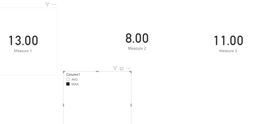
Status 1: 13.00
Status 2: 8.00
Status 3: 11.00
And then in the end, I would display these numbers as a product of time where I have 3 charts showing the trend of each status, and I can toggle between the average and max for each of the 3 statuses over time on 3 different charts.
Please let me know if this is possible, and if I explained well enough.
I appreciate your help 🙂
Solved! Go to Solution.
- Mark as New
- Bookmark
- Subscribe
- Mute
- Subscribe to RSS Feed
- Permalink
- Report Inappropriate Content
Hi @Andrew17 ,
You could create a slicer table at first. Then create three similar measures to show the result.
Measure 1 =
VAR a =
    SELECTEDVALUE ( Slicer[Column1] )
VAR b =
    MAX ( 'Table'[Status 1 Time] )
VAR c =
    AVERAGE ( 'Table'[Status 1 Time] )
RETURN
    IF ( a = "MAX", b, c )
Then use card visual. Here is the result. You could also use bookmark to switch your results.
Here is my test file for your reference.
If this post helps, then please consider Accept it as the solution to help the other members find it.
- Mark as New
- Bookmark
- Subscribe
- Mute
- Subscribe to RSS Feed
- Permalink
- Report Inappropriate Content
Hello Andrew,
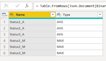
To achieve it, I created a new table as below.
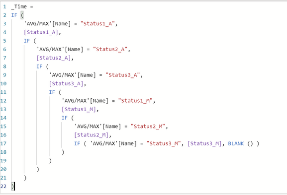
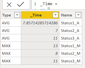
Then Created Measures for each status and assigned those measure values to the above table as a new calculate column.
Then, used this table in the chart with Type as Slicer.
Attached the link for solution below.
https://1drv.ms/u/s!AlTyyZ_9D_WjimMgrhfU3pGS-hbq
Thanks,
James
- Mark as New
- Bookmark
- Subscribe
- Mute
- Subscribe to RSS Feed
- Permalink
- Report Inappropriate Content
Hi @Jamesmathew ,
Thanks for your response, this is definitely pushing me in to the right direction!
I'm trying to get this solution to show the trend of the data (based on the date fields) Is there a way to manipulate the data to show a line chart with the date in the x axis?
Helpful resources

Microsoft Fabric Learn Together
Covering the world! 9:00-10:30 AM Sydney, 4:00-5:30 PM CET (Paris/Berlin), 7:00-8:30 PM Mexico City

Power BI Monthly Update - April 2024
Check out the April 2024 Power BI update to learn about new features.

| User | Count |
|---|---|
| 112 | |
| 100 | |
| 76 | |
| 74 | |
| 49 |
| User | Count |
|---|---|
| 146 | |
| 108 | |
| 106 | |
| 90 | |
| 62 |


